
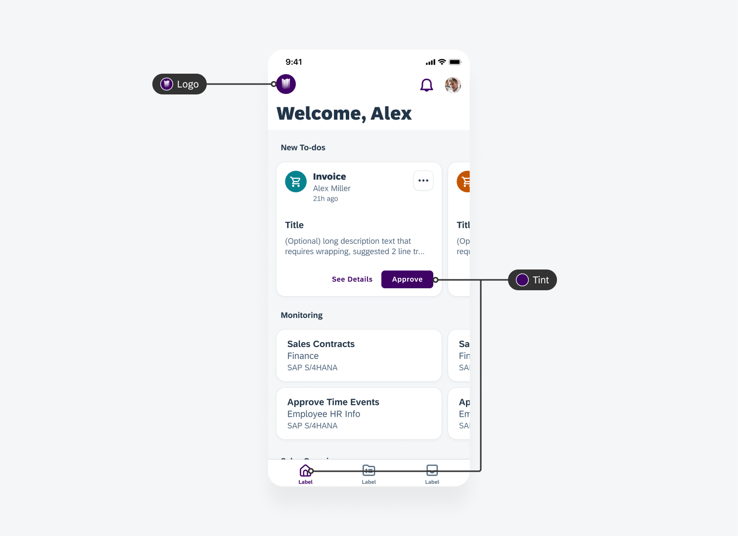
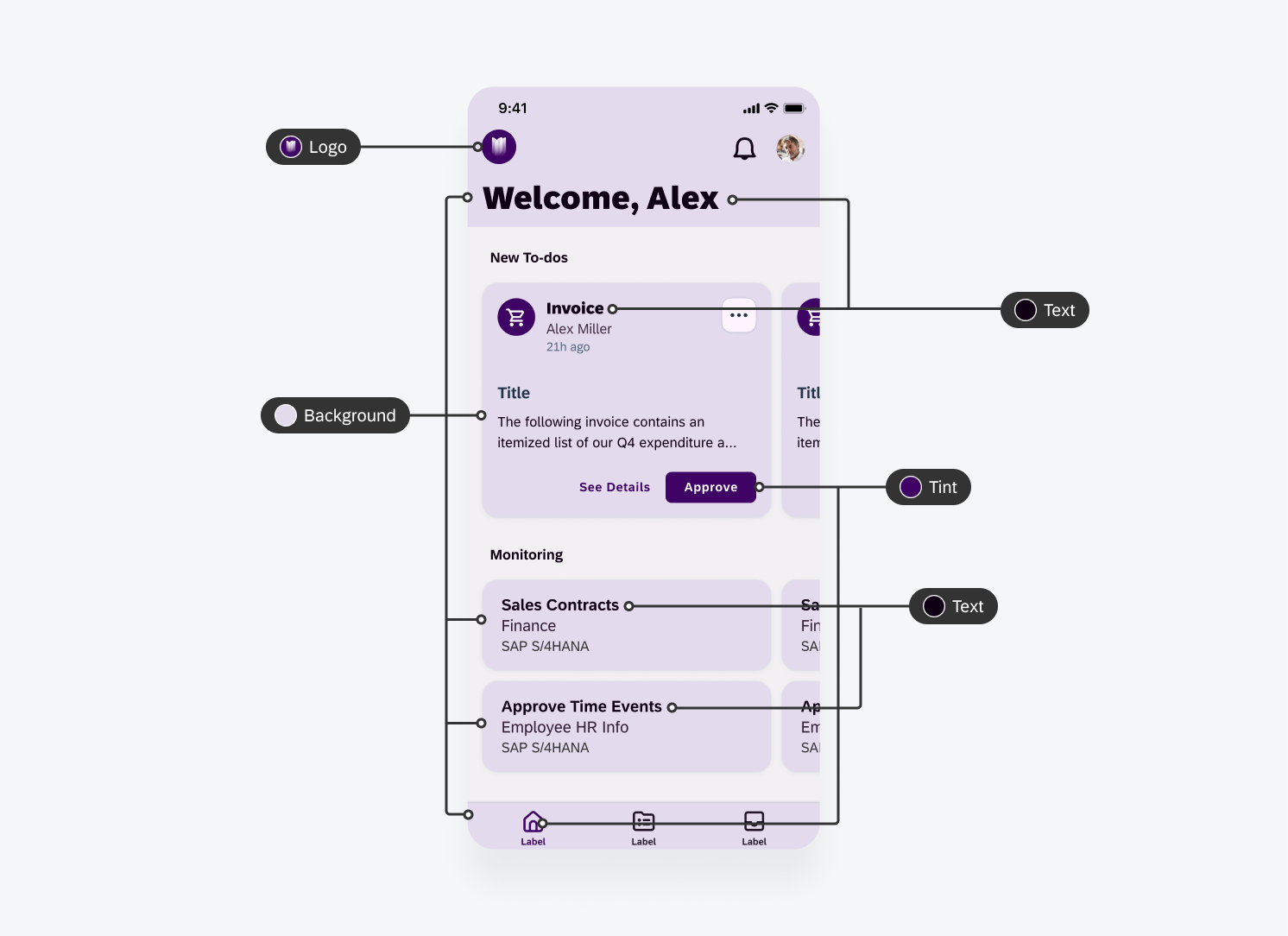
Elevation
Elevation refers to the virtual height or distance of an interface element from the background surface, expressed through visual cues such as shadows and blur effects. In SAP Fiori for iOS, this principle is implemented through a subtle combination of translucent materials and minimal shadows, creating layered depth that aligns with iOS’s minimalist design language to deliver an intuitive, cohesive app experience.
Shadows: Adding Depth and Focus
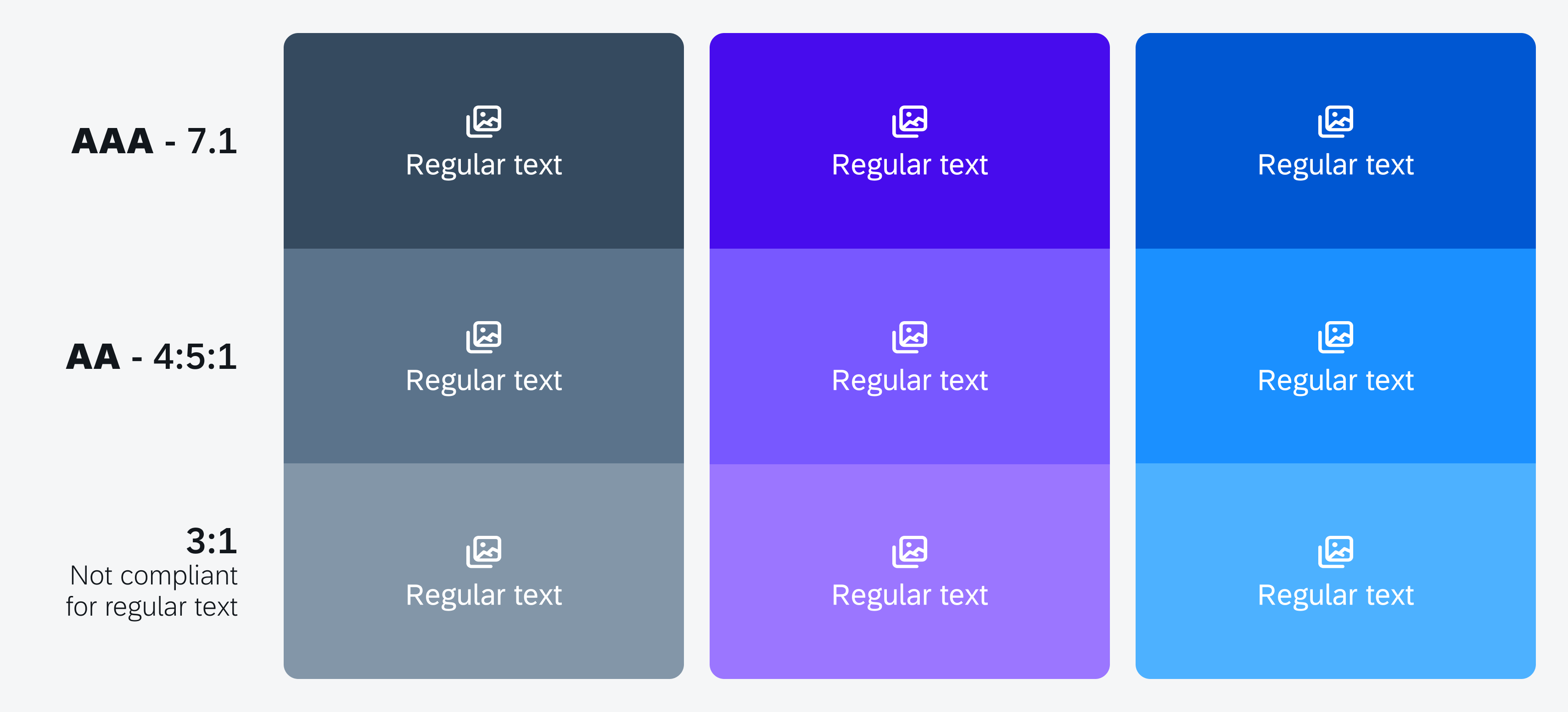
Shadows are an essential technique for making key interface elements stand out and appear more interactive, such as cards, modals, and other actionable components.
Soft, Subtle Shadows
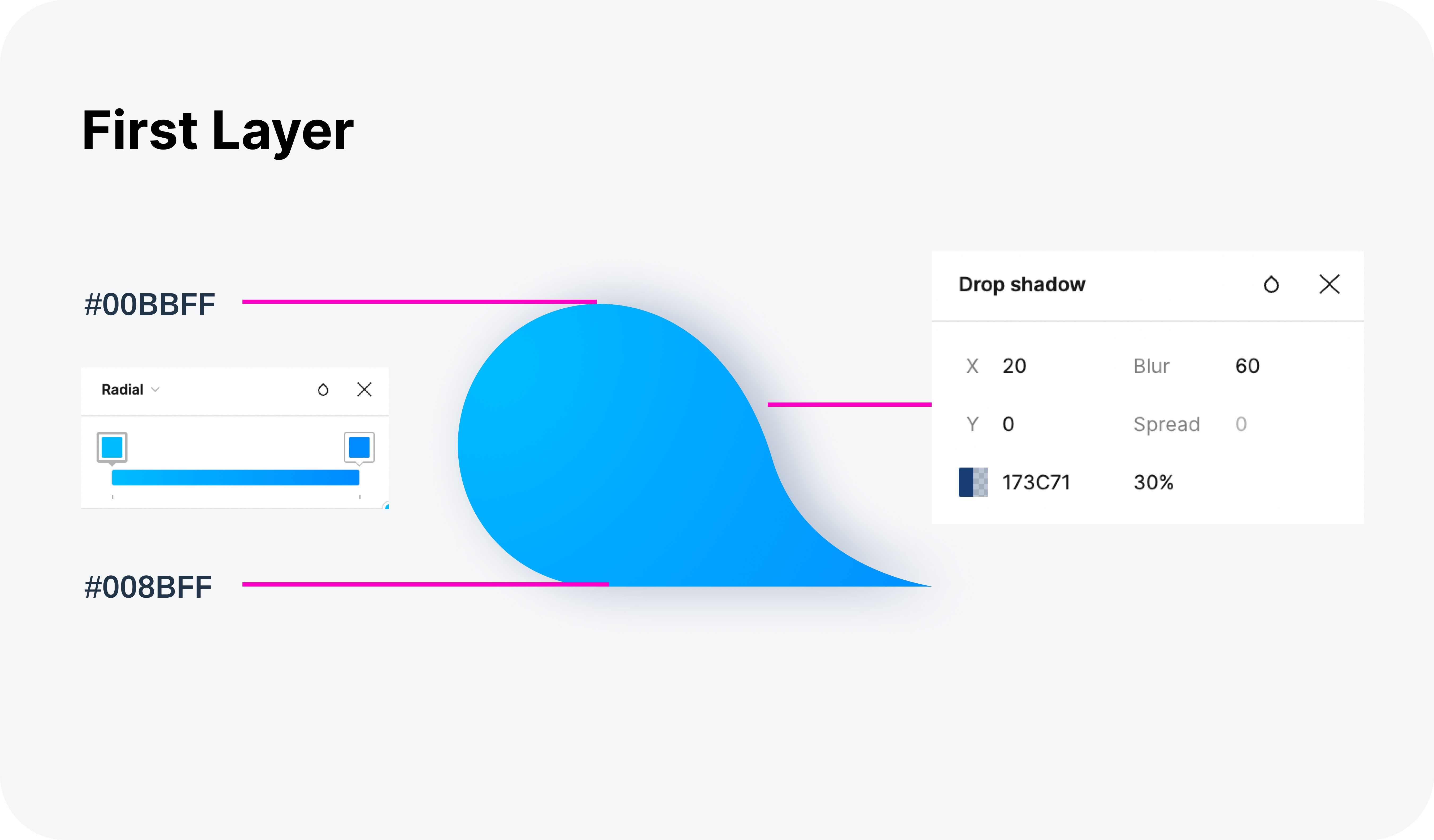
Soft and diffused shadows mimic real-world lighting conditions. The goal is to enhance element elevation and usability while maintaining visual harmony, allowing elevated components to stand out without overwhelming the design.
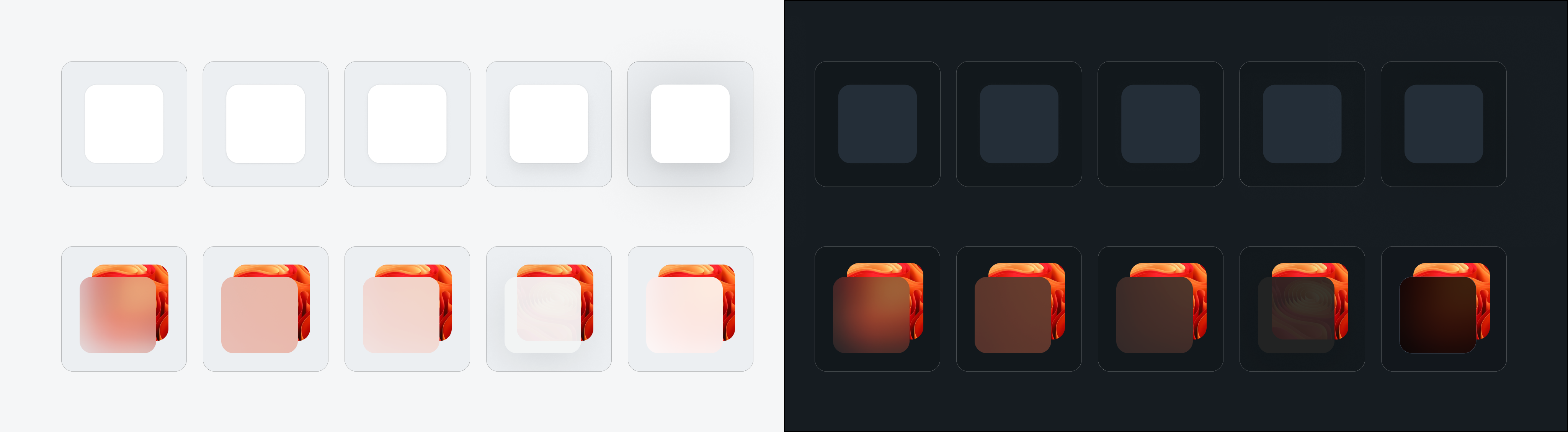
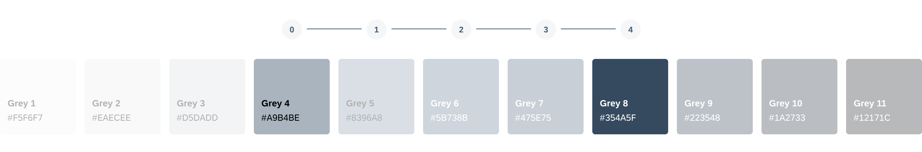
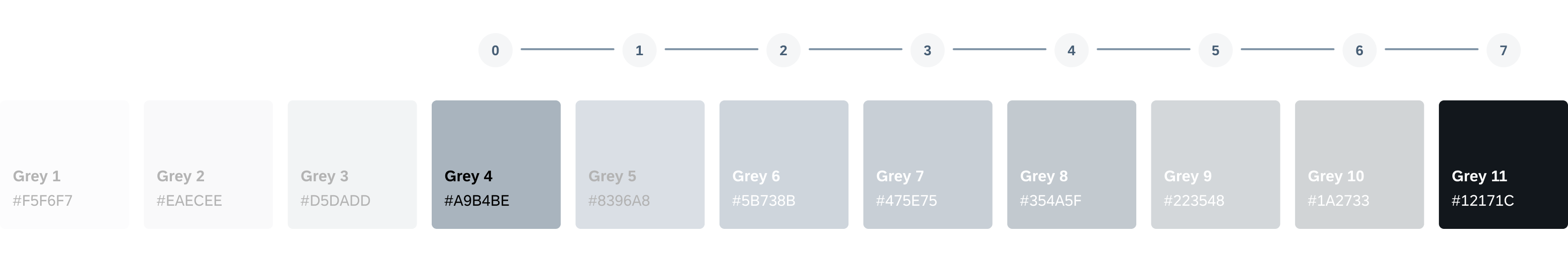
Elevation Levels
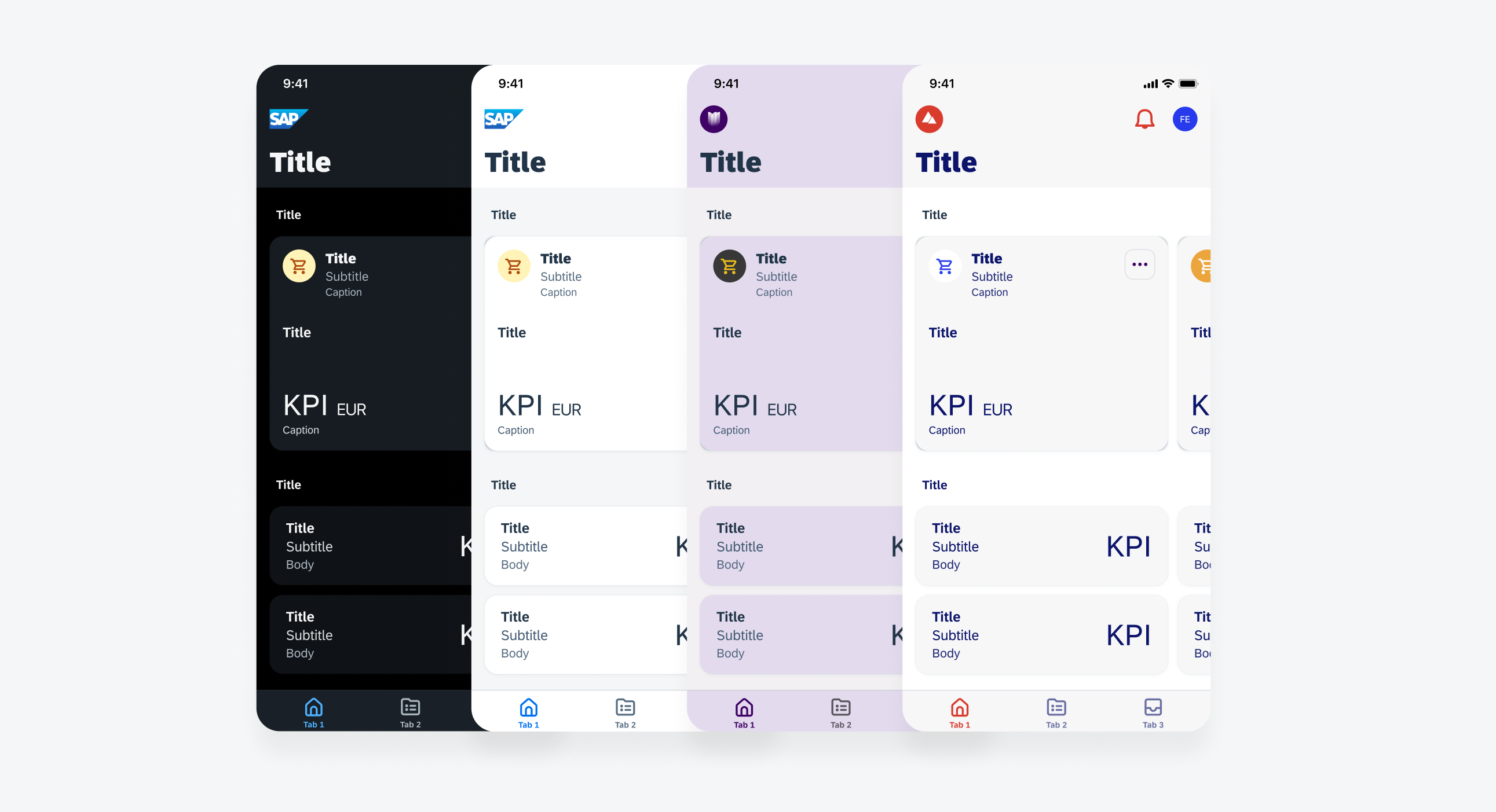
SAP Fiori for iOS provides five distinct elevation levels (0-4) to establish visual hierarchy within the UI. Higher levels are typically used for prominent content, guiding users’ attention to the most critical interactive areas.
| Name | Usage | Light Mode | Dark Mode |
| Level 0 | Banners / headers / preview table views | ||
| Level 1 | N/A | ||
| Level 2 | Cards / modal views (singular) | ||
| Level 3 | Toast messages / quick sort menus | ||
| Level 4 | Popovers |
Materials: Separating Content Layers
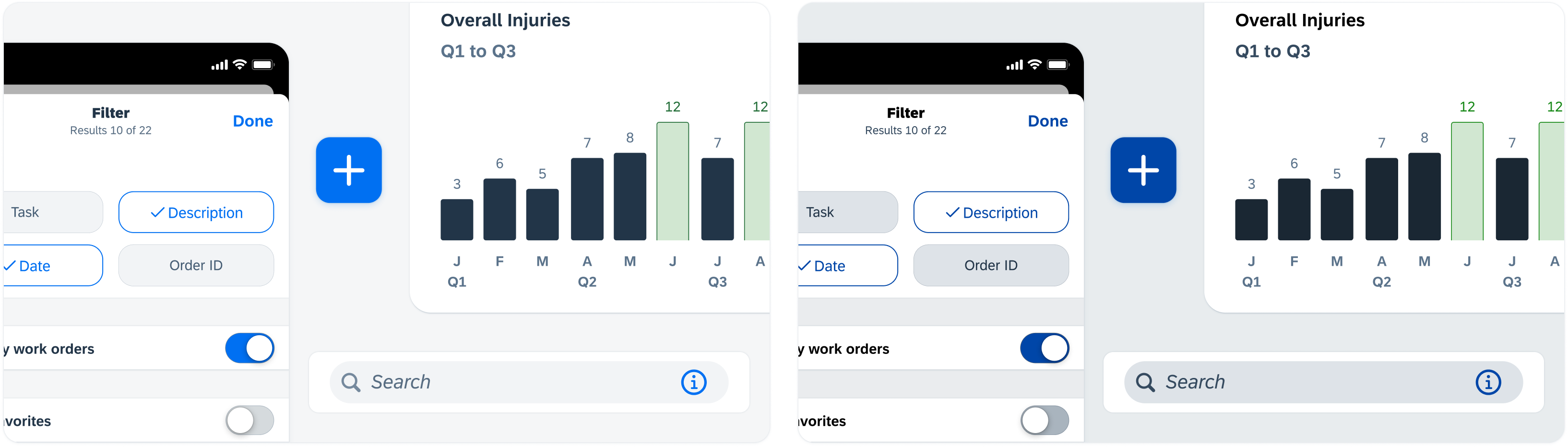
Apple’s materials effects use blur and transparency to create a layered, natural-looking depth in your interface. This approach helps integrate key interface elements, such as navigation bars, modals, contextual menus, and toolbars, delivering a visually immersive experience that balances functionality with harmony.
Depth and Focus through Material Thickness
The thickness of a material affects the degree of background blur. Thicker materials blur more heavily, signaling a higher focus on foreground content, while thinner materials preserve more background context.
Maintaining Focus with Foreground Clarity and Background Blur
Materials keep interactive elements (such as text, buttons, and other controls) sharp and clear while subtly blurring the background. This helps users focus on actionable UI components without losing overall context awareness.
Layering Materials for Content Hierarchy
Different material types (Chrome, Regular, Thin, UltraThin, Thick) establish varying levels of focus and separation. Thicker materials push background content further back, while thinner materials balance foreground prominence with background visibility.
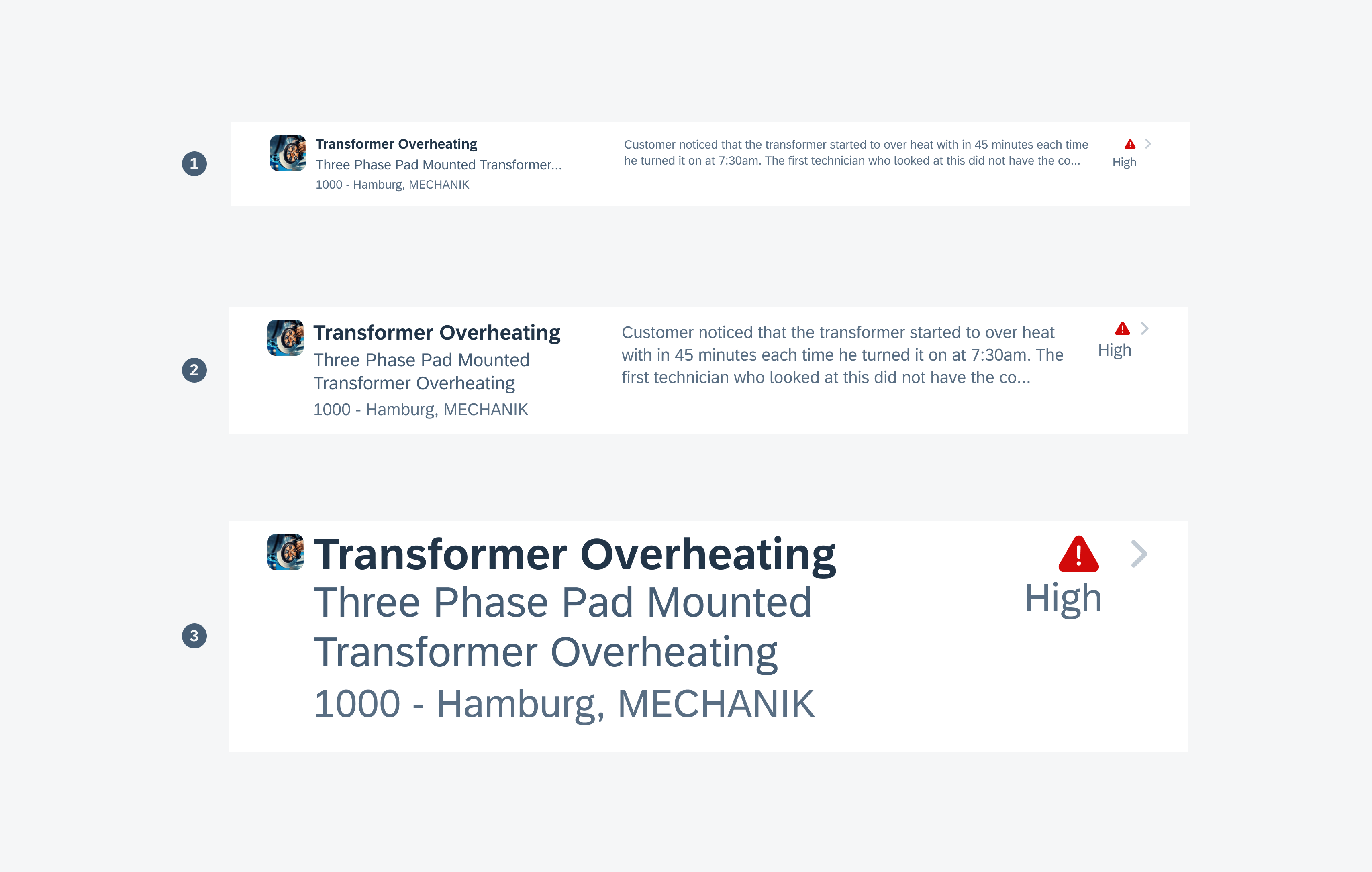
Vibrancy: Enhancing Foreground Elements
Vibrancy works in tandem with materials to increase brightness and contrast on blurred backgrounds, ensuring that elements like text, icons, and buttons remain legible and visually prominent. This technique effectively highlights important actions and differentiates them from passive content.
Practical Usage Examples
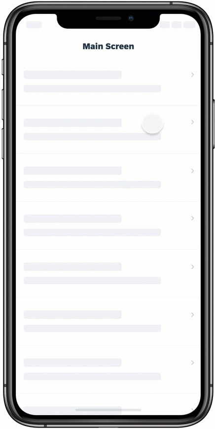
Navigation bars, tab bars, and toolbars: Use materials to highlight controls and titles, while preserving underlying.
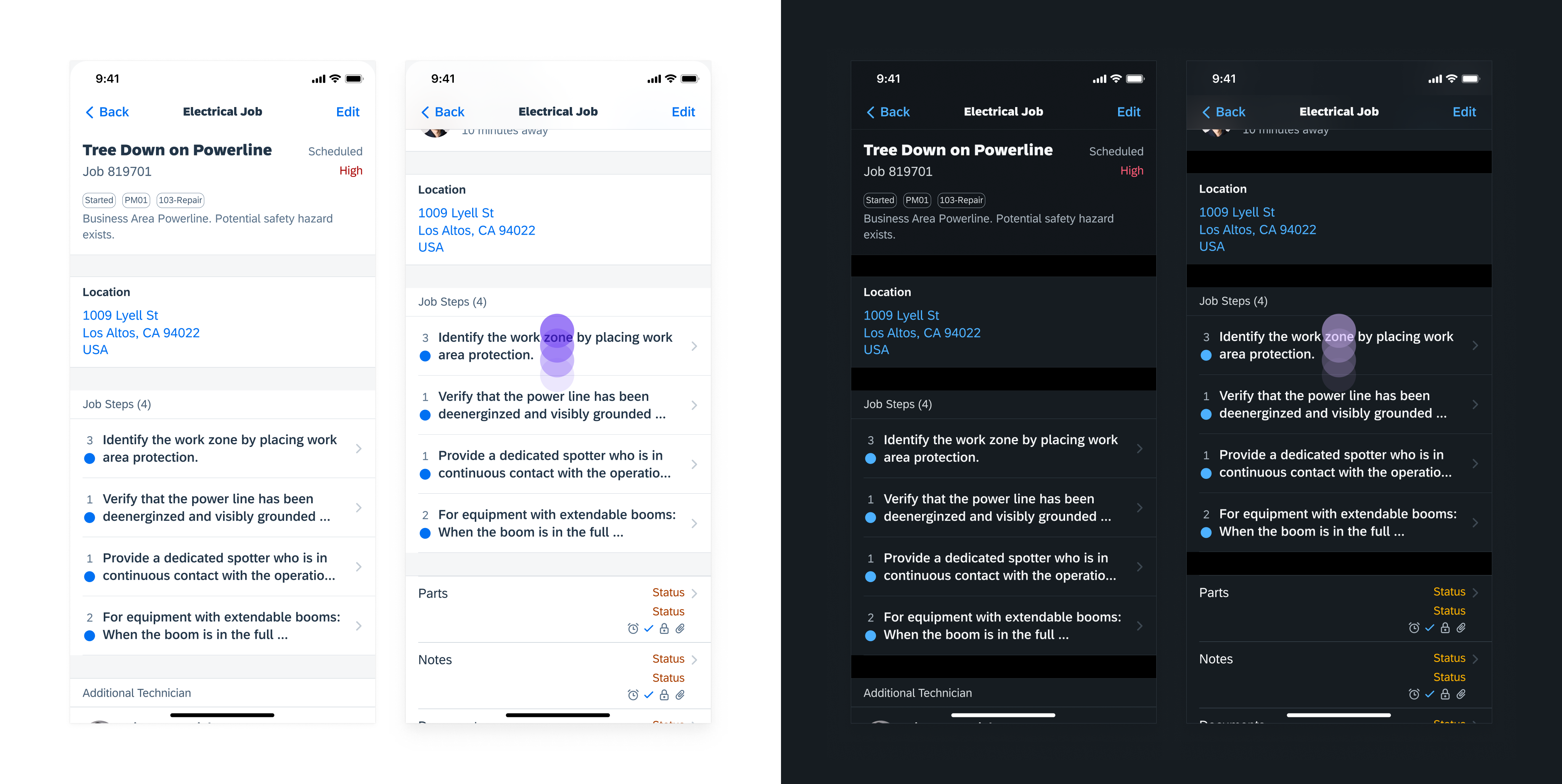
Navigation bar showcasing Materials Chrome (UIKit) and Material Regular (SwiftUI) when scrolling
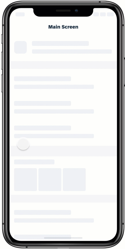
Action sheets and alerts: Apply thicker materials for strong element separation, maintaining background visibility.
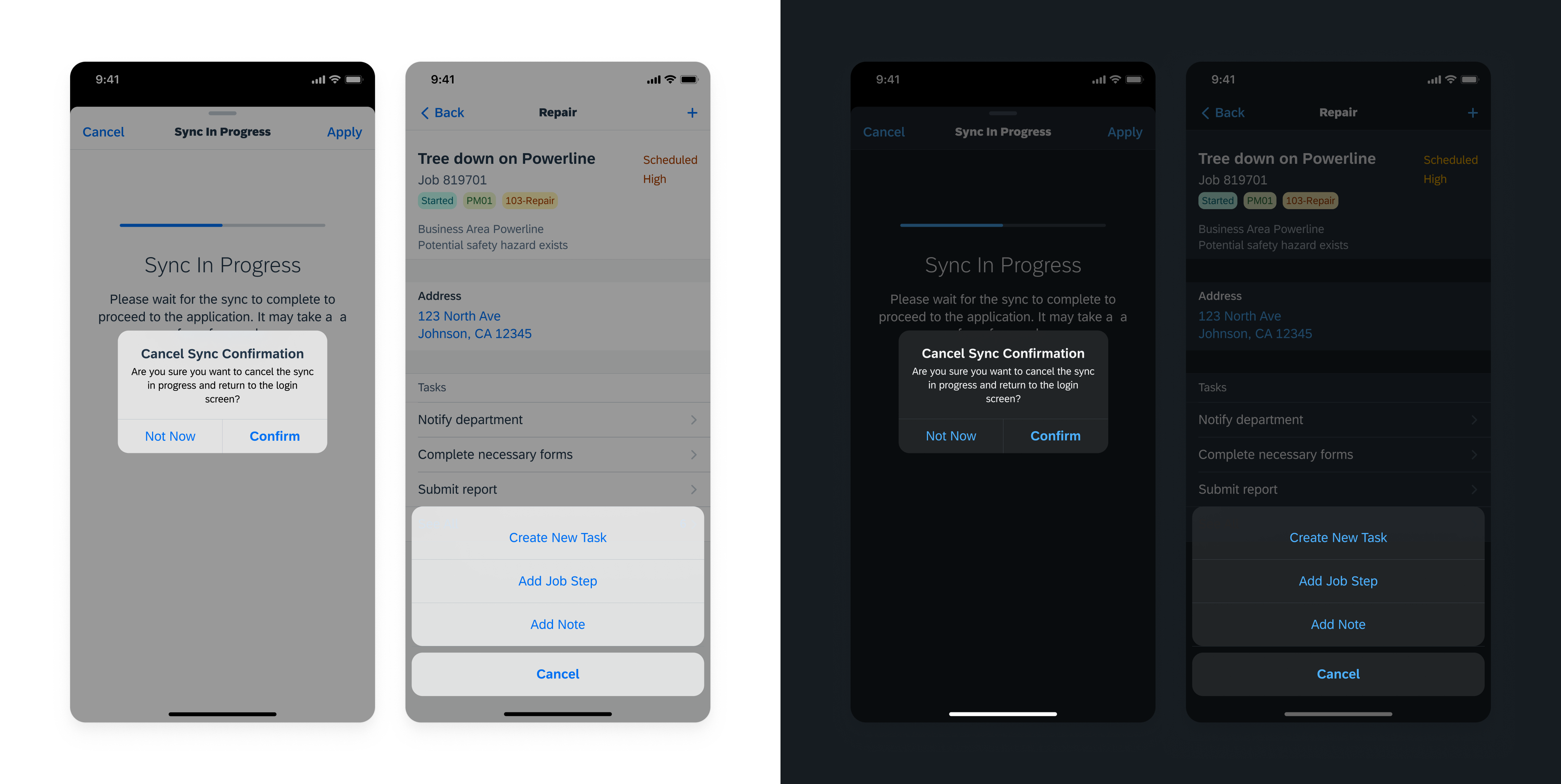
Action sheet and alert showcasing Materials Regular
Resources
SAP Fiori for Android: Elevation
Apple Development Documentation for Materials
Related Components/Patterns: Navigation Bar, Tab Bar, Toolbar, Accessibility


 Your feedback has been sent to the SAP Fiori design team.