Segmented Control Form Cell
FUISegmentedControlFormCell
Intro
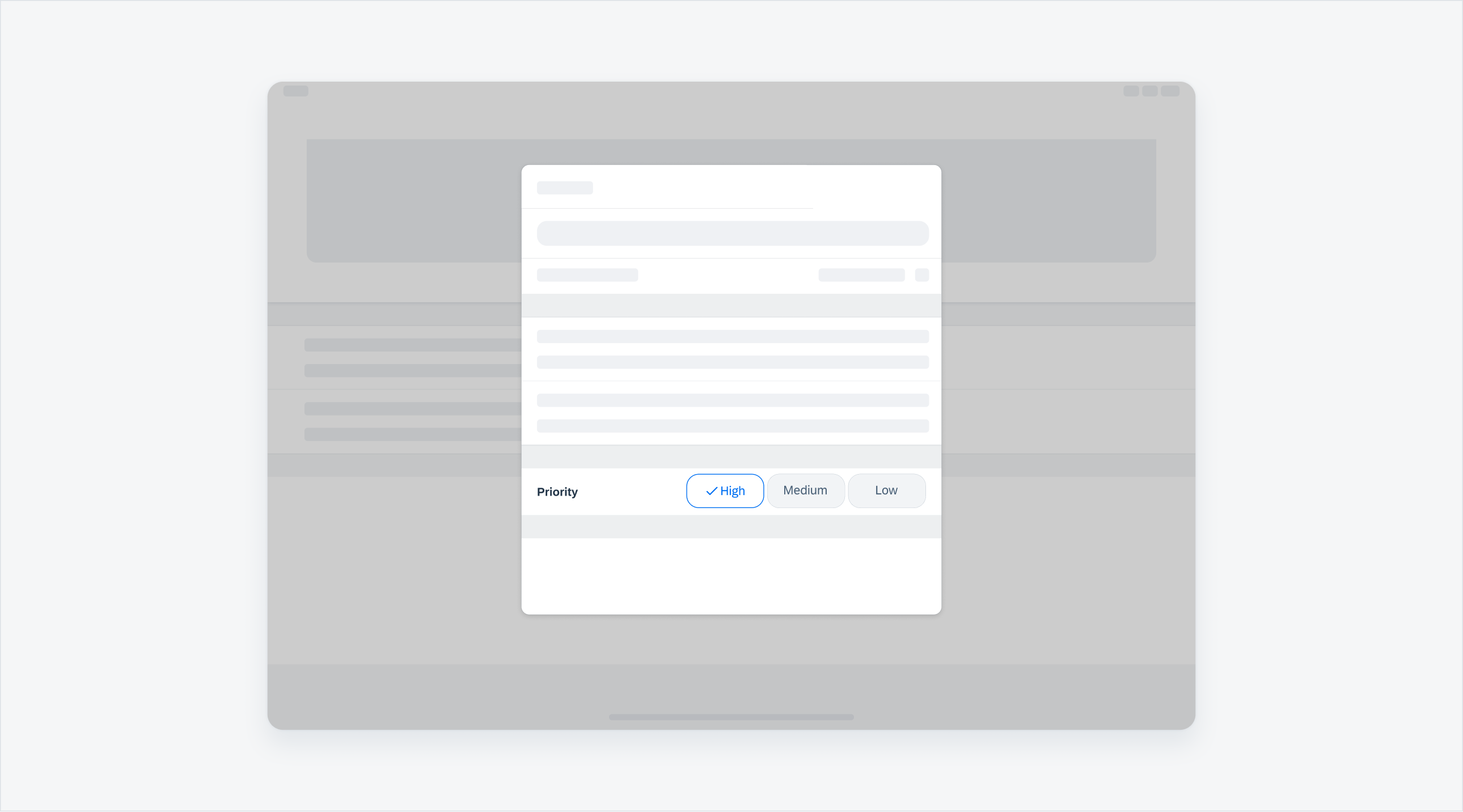
A segmented control form cell allows a user to quickly select from a small set of values. It is typically used in the create and edit pattern, or occasionally in the filter pattern. If the value label is too long or there are more than three values, we recommend using a list picker or a filter form cell instead.
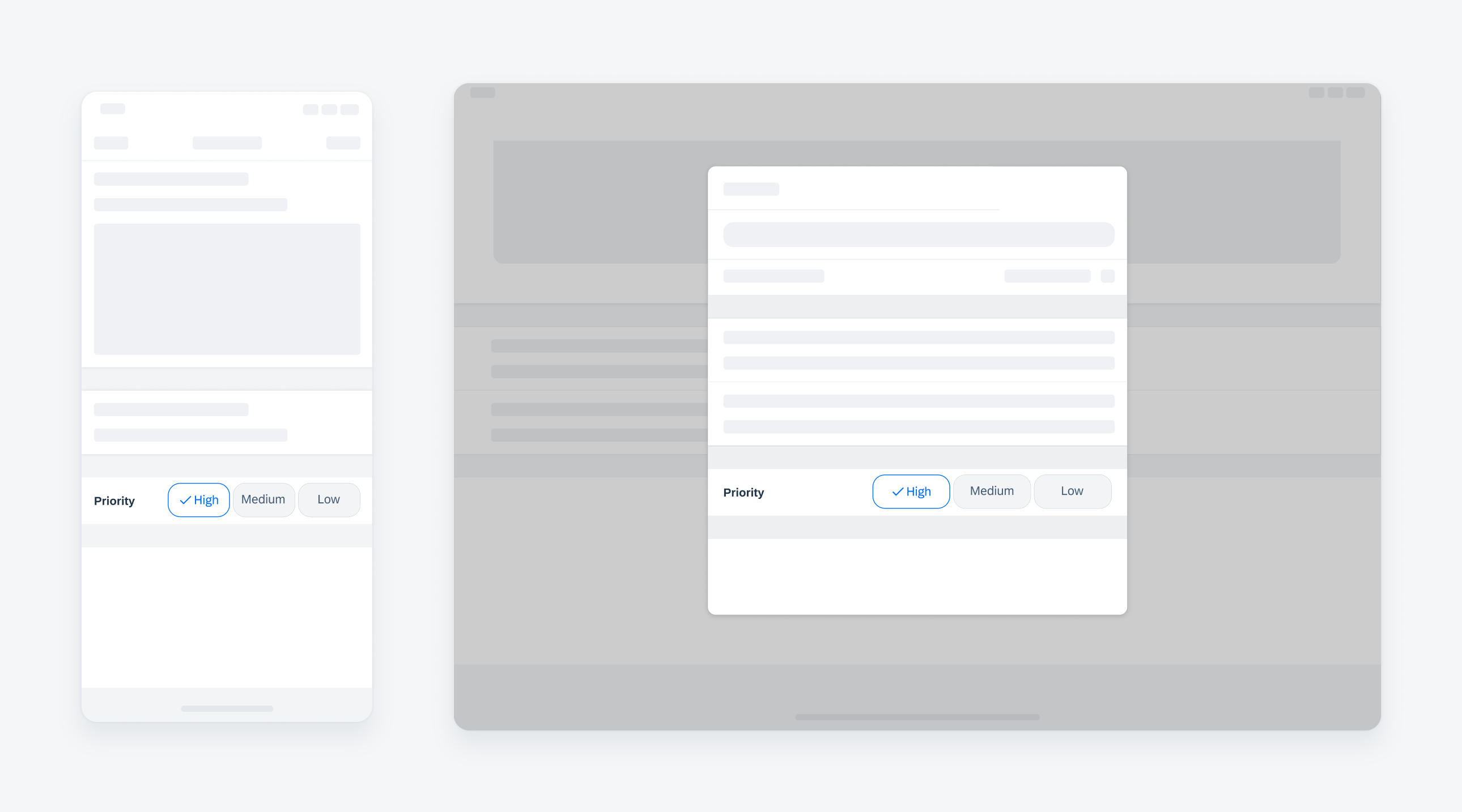
Compact width text input on iPhone (left), regular width on iPad (right)
Do not use a segmented control form cell if the values are long and need to be truncated. Use a list picker or a filter form cell instead.
A. Label
Describes the intent of the selection.
B. Buttons
May be selected state and unselected state with a tap. We highly recommend having a default selection as it indicates to the user that the buttons are tappable.
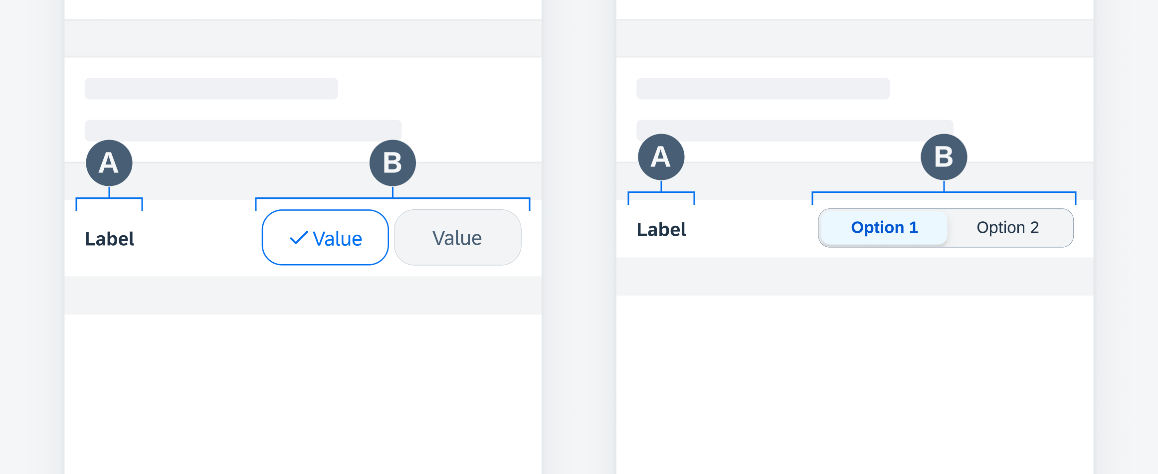
Segmented control form cell anatomy (single-line button variation on left, single-line segmented variation on right)
Single-Line Buttons
Buttons are displayed in a single line with the form cell label. If the values are long, use the stacked variation rather than truncation.
Single selection and multi-selection are available for this variation.
Stacked Buttons
Buttons are displayed underneath the form cell label in the stacked variation. Use this variation when values are too long for single-line variation.
Single selection and multi-selection are available for this variation.
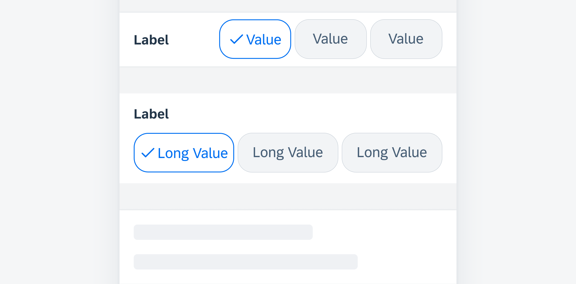
Single-line buttons (top) and stacked buttons (bottom)
Single-Line Segmented
This variation displays a segmented control with a form cell label in a single line.
Values are mutually exclusive and only single selection is possible for this variation.
Stacked Segmented
This variation displays a segmented control underneath a form cell label.
Values are mutually exclusive and only single selection is possible for this variation.
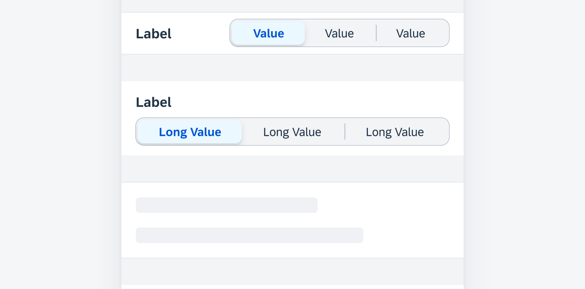
Single-line segmented (top) and stacked segmented (bottom)
Development: FUISegmentedControlFormCell
SAP Fiori for Android: Filter Chips
Related Components/Patterns: Segmented Control, Filter Form Cell, List Picker

 Your feedback has been sent to the SAP Fiori design team.