Text Inputs
FUITextFieldFormCell, FUINoteFormCell, FUIKeyValueFormCell, FUITitleFormCell
Intro
Text input controls are used to request a text entry from the user. They are usually found in the create or edit pattern.
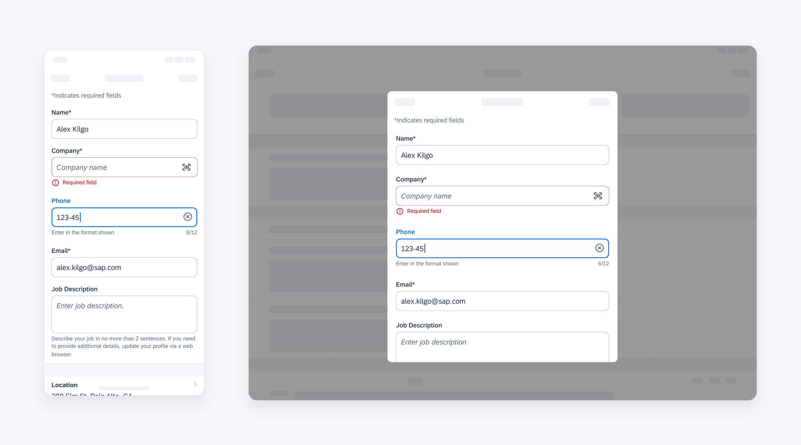
Compact width text input on iPhone (left), regular width on iPad (right)
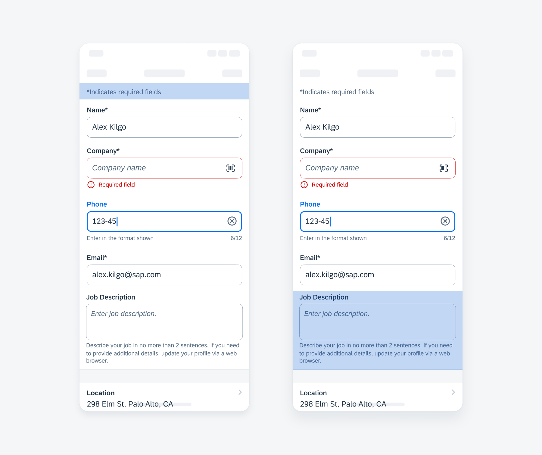
To indicate that a text input is required, include an asterisk next to the label. On the top of the form, a line should mention that asterisks indicate required fields.
If a text input is optional, consider displaying the word “optional” in parentheses next to the label.
In forms with some required inputs, all of the required ones will be indicated. However, if there are fewer optional inputs, only the optional ones will be indicated.
A. Label
Describes the intent of the text input form cell.
B. Input Field
Indicates tappable area where input values are displayed.
C. Helper Text (Optional)
Provides additional information about the form cell. Helper text may wrap as needed.
If the cell is read-only (see Variations below), we recommend displaying “Read-only field” as helper text.
D. Right Accessory Icon (Optional)
In certain use cases, a barcode scanner may be used to populate the input field with information.
E. Character Counter (Optional)
Displays the number of input characters in real-time over the total character limit.
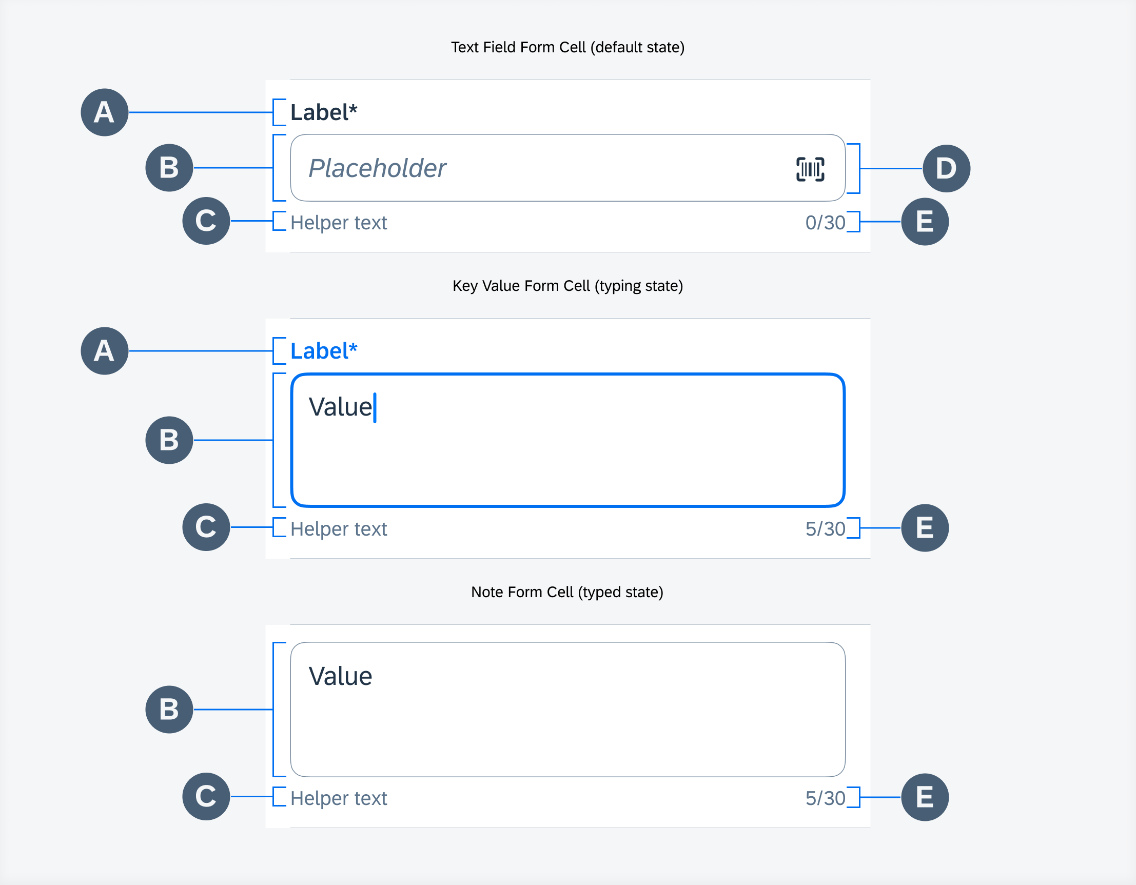
Text inputs anatomy (from top to bottom: FUITextFieldFormCell, FUIKeyValueFormCell, FUINoteFormCell)
Tapping on any of the text input controls automatically brings up the keyboard to facilitate text input.
Use the appropriate keyboard for different types of data entry. For example, use the numeric keyboard when asking for phone numbers.
Display a “Clear” button when typing in a text field. Tapping on it clears all the content in the text field.
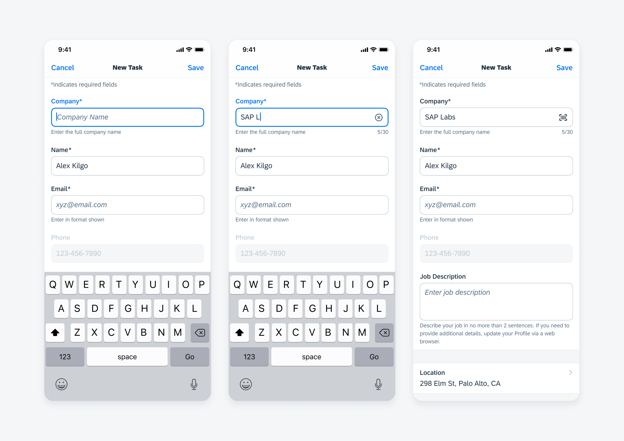
From left to right: active state, typing state, typed state
Error Handling
Text field form cell, key value form cell, and note form cell indicate errors through color and an error icon.
In an error state, the form cell label and bounding box outline turn red, while the helper text appears (if there is no helper text present) or changes (if there is already helper text) to a customizable error message. In a form, an error banner may also be used in conjunction with individual component error states.
The error state should persist until the user rectifies the error. In the flow shown below, the error state disappears once the user starts typing. If there was a helper text prior to the error, the error message will revert back to the helper text.
Title form cell indicates error using the in-line banner.
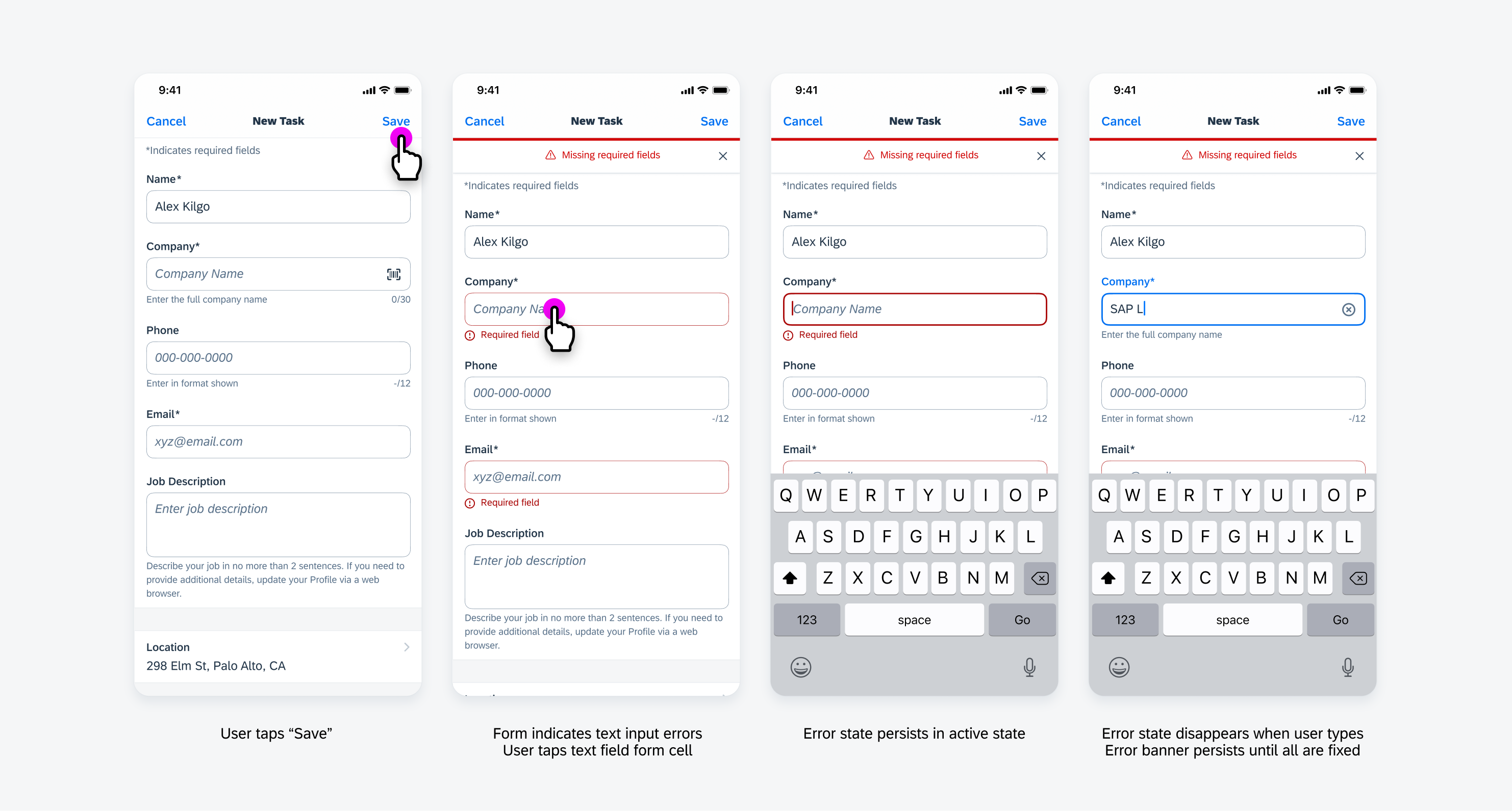
Error state flow example
Character Counter
Text field form cell, key value form cell, and note form cell may optionally display a character counter in instances where a character limit is required.
In use cases where a user is restricted from typing over the character limit, the user’s input is automatically stopped once they reach the limit. The real-time counter turns blue and the helper text appears or changes to “Character limit reached”.
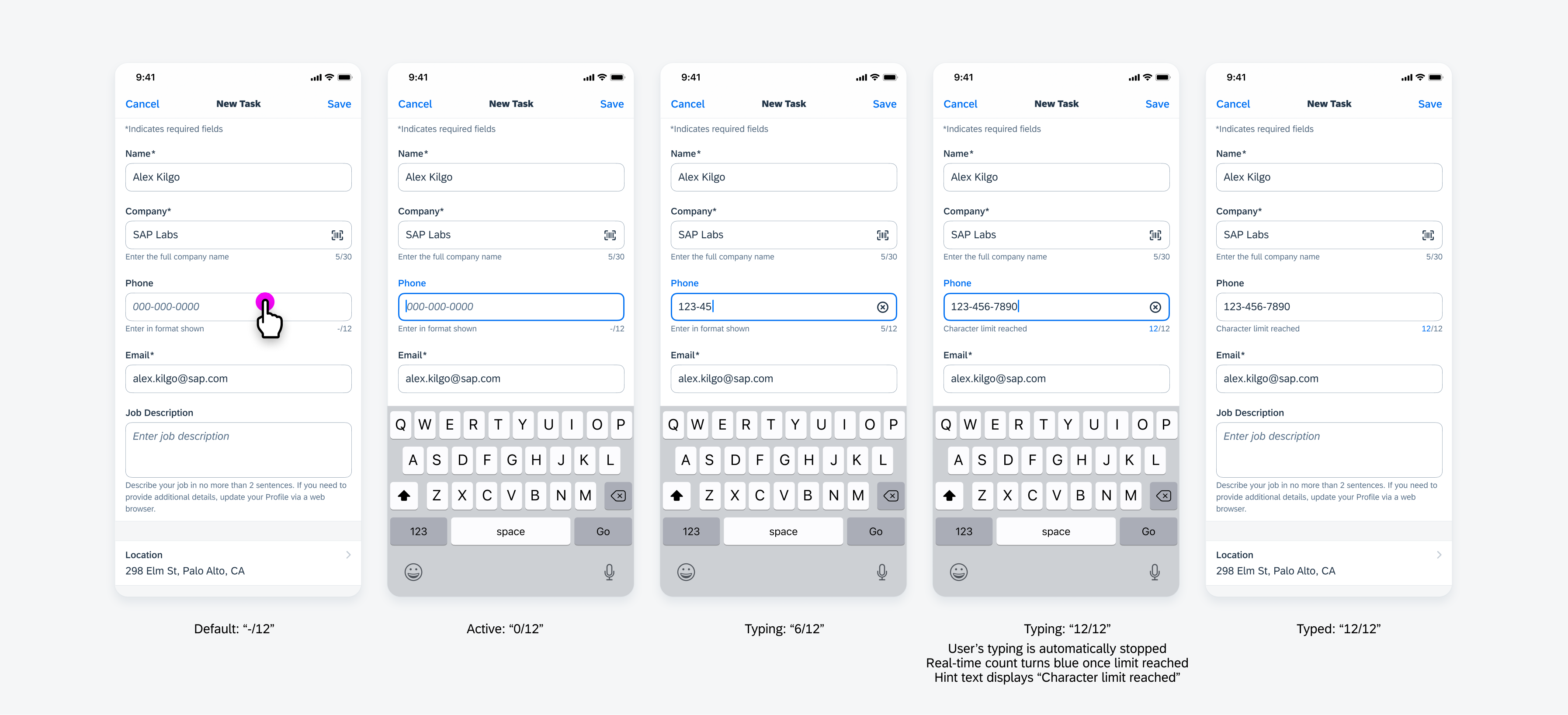
Character counter flow example: user input is automatically stopped when limit reached
In use cases where a user is allowed to continue typing over the character limit, the component displays an error once the user’s input surpasses the limit. The real-time counter turns red and the helper text appears or changes to “Reduce the number of characters”. The error state will persist until the user’s input is shortened to within the character limit.
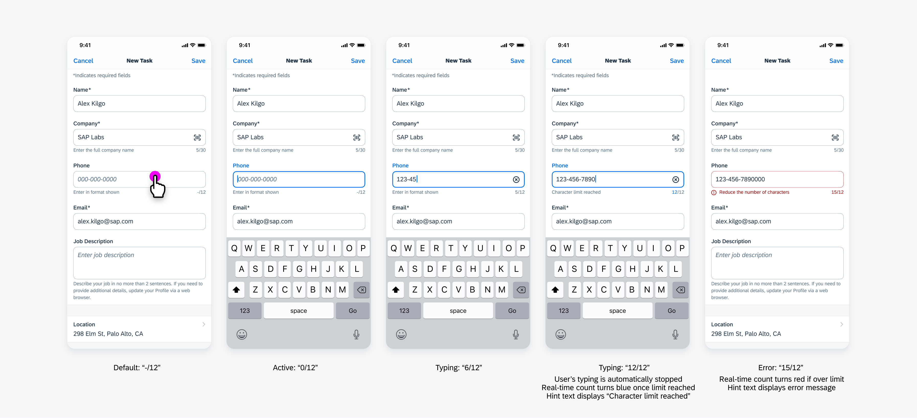
Character counter flow example: user input is allowed over limit and becomes an error
Title Form Cell
A title variation allows the user to enter a small amount of information into a single line, fixed-height container. It is best used for content that is self-explanatory, for example, the title of an object or the name of a person.
Be sure to include clear and concise prompt text to communicate the purpose of the input field, for example, “Title” or “Description”. If said input is required or mandatory place an asterisk (*) behind the prompt text, for example “Title*” or “Description*”. Avoid vague directions such as “Tap to Write.”
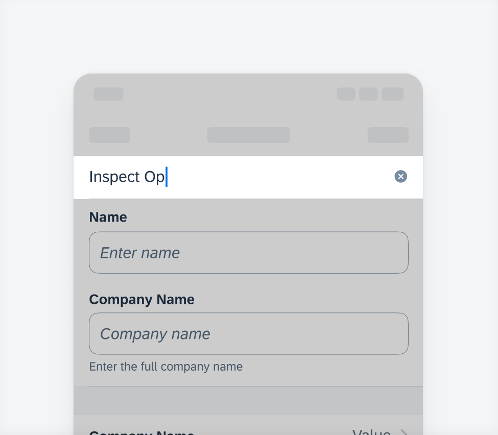
Example of title
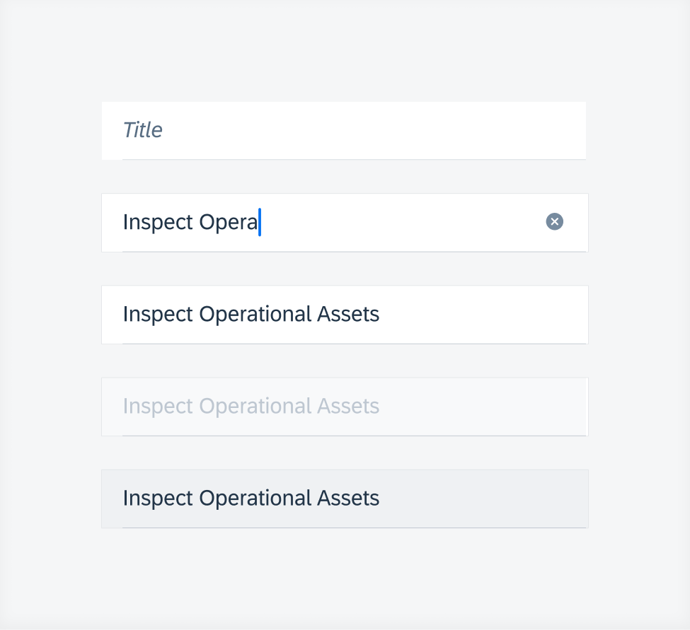
Title states (top to bottom) – default, typing, typed, disabled, read-only
Text Field Form Cell (FUITextFieldFormCell)
A text field variation is a single-line entry. The height of the field is fixed. The label is always required, while prompt text is optional. The prompt text should inform the user about the type or format of value that they should be entering.
A read-only text field form cell may optionally include helper text indicating that it is a read-only field (see example to the right).
An error state must include helper text indicating the nature of the error and an error icon.
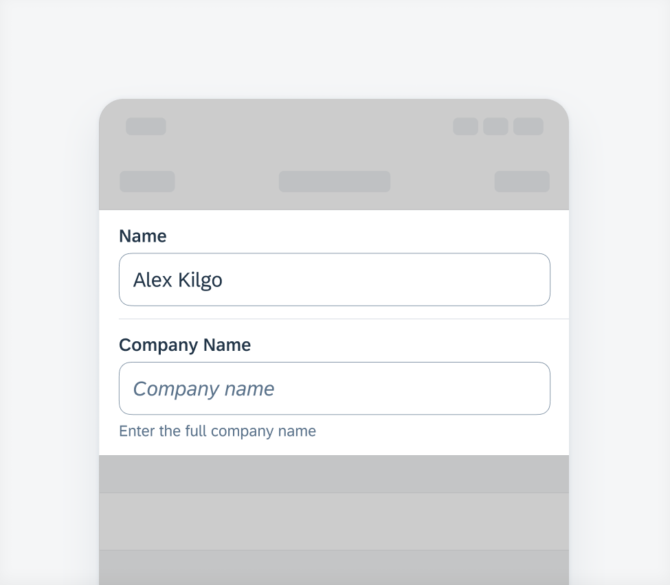
Examples of text field form cell
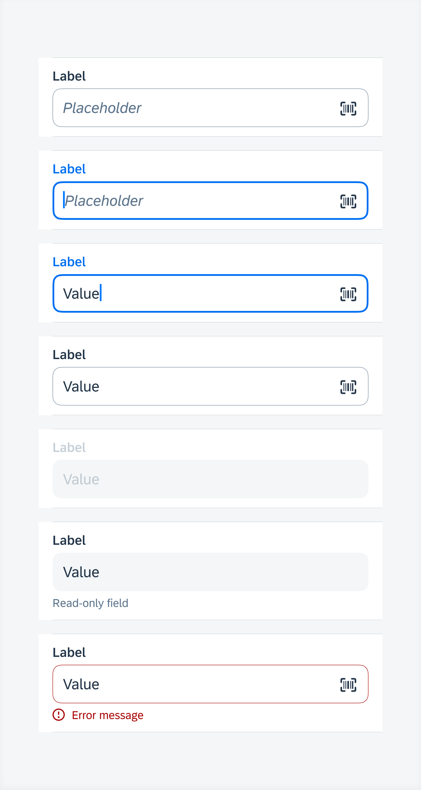
Text field form cell states (top to bottom) – default, active, typing, typed, disabled, read-only, error
Input text can be grouped with specific formats in a text field form cell. For example, parenthesis and hyphens may be added to form a format for phone numbers. This may also be applicable for requesting credit card numbers from the user.
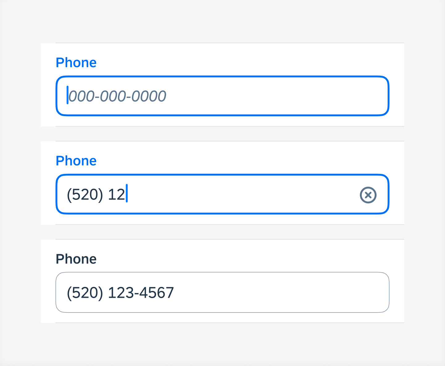
Examples of grouped characters
A prefix may also be added to define a unit for each field. Prefixes are left aligned in the text field.
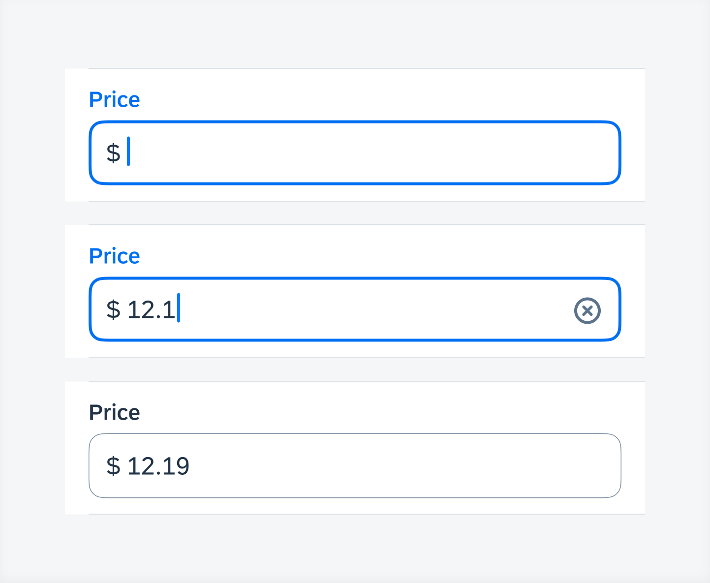
Examples of prefixes
A suffix may also be added to define a unit for each field. Suffixes are right-aligned and will move along with the cursor.
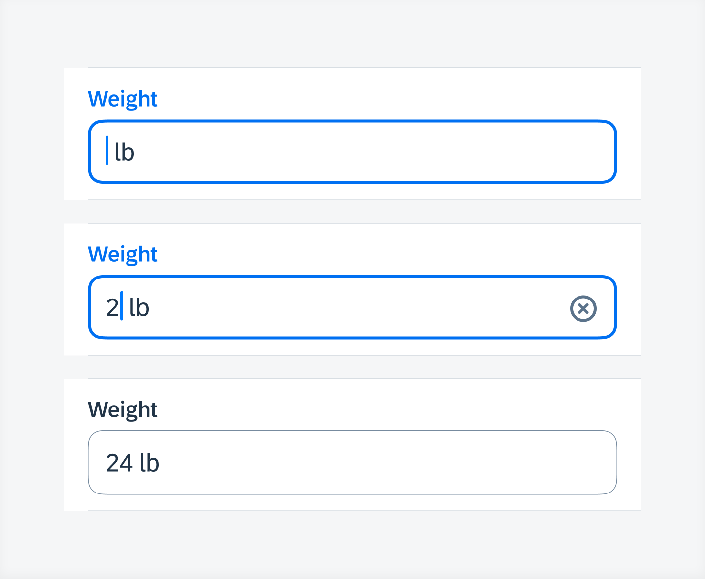
Examples of suffixes
An icon may be included to launch the barcode scanner or OCR scanner.
Examples of text field form cell with an icon
Key Value Form Cell (FUIKeyValueFormCell)
A key value variation is used for multi-line text entry. If additional accessories are present below the key value form cell, such as an attachment component, the height of the cell should be fixed, and a scroll bar will allow users to see the hidden content. If the key value form cell is the bottom-most component in the create pattern, the height of the cell can be flexible to grow downwards as the user inputs additional text into the cell.
A read-only key value form cell may optionally include helper text indicating that it is a read-only field (see example to the right).
An error state must include helper text indicating the nature of the error and an error icon.
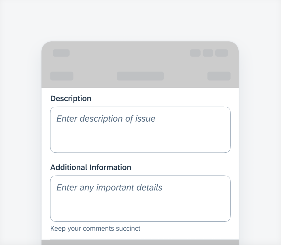
Examples of key value form cell
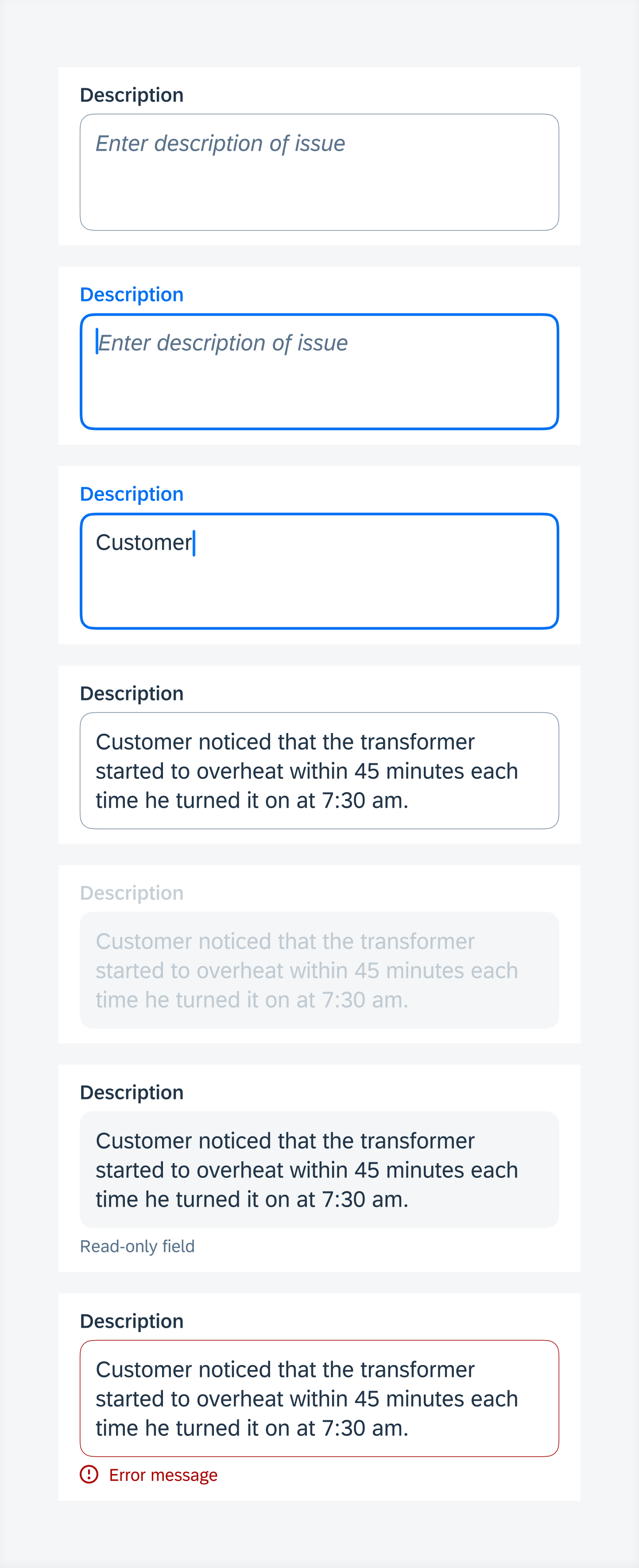
Key value form cell states (top to bottom) – default, active, typing, typed, disabled, read-only, error
Note Form Cell (FUINoteFormCell)
A note form cell variation is used for multi-line text entry. It follows the same behavior as a key value variation but has no label.
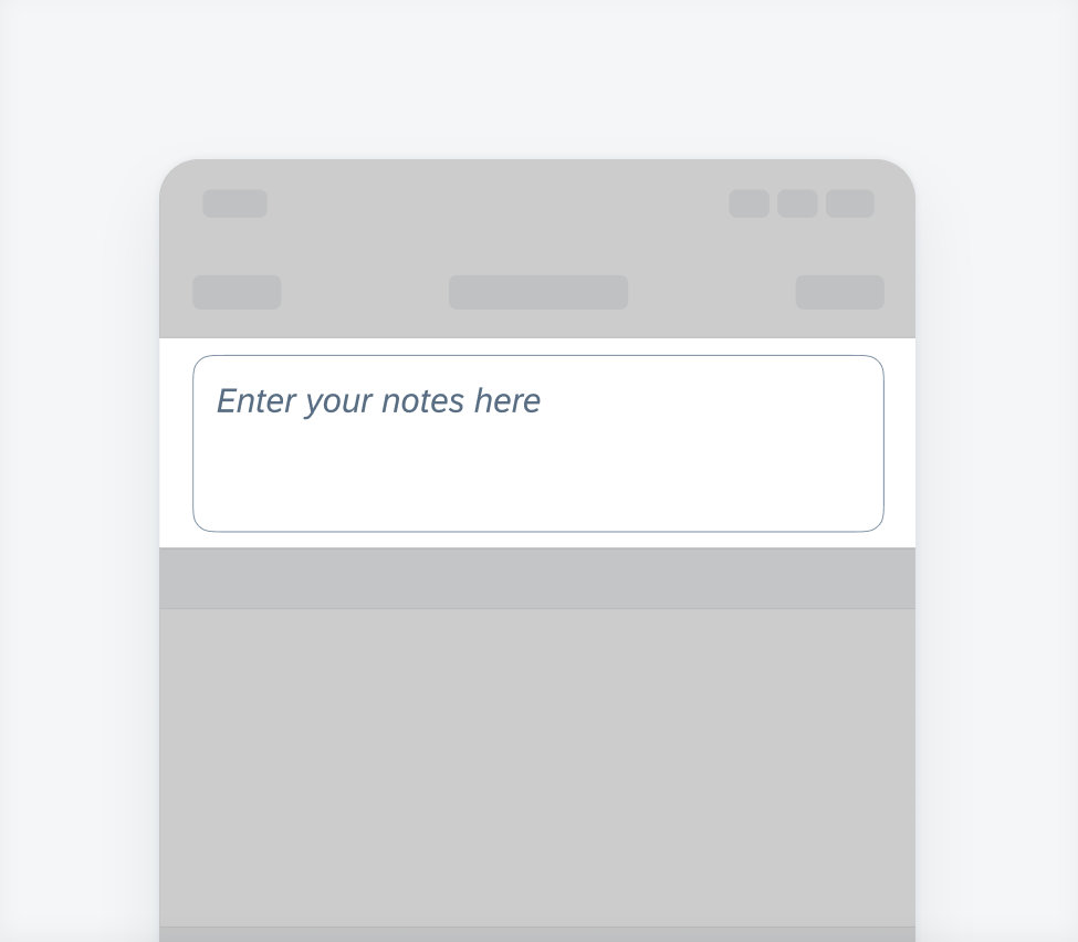
Example of note form cell
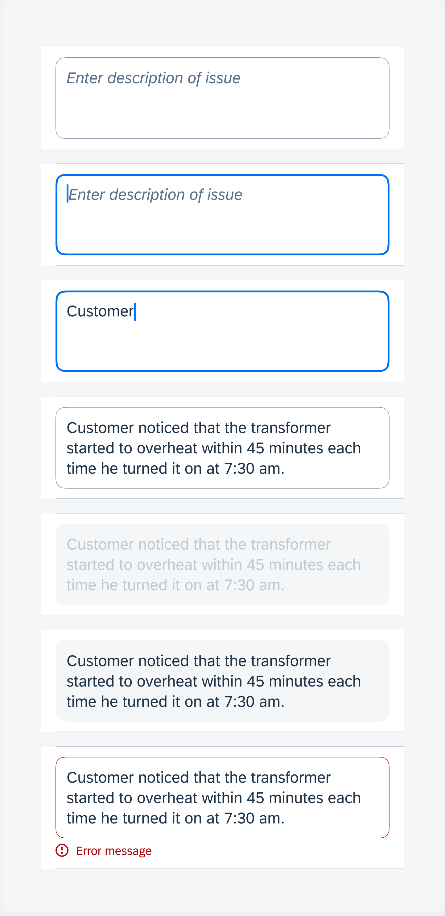
Note form cell states (top to bottom) – default, active, typing, typed, disabled, read-only, error
Development: FUITextFieldFormCell, FUINoteFormCell, FUIKeyValueFormCell, FUITitleFormCell
SAP Fiori for Android: Text Input
Related Components/Patterns: Create & Edit, Barcode Scanner, OCR Scanner

 Your feedback has been sent to the SAP Fiori design team.