Map
Intro
The map pattern is designed to display the location of business objects and give a visual indication of the object type, such as a point, polyline or polygon. It can also be used to show points of interest, optimized routing based on business criteria, and other quantitative location-based data.
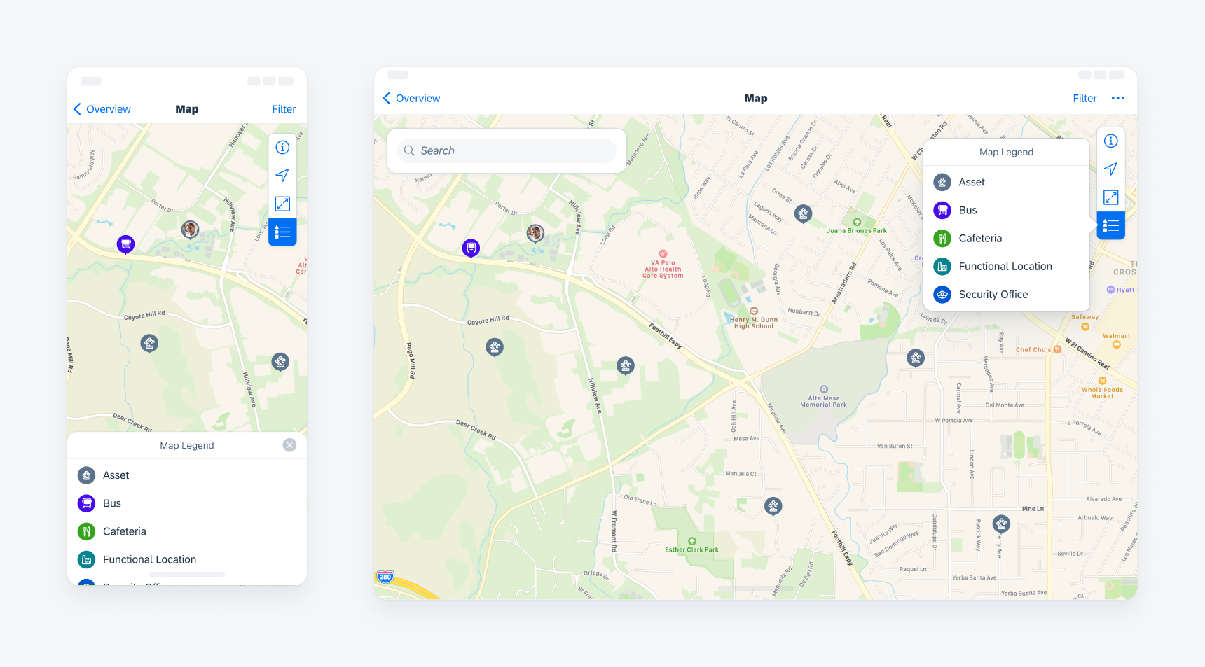
Example of the map view on compact (left) and regular (right)
- Quickly access geospatial and business data from the field
- Search for business objects
- See an overview of business objects and their locations
- Quickly access previews of business objects
- Get directions to business objects from their current location
- Show and hide different map view and feature layers
A. Map Search
Search is an optional feature that can be included in the map view.
There are two types of search panels: one with a list of business objects displayed, and one with only the search bar. When using the search panel with the list, the items should be presented as object cells, and the list can be filtered. Please refer to the object cell and filter guidelines for more details.
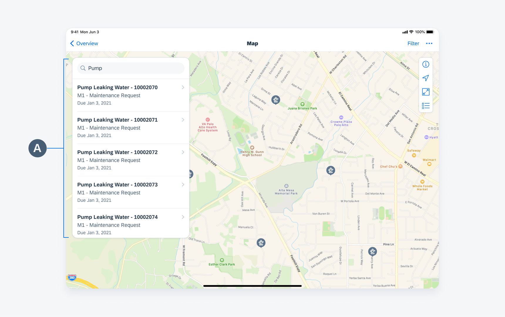
Search panel on the map view
B. Toolbar
The toolbar appears at the top-right corner of the map. It contains buttons for performing actions relevant to the current view or the content within it. There are five default actions available to use in the toolbar and you may include up to six actions.
The five default actions are:
- Map Settings: Appears as a modal window when the user taps on the information icon. The content that appears within the settings modal depends on each app’s specific needs. Some examples for settings are Map View Options, Feature Layers Options, Near Me Radius, and Map Unit Measure.
- Current Position: Displays the user’s real-time location if the device’s GPS setting is turned on. The user’s current location is highlighted on the map. There are two states of the current position icon: On and Off.
- Show/Hide Panels: Moves all panels including the search box off the screen. Tapping the button again returns the panels to their previous positions.
- Map Legend: Provides detailed information about the symbols and visual elements that appear on the map view.
- Zoom Extents: Resets the map zoom to a level where all available markers appear on screen at once.
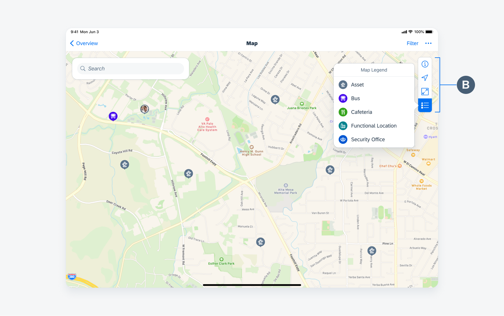
Map toolbar that displays the map legend
C. Map Markers
Map markers indicate either single or multiple business objects on a map. They can be represented by points, polylines, or polygons. Each marker type has a default and a selected state.
- Points are used to represent one or more business objects at a specific location. Point markers can be shown with icons, images, numbers, and letters to give additional information about the business object.
- Polylines can represent linear assets, such as pipelines or water-distribution networks.
- Polygons are used to represent areas, such as functional locations or regional boundaries.
Objects that are close together cluster together or apart depending on the zoom level of the map. As the user zooms out, markers merge into a single marker with a number count displaying how many objects are located within the cluster. As the user zooms in, the marker breaks apart into the individual objects. Objects that share one single geometry (location) are displayed as a single marker with the number count. If objects in a cluster are different types, the marker should be set to a neutral color. If objects in a cluster are all the same type, the marker should reflect the color set for that specific object type.
Users can select a cluster marker by tapping it and a list panel showing each object within the cluster should be displayed. Selecting one of the objects from the list opens the detail panel for that object.
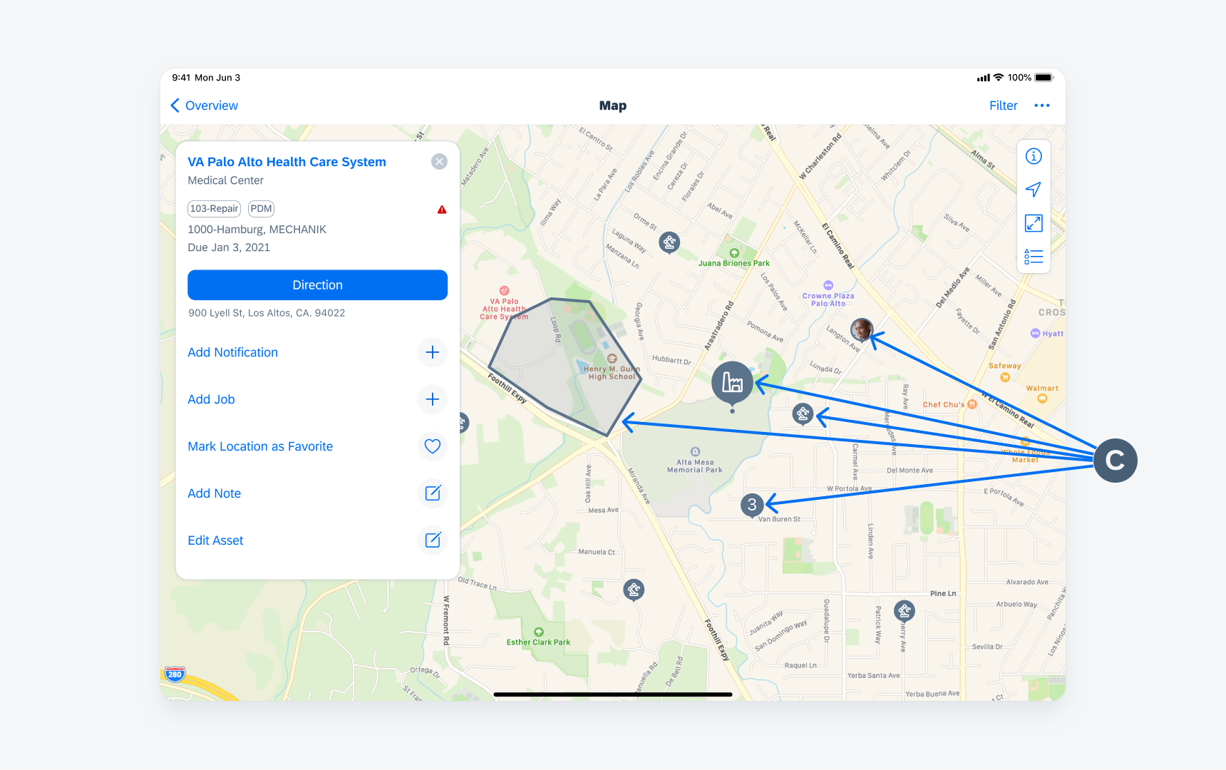
Example of markers on map view
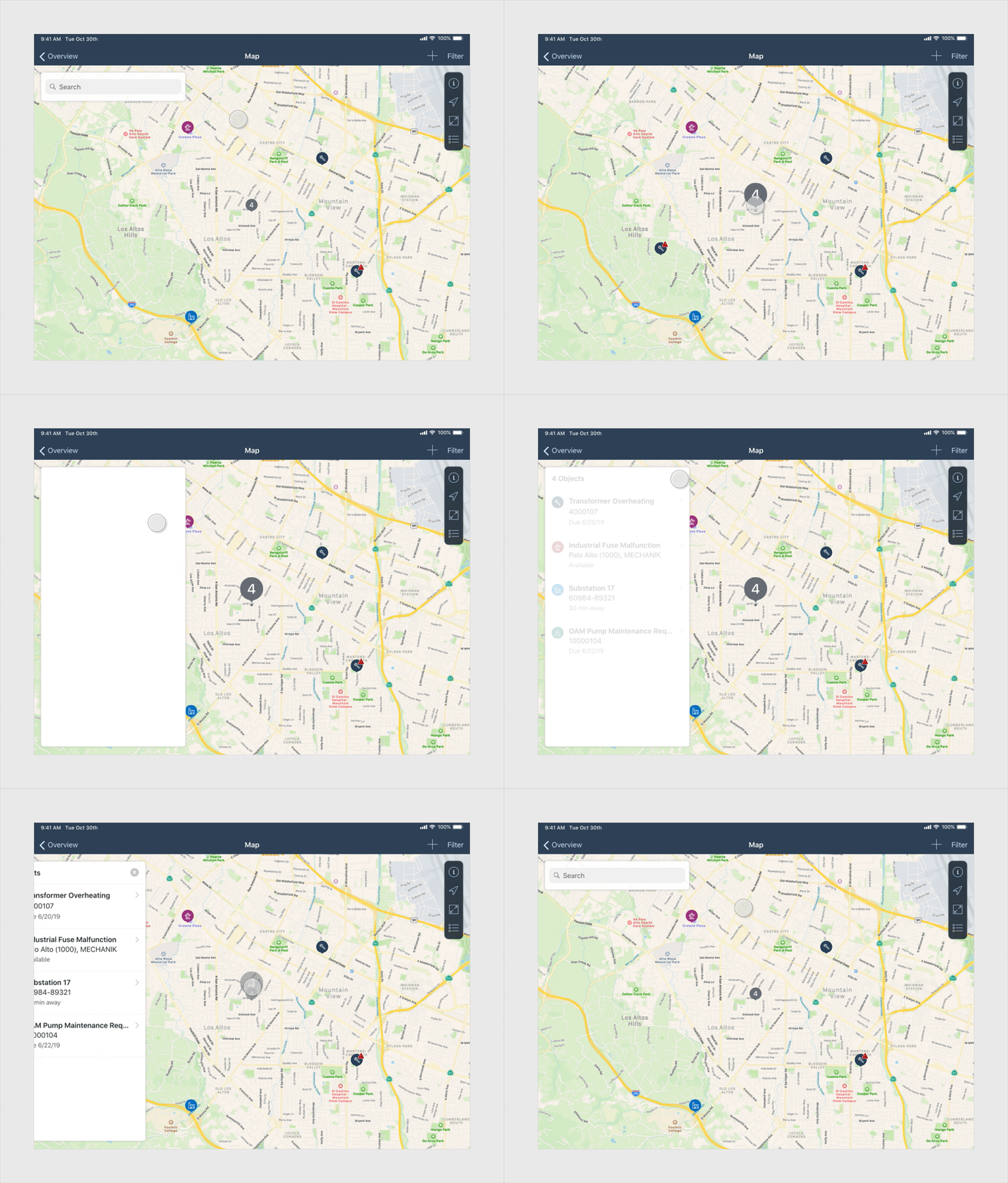
Interacting with a map marker (using the design from SDK 6.1)
D. Detail Panel
When a user selects a map marker, either a point, polyline or polygon, a detail panel slides in from the left to show additional information.
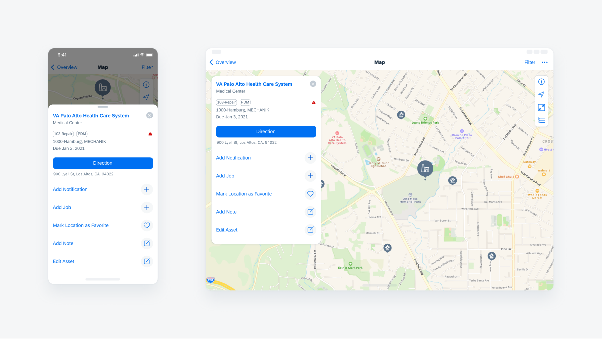
This panel displays information about the selected business object, and can contain general details, navigation direction information, analytics, quick actions, etc. As the panel is constructed in a modularized fashion, the specific combination of content types will vary across applications.
Examples of different content types to include are:
- Title: This section should always be at the top of the panel. Include the object’s name with an optional subtitle. Use tint color for the title when it’s possible to drill down further to see more details about the object.
- Additional Information: Use this section to display additional information about the object. Short texts, status icons, and system-generated tags may be used.
- Directions Button: A directions button with or without the address may be used.
- Actions Cell: Use this section to display quick actions related to the object.
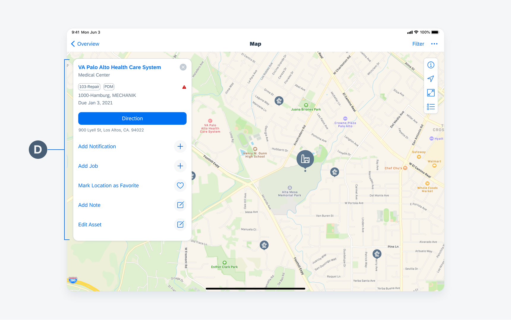
Example of a detail panel in a map view
From the Map view, the edit mode can be initiated two ways depending on if you are creating a new object or editing an existing object. The transition to edit mode will happen in place and preserve any filters and/or settings that have been set.
Edit Existing Object
When editing an existing object, the edit mode is triggered from the action cell in the detail panel of the selected object. In edit mode, the selected object (point, polyline or polygon) is displayed and can be edited as needed. Once the object’s new geometry is saved, the user returns to the previous map view.
Edit: Create New Object
When creating a new object, the edit mode is initiated from the “Add” icon in the navigation bar. The user can choose from a list what type of object they want to create. Point, polyline, and polygon are supported. The transition to edit mode happens in place and preserves any filters and/or settings that have been set.
Once in edit mode, the user can tap on the locations where they want a point, or series of points, to be placed. Point locations can be changed with a tap and drag gesture, or via the address fields in the edit panel. After the object is created and saved, the user returns to the map view from where they started.
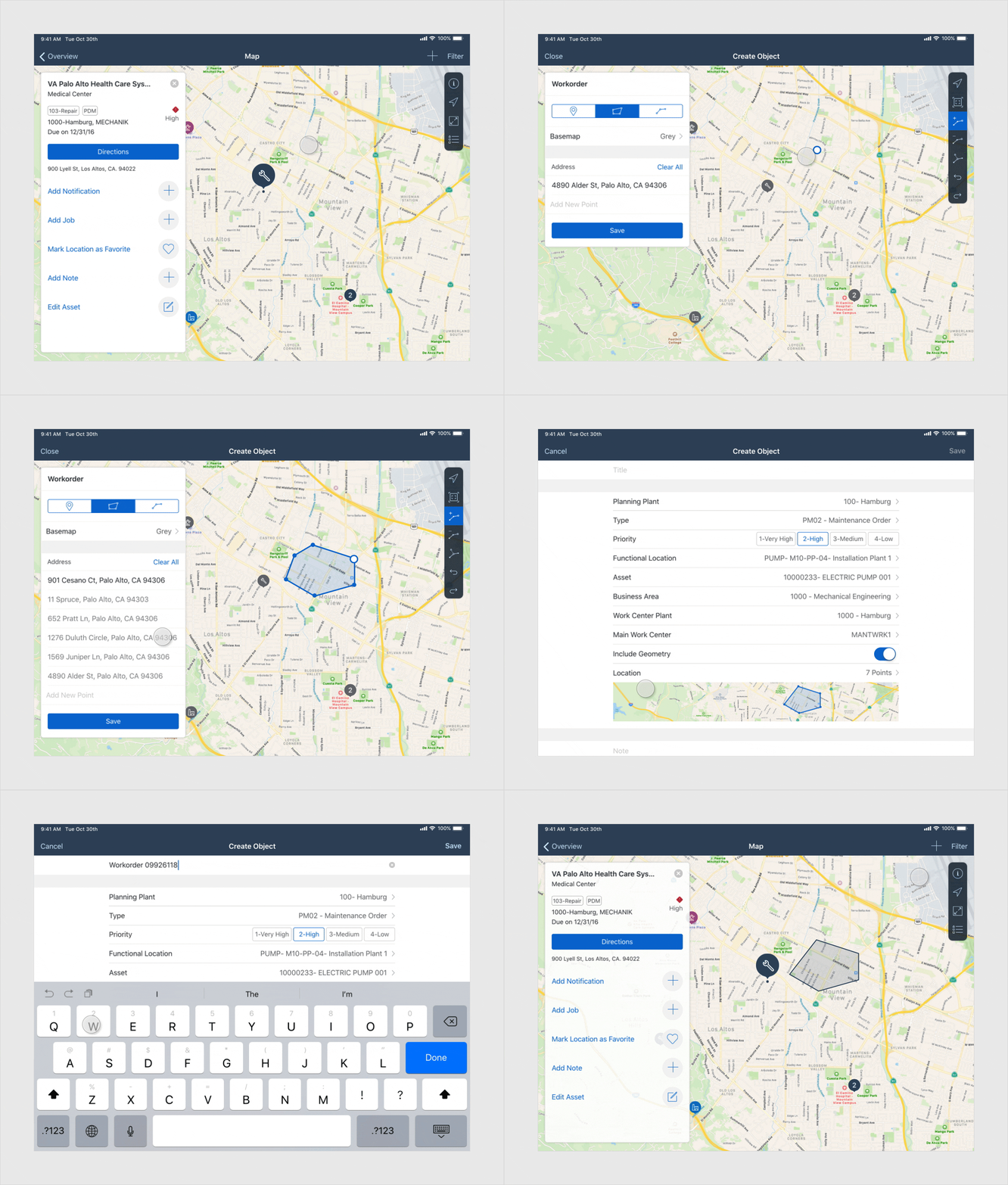
Creating a new map marker (using the design from SDK 6.1)
Map Routes
Routes are path indicators that contain multiple stop sites in the map.
Behavior
Once users have drilled down into a stop on the route, they can drill into one specific object from the list. Here, selecting a single object triggers the map to zoom in so that they are able to see the exact location.
For example, in the image to the right, choosing the object “Lease Well 113” from the list triggers the map to zoom into the location while having the object’s detail panel slide in with all the information associated with the selected object.
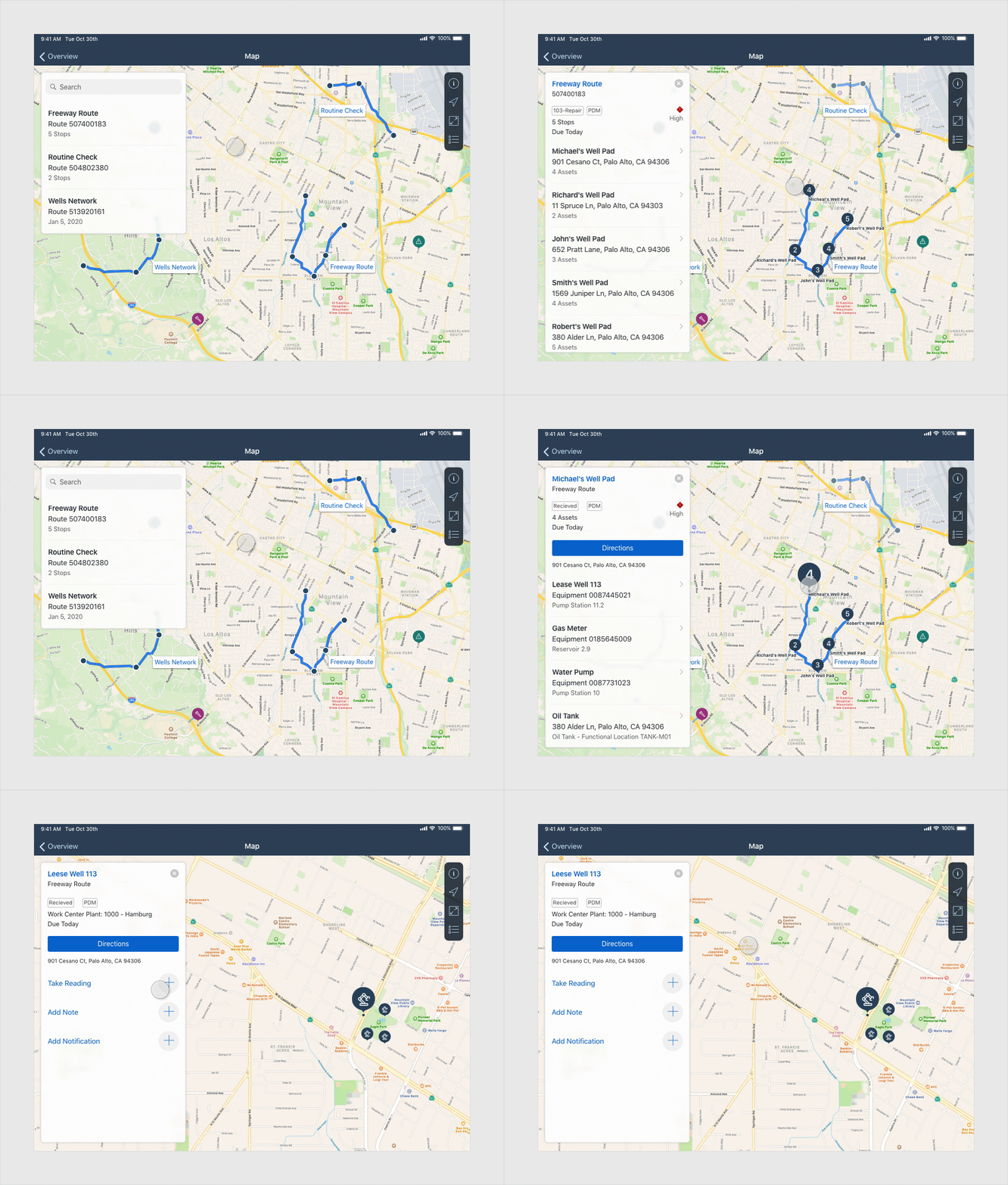
Interacting with a map route (using the design from SDK 6.1)
The map pattern is supported for both compact and regular widths, but some of the features are displayed differently. At this time, edit mode is only available in regular width.
Example 1 – Map Settings in compact is a full screen modal. In regular, settings is a modal window.
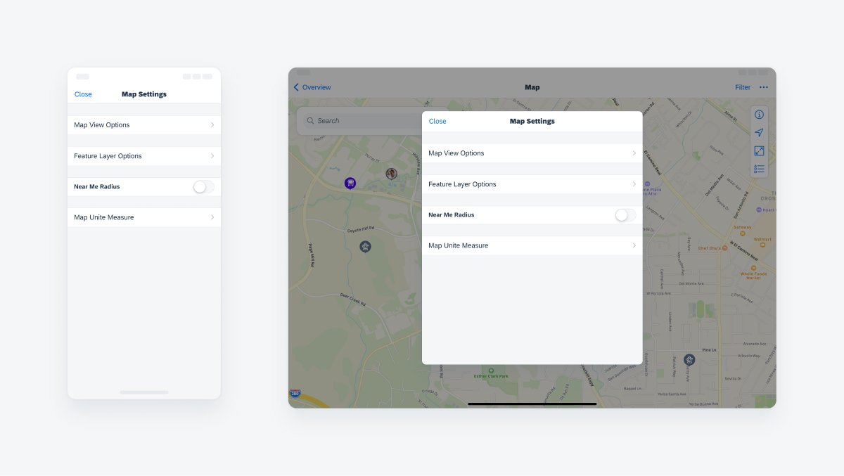
Adaptivity of the map settings screen
Example 2 – In compact view, the map legend is displayed at the bottom of the screen. When in landscape mode, the legend is anchored in the top left of the screen. In regular view, it always appears as a pop-over anchored to the floating toolbar.
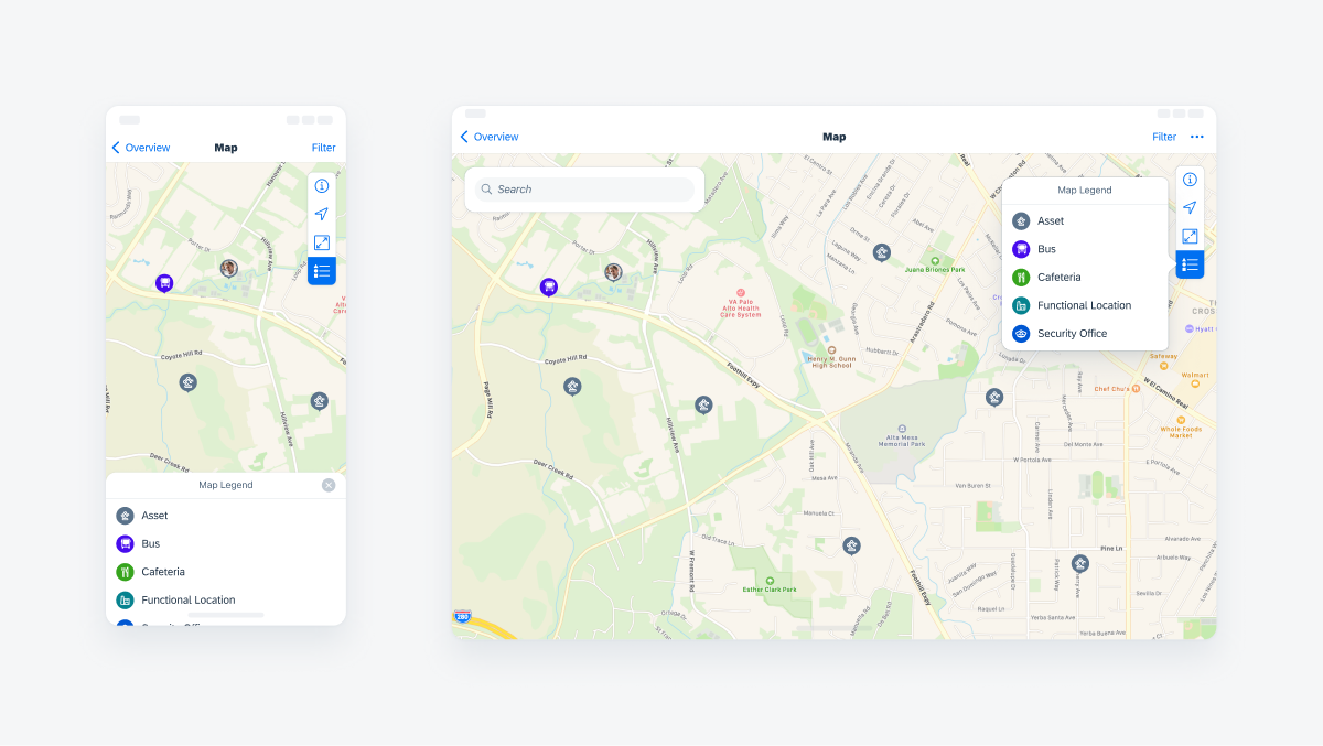
Map views when the map legend is opened
Example 3 – In compact view, the detail panel slides up from the bottom of the screen. In regular, the detail panel slides in from the left and floats along the left side of the screen.

 Your feedback has been sent to the SAP Fiori design team.