Calendar
FUICalendarView
Intro
The calendar view provides a visual overview of a week, a month, or multiple months.

Example of calendar views on iPhone (left) and iPad (right)
- Use calendar view to display a visual overview of a week, a month, multiple months, or a range of selected dates.
- Use calendar view to visually present correlations between two dates, for example, consecutive holidays, flight ticket prices in peak season versus off season, hotel room availabilities.
Don’t use calendar view when text-based / list-based components, such as pickers, can fulfill your primary requirement.
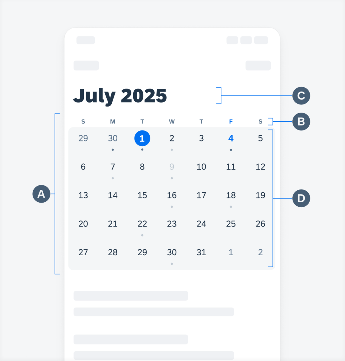
The structure is composed of four parts: calendar view container, week label container, date cell container, and month label.
The space below the calendar view container is available for different configurations. for instance, using object cells as an agenda or timeline as a timesheet.
A. Calendar View Container
B. Week Label Container
C. Date Cell Container
D. Month Label (as Navigation Bar Title or Large Title)
Calendar View Container
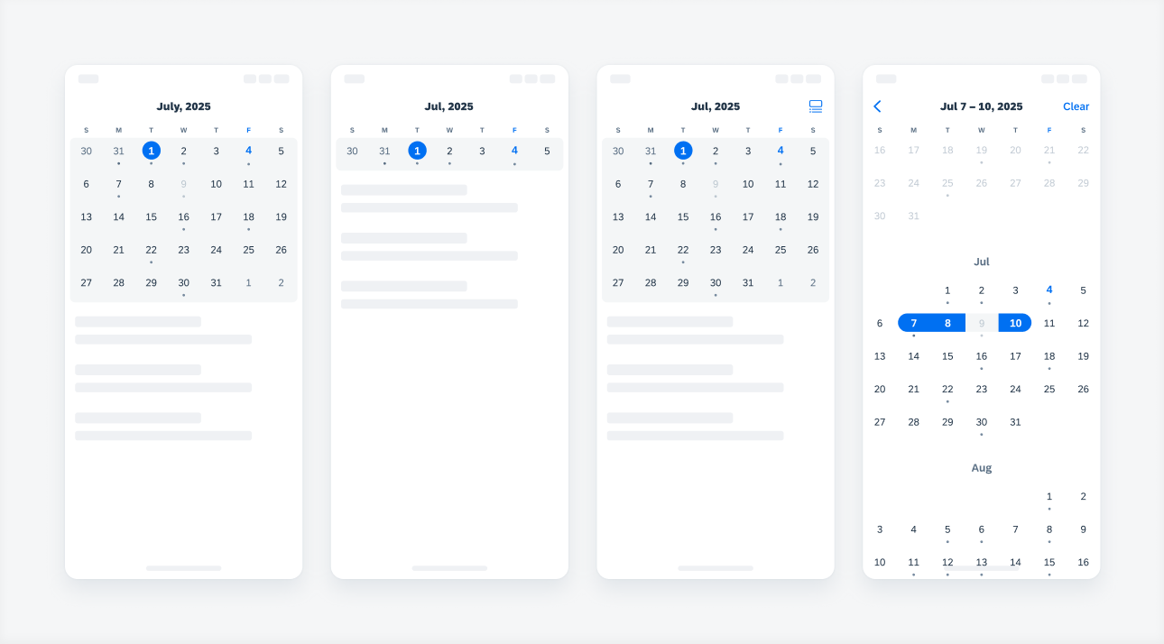
There are four types of calendar views. Select the one that best suits the purpose of your app and start designing from there.
- Month View (Default)
- Week View
- Expandable View
- Date Selection View

4 types of the calendar view containers: month view, week view, expandable view, and date selection view
Week Label Container
The week label container provides the following types of start day of the week:
- Sunday (Default) – US Standard
- Monday – Europe, Asia, Oceania Standard
- Saturday – Middle East Standard

Week label starting from Sunday (left), Monday (middle), and Saturday (right)
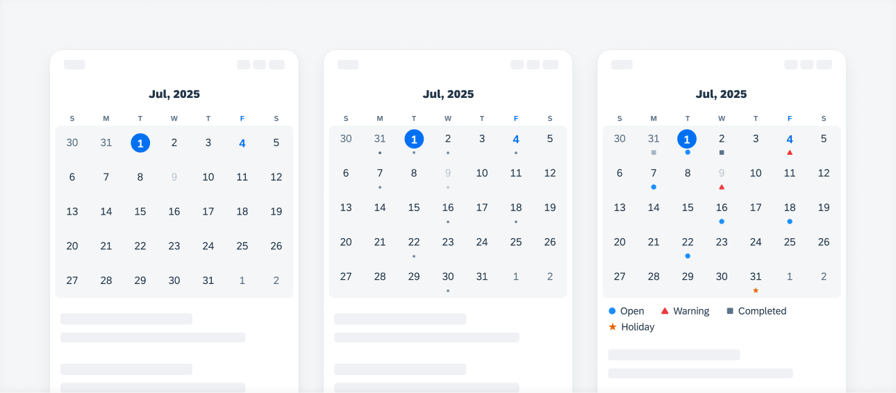
Date Cell Container
- Number Only
- Number with Dot Indicator (Default)
- Number with Icon Indicator & Legend
*Two types cannot be mixed. For instance, if your app is currently configured with the “Number Only” type and you want it to display Dot Indicator of the day, please reconfigure your app with the “Number with Indicator” type.
*Also for “Icon Indicator” the icon legend does not come out of the box with the SDK, app teams should try to re-configure/customize the existing chart legend component.

Calendar view that shows (from left to right): numbers only, numbers with a dot indicator, and numbers with an icon indicator
Month Label
The following types of month labels are available: single-line, double-line, and large title. These labels use three-letter, title-case abbreviation. For instance: Jan, Feb, Mar.
- Single-Line Title (Default)
- Double-Line Title
- Large Title – with a large title, the label should be fixed and not be scrollable with the rest of the content

Calendar view with a single title (left), double title (middle), and large title (right)
Alternate Calendars
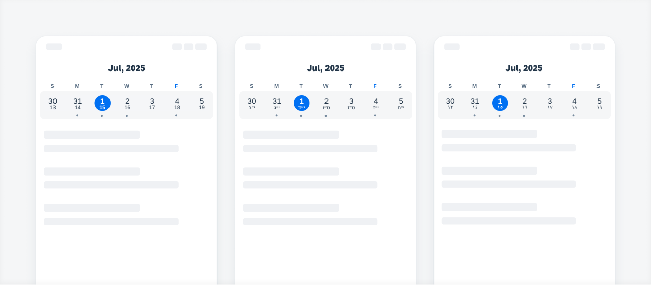
The following types of alternate calendars are available aside from the default Gregorian calendar: Chinese, Hebrew, and Islamic.
- Chinese
- Hebrew
- Islamic

Calendar view that shows the alternate calendars (from left to right): Chinese, Hebrew, and Islamic
Development: FUICalendarView, Calendar
SAP Fiori for Android: Calendar
Related Components/Patterns: Pickers, Object Cell, Timeline, KPI Label, Cell Button


 Your feedback has been sent to the SAP Fiori design team.