Modality
Intro
Modality is a method to present content in a temporary mode, generally through a modal sheet, form sheet or popover. With Adaptive Design, Modality on iPhone and iPad devices will adapt to the screen sizes and utilize the available space.
A modal is used for completing a task, updating content, or selecting filters. It helps the user to focus on the current task by providing relevant properties. The create and filter patterns are generally presented in modals.
A modal typically slides up from the bottom of the screen and remains open until the user has taken an action to close it. Note that in edit mode, the modal has a Dissolve transition. To learn more about transitions, see Animation.
Full-Screen Modal
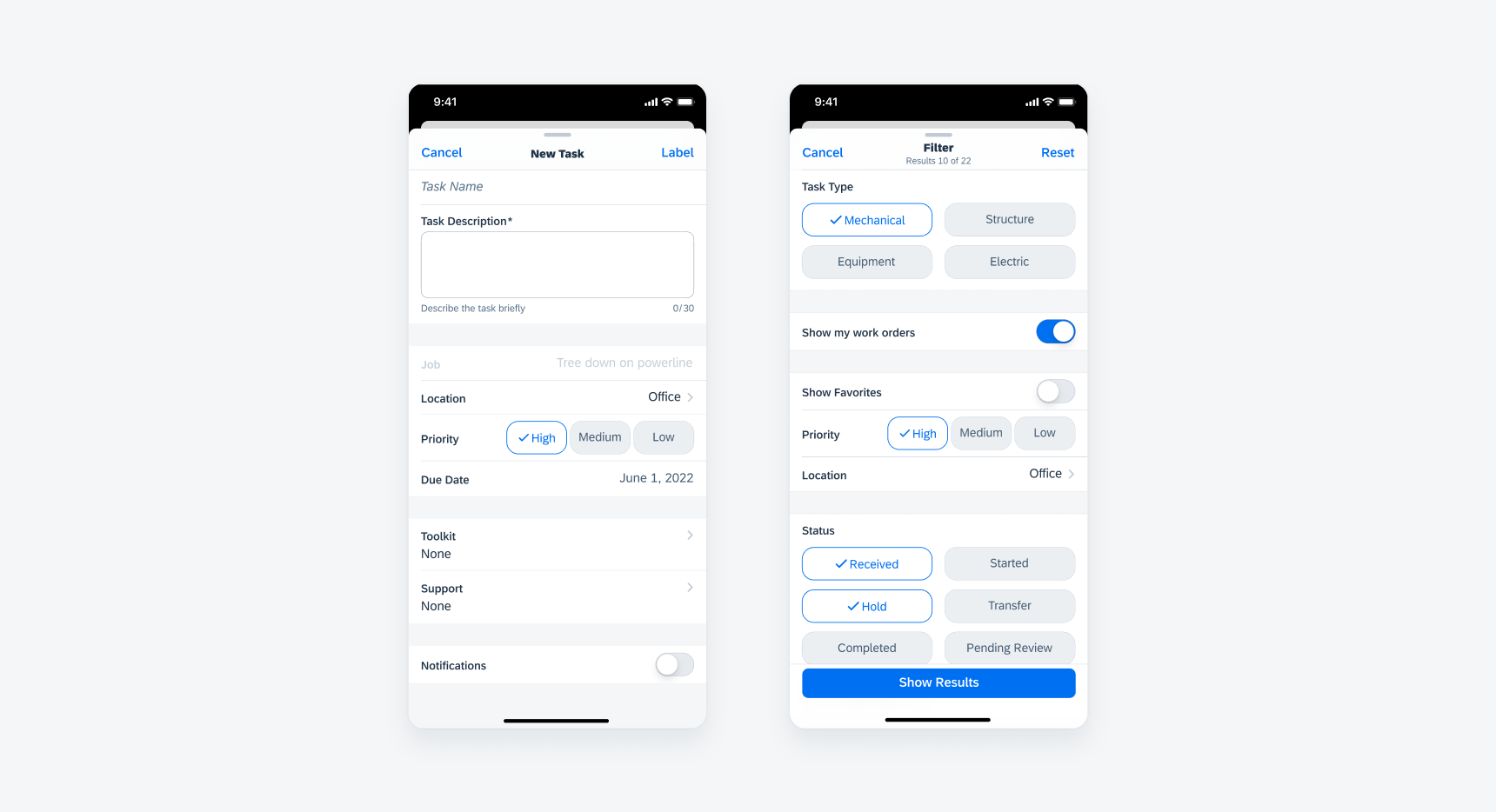
In compact width, a modal is presented as a full-screen window. To exit from a full-screen modal, the user must tap on one of the two action buttons placed in the navigation bar. The button on the left is generally a “Cancel” button, which abandons the current task. The button on the right is usually used to complete the task or save the user’s progress. We recommend using language that best describes the current action, for example, use “Create” or “Add” when the user is creating a task or adding a contact. Avoid using “Done” because it may sound vague to the user.

Create pattern (left) and filter pattern (right)
Form Sheets
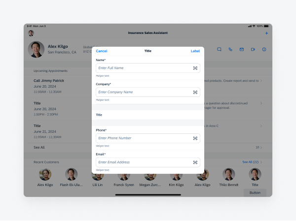
In regular width, modals can be displayed as form sheets, appearing in the center of the screen with a semi-transparent overlay underneath. Form sheets are used to collect data from users. In this example, the form sheet is collecting information needed to create a follow-up job for the maintenance worker. Users should be able to complete the task without referring to extra information outside of the modal.
Tapping outside of the form sheet allows the user to exit the window. In this case, the task itself would not be completed, and any progress consequently would not be saved, that means it would function like tapping on a “Cancel” button. Once an exit action is triggered on a form sheet, the modal window slides downwards until it has completely exited the screen.

Form sheet in regular width
Popover
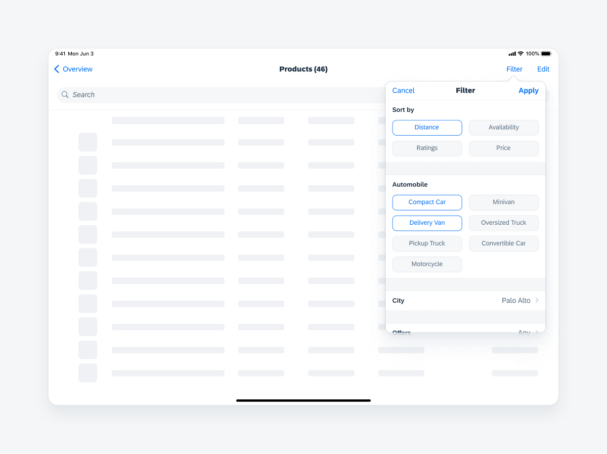
Popover is another type of modal used in regular width. It is often used when a user needs to complete a quick task or action, such as filtering a list. Tapping outside of the popover allows the user to dismiss the modal.

Popover in regular width
Full-Screen Modal
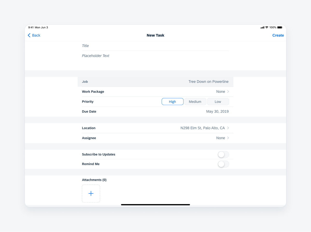
A full-screen modal can also be used in regular width. Readable width should be applied to components in a full screen modal as it may be difficult for the users to read across a wide screen. It is best used for tasks that are complex and require the user’s full attention.

Full screen modal in regular width
Development: FUIModalCheckoutViewController, FUIModalProcessingIndicator, FUIModalLoadingIndicatorView, FUIModalLoadingIndicator, FUIModalProcessingIndicatorView
SAP Fiori for Android: Dialogs

 Your feedback has been sent to the SAP Fiori design team.