
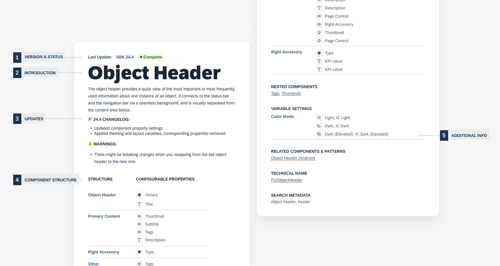
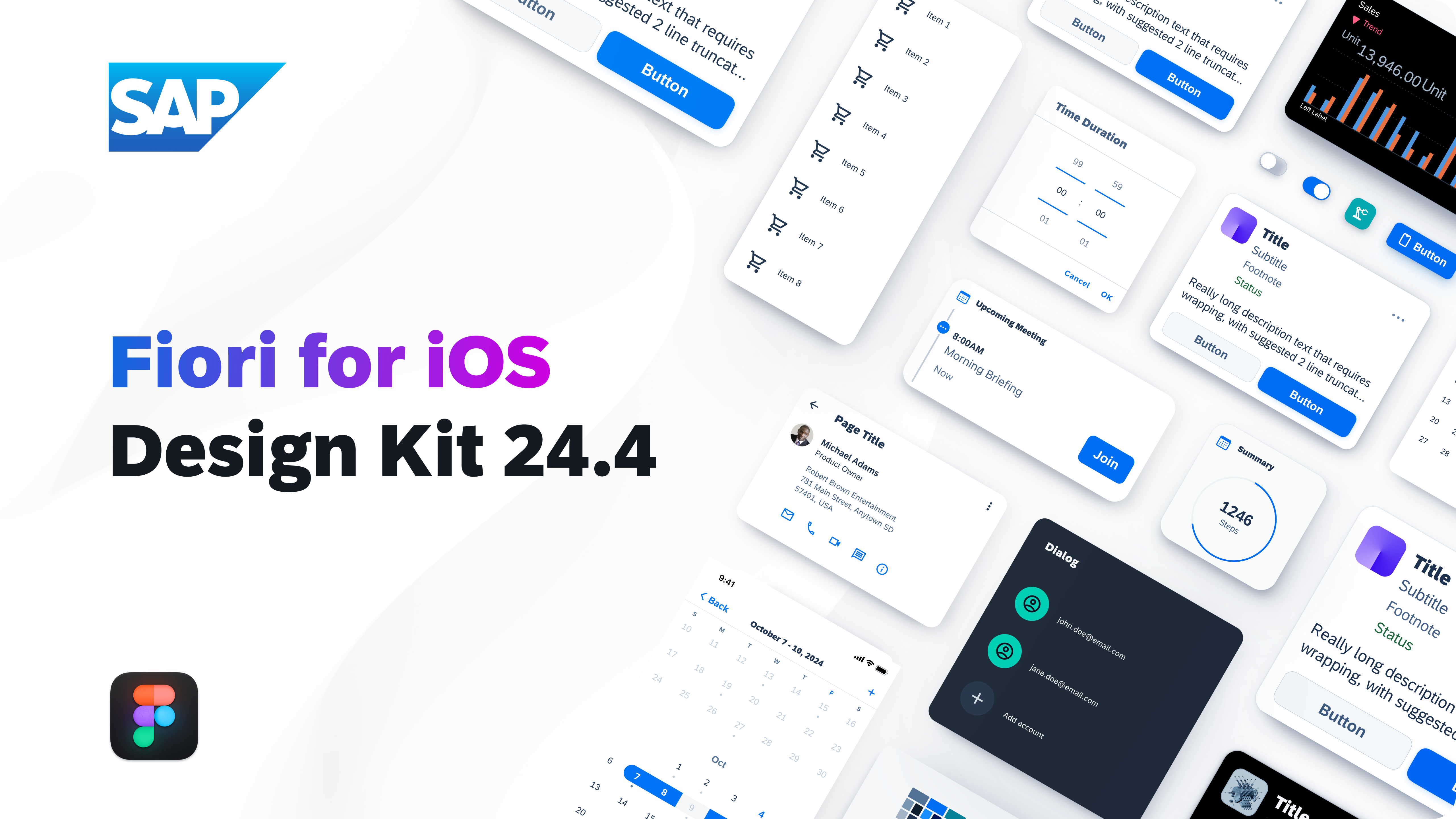
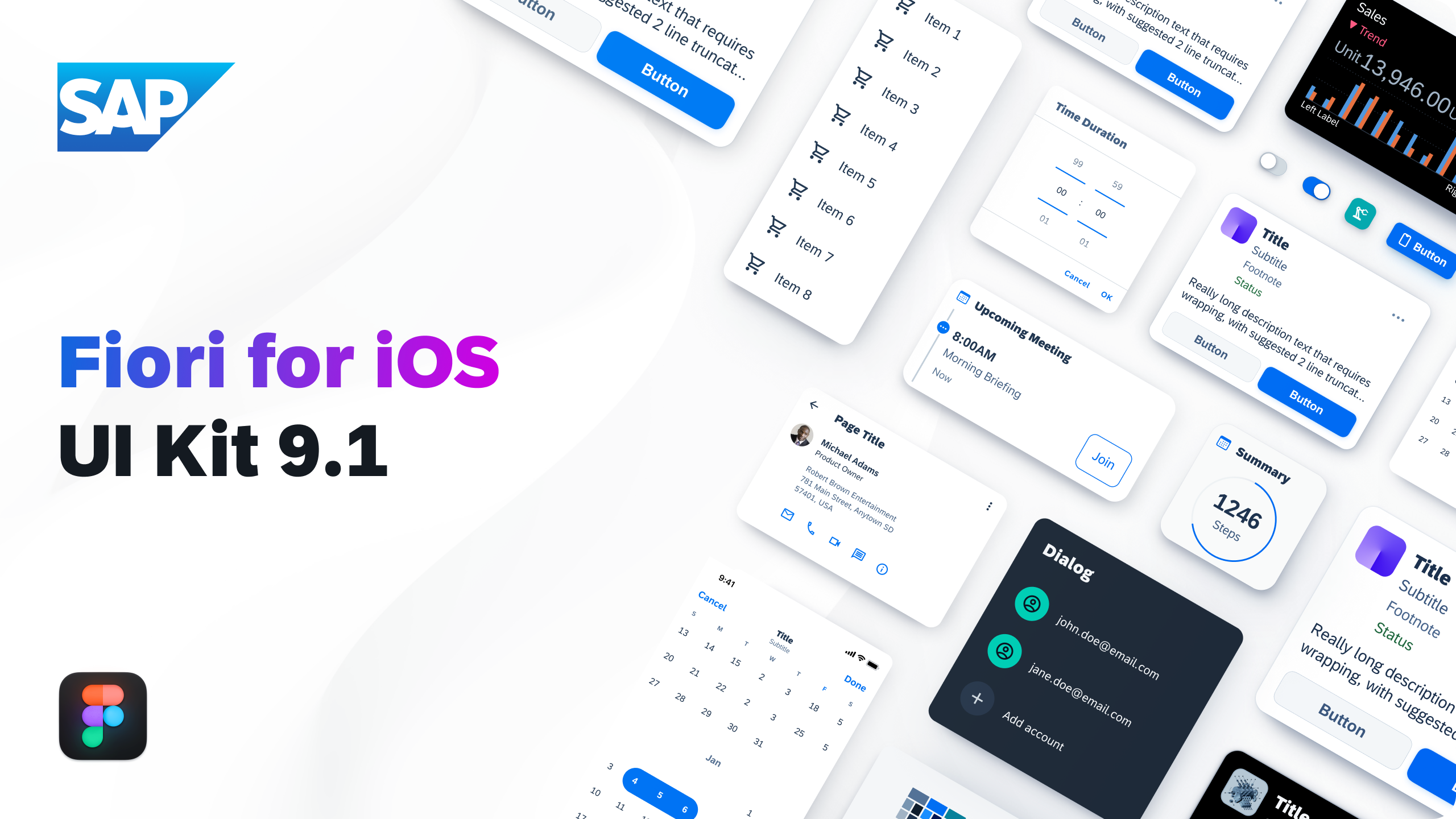
SAP Fiori for iOS – Design Kit
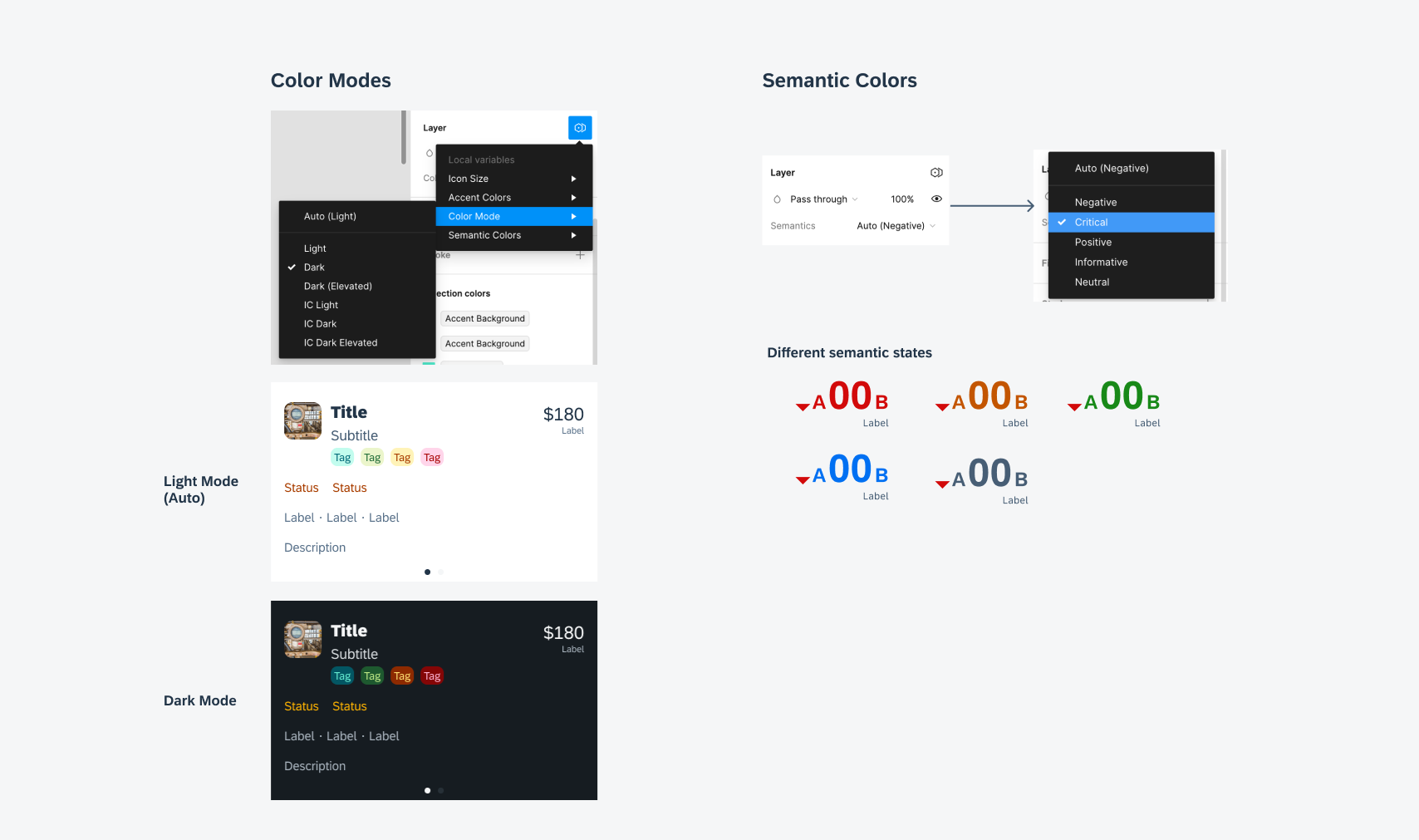
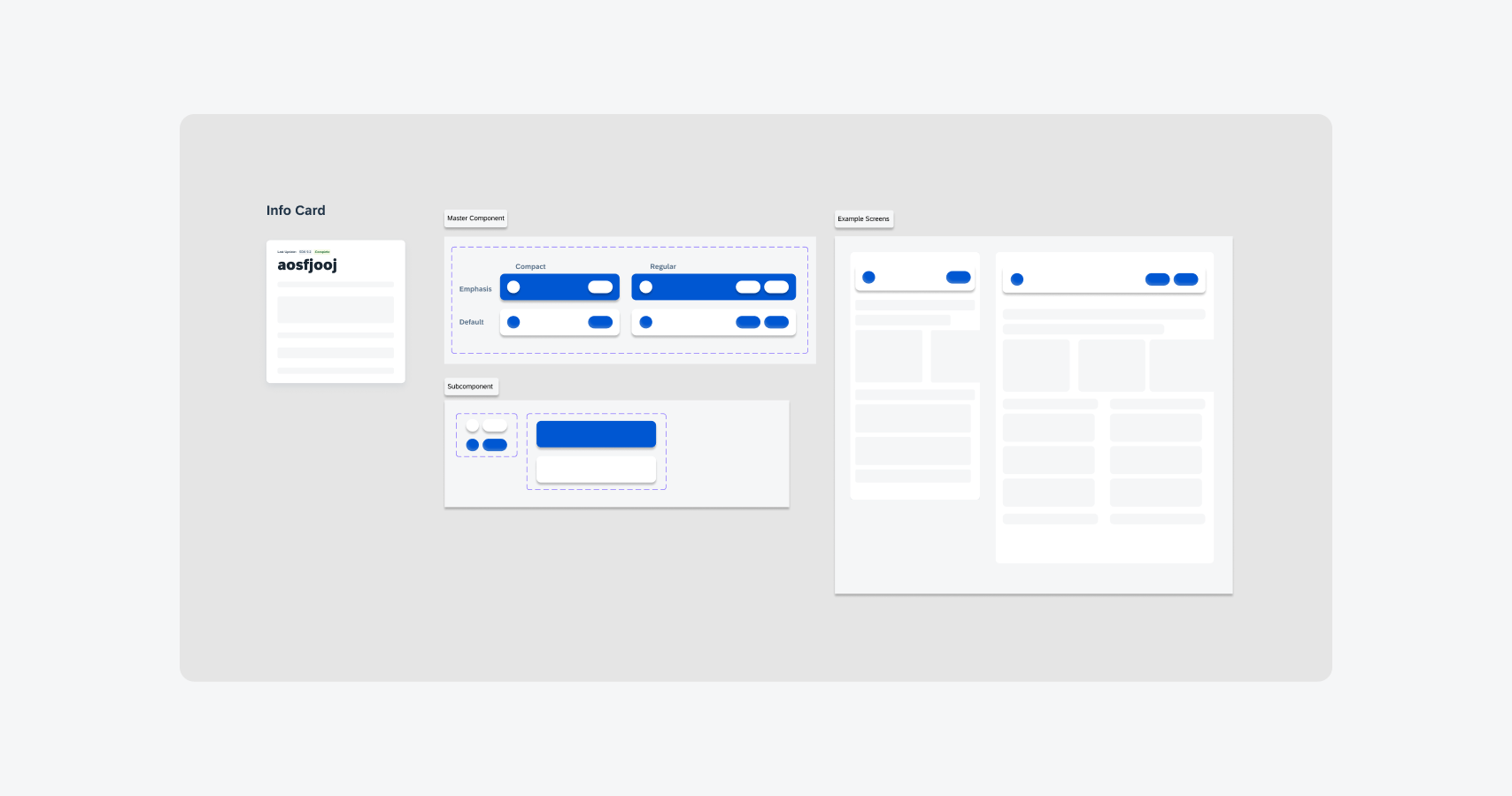
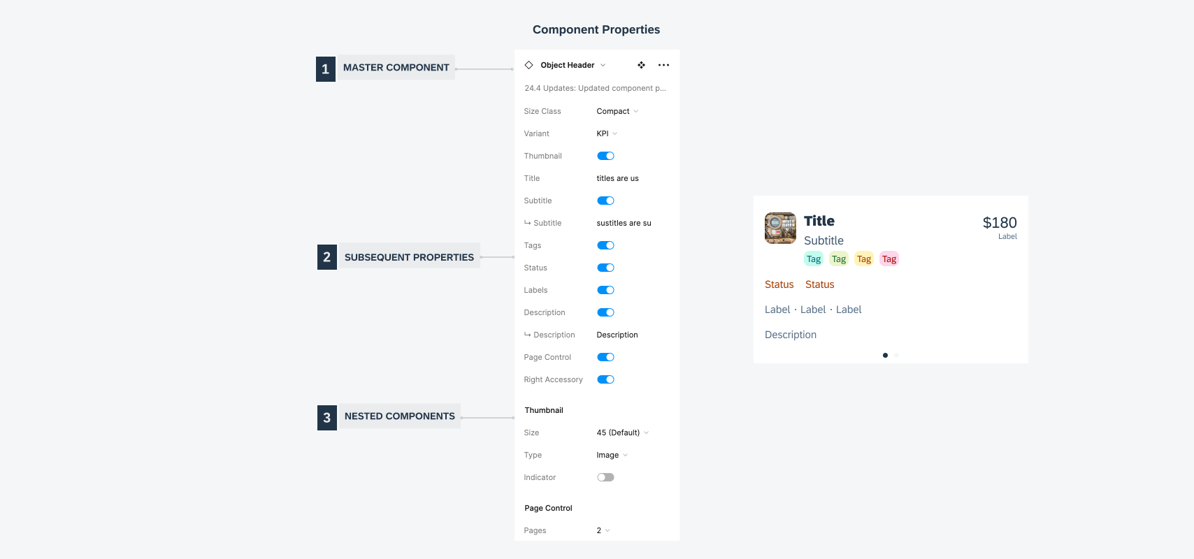
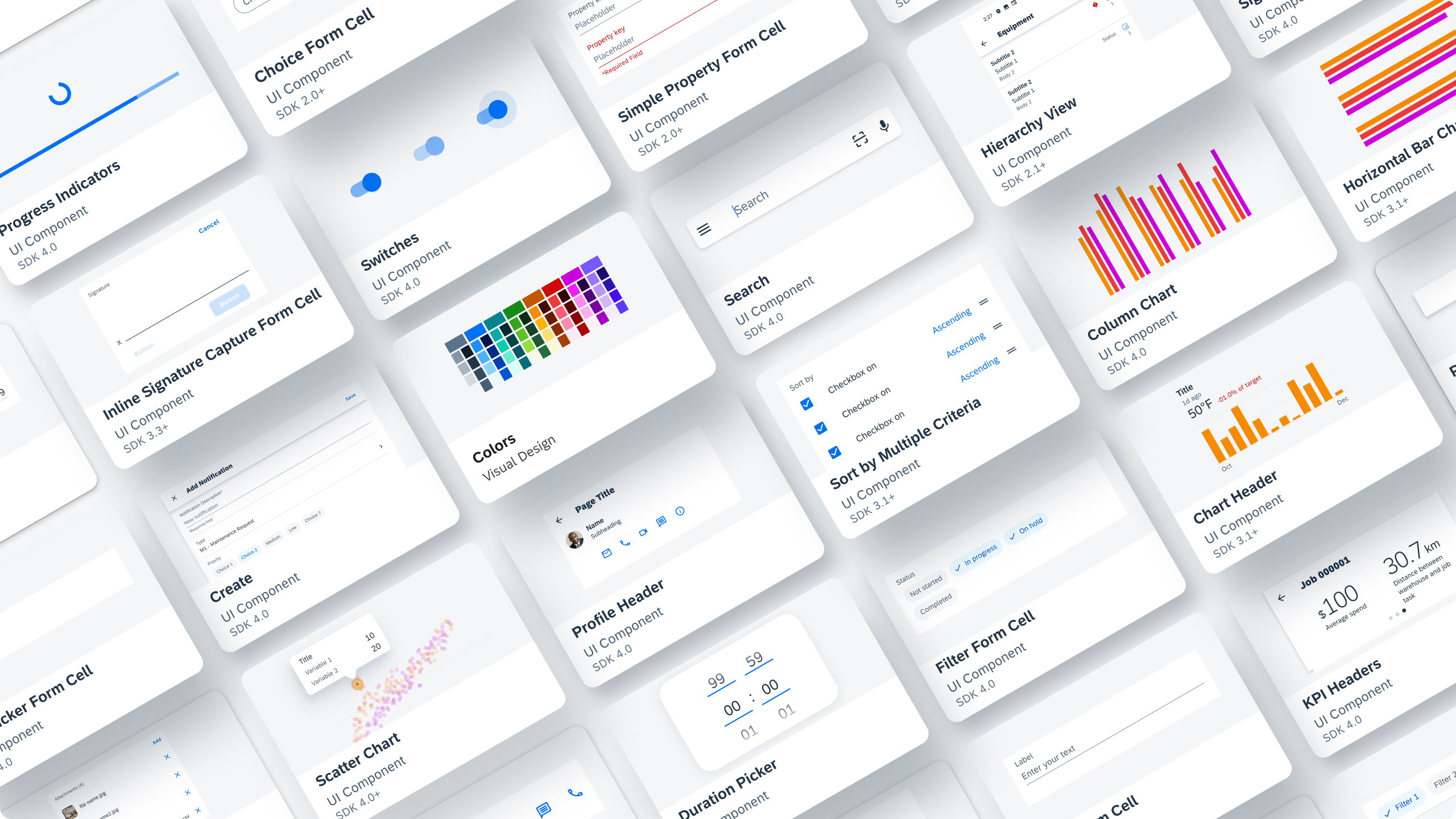
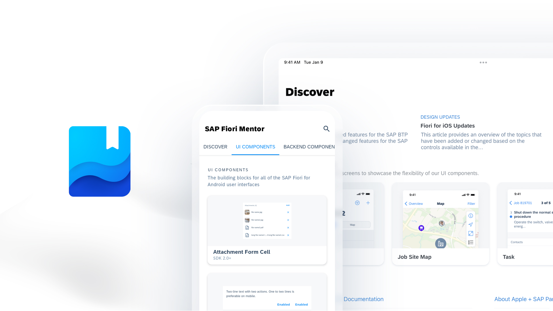
This Figma Design Kit contains SAP Fiori for iOS UI components, patterns, page types, and foundation. It helps accelerate design and development processes and encourages consistency across SAP applications.
Download the 72 font: Desktop | Web
Download the San Francisco font here.
Download SF Symbols here.
SAP Fiori for iOS 24.12 (Figma Library)

 Your feedback has been sent to the SAP Fiori design team.