
Updates in 9.2
This article provides an overview of the ongoing topics for SAP SDK for iOS version 9.2.
Updates to Guideline Structure
Input & Selection
The “Form Cells” section has been renamed to “Input & Selection” to better reflect the usage of the controls. The individual component name inside the form cells section remains unchanged.
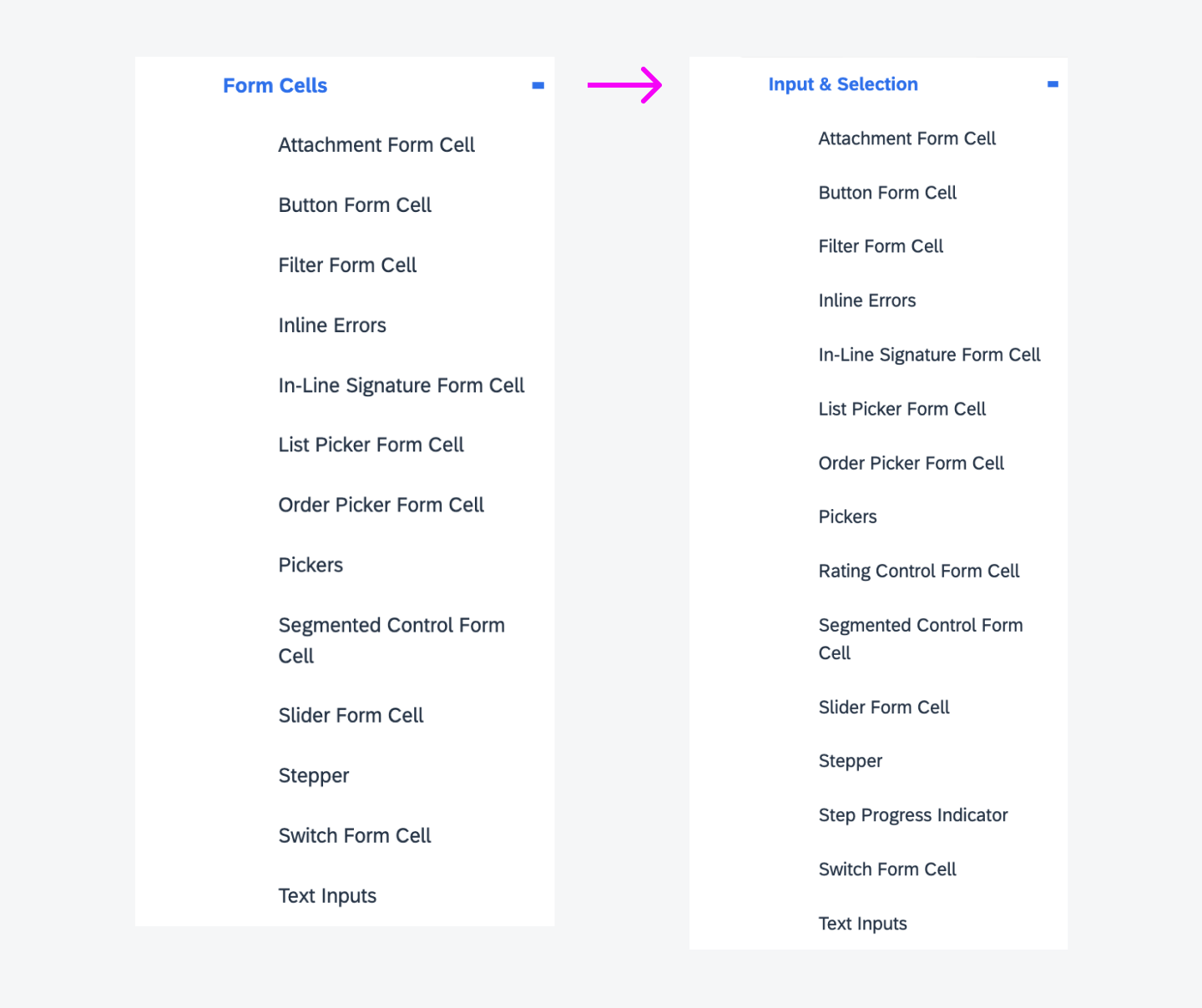
Input & Selection naming changes
Foundation
Accessibility
Updated guideline! The Accessibility guideline article has been updated to include more content on color contrast and increase contrast mode. Navigate to Accessibility to learn more.
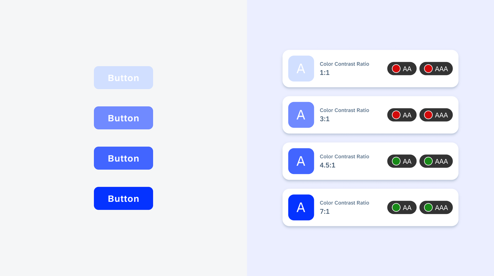
Accessibility updates
Colors
Updated guideline! The Colors guideline article has been updated to a new structure with updated content. Navigate to Colors to learn more.
Colors updates
Rich Text Document
Updated guideline! The Rich Text Document guideline has been revised to reflect updated text styling for text heavy documents. See Rich Text Document to learn more.
Rich text document updates
UI Components & Patterns
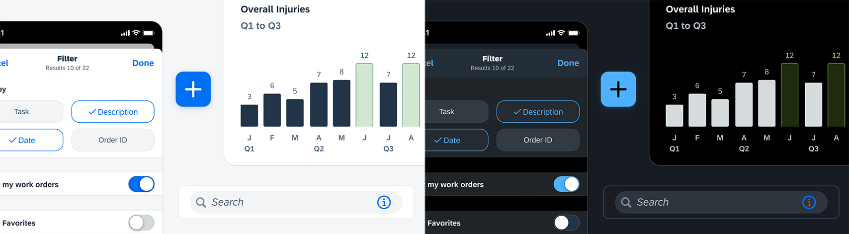
Filter Feedback Bar
Updated component! For better accessibility, we have added the ability to toggle on or off the animation for selected filters and reduced the filter feedback bar height for an improved filter button interaction. Refer to Filter Feedback Bar for details.
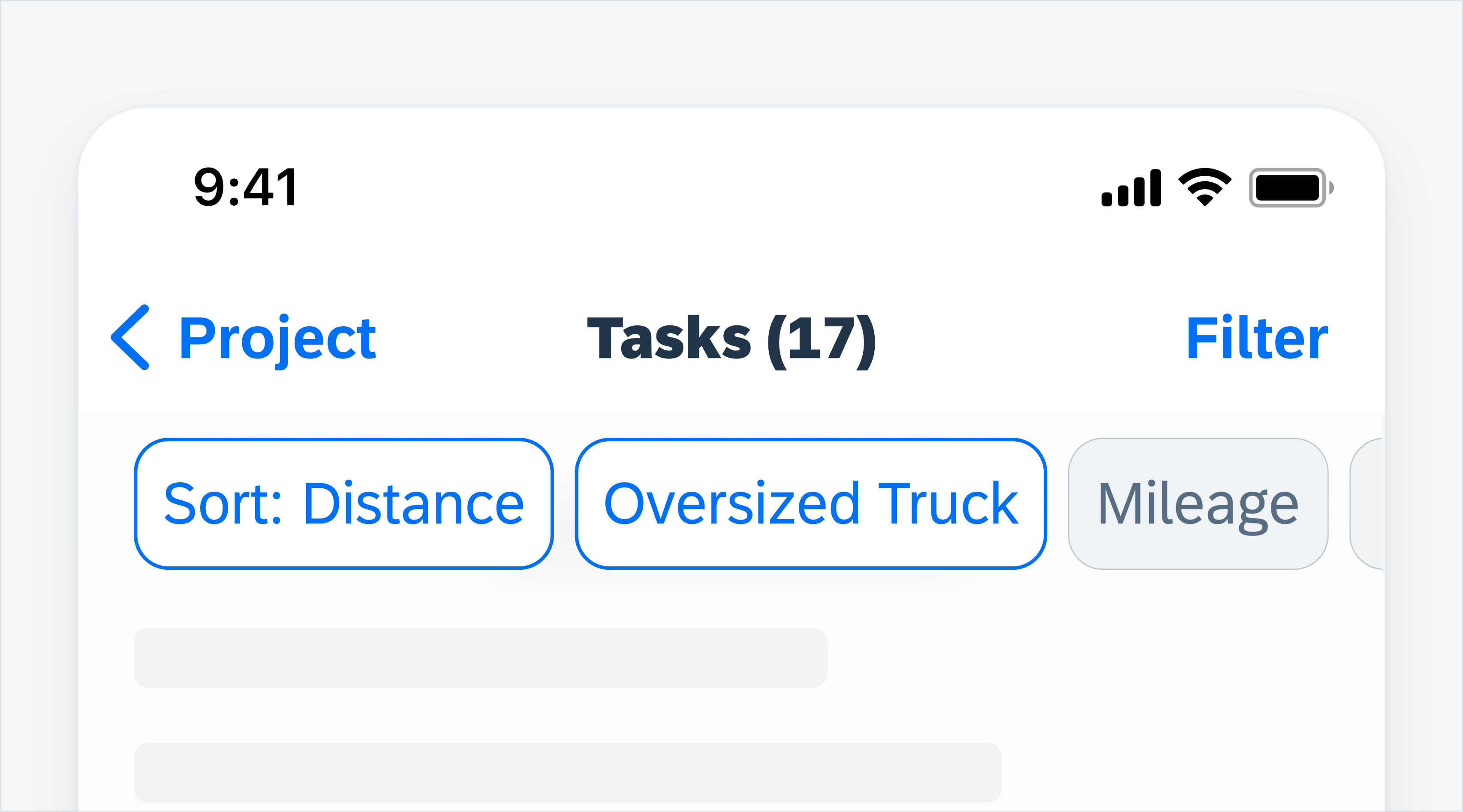
Example of the filter feedback bar
List Picker Form Cell
Updated component! The list picker form cell now comes with a new flow with modal sheets and an optional anchor button. This new flow can be used to present non-immersive content or support simple tasks. Refer to List Picker Form Cell for more details.
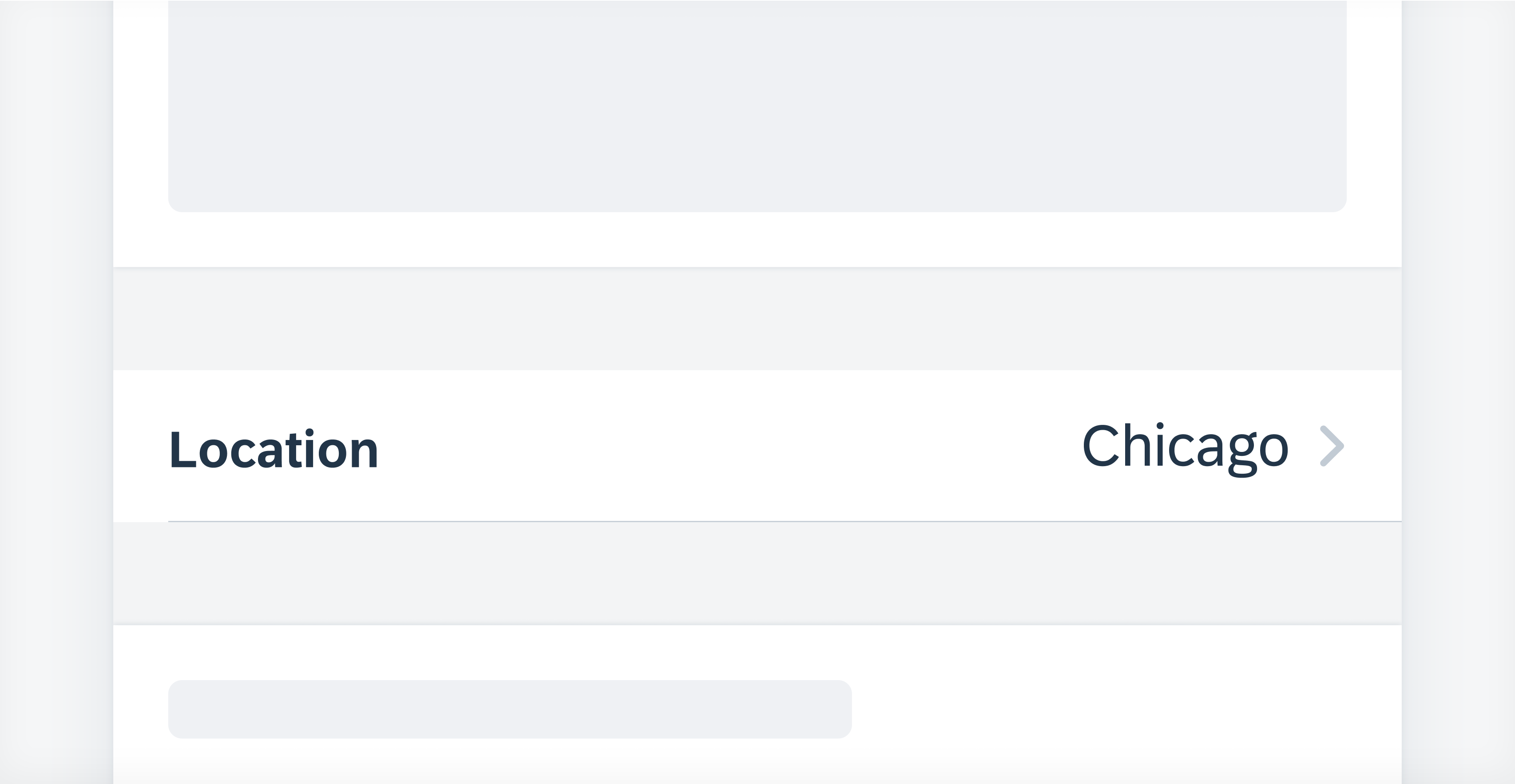
Example of the list picker form cell
Rating Control Form Cell
New component! The rating control form cell indicates an average rating for an object in a form cell. It has now been added to the UI Kit and guidelines. Refer to Rating Control Form Cell for details.
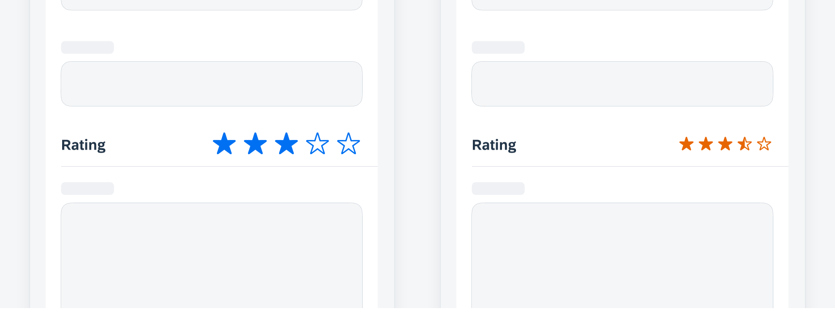
Examples of rating control form cell
Step Progress Indicator
New component! A step progress indicator is a progress indicator for tracking and displaying a user’s state in a user flow. It allows the user to navigate to another step in both the default view and the optional “all steps” view. Refer to Step Progress Indicator for details.
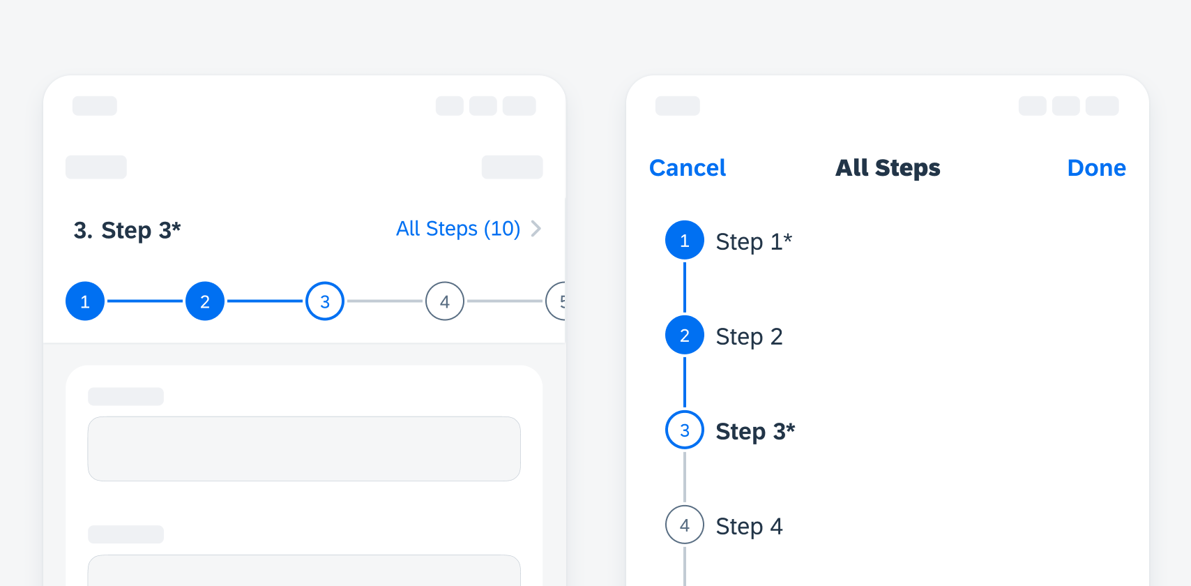
Examples of step progress indicator default view (left) and “all steps” view (right)
Text Inputs
Updated component! Text inputs (text field form cell, key value form cell, note form cell) now have a new error state and an optional character counter enhancement. The new error state leverages the bounding box and hint text with color for a seamless experience that is consistent with Android. The character counter provides a familiar visual cue for users in instances where a character limit is required. Refer to Text Inputs for details.
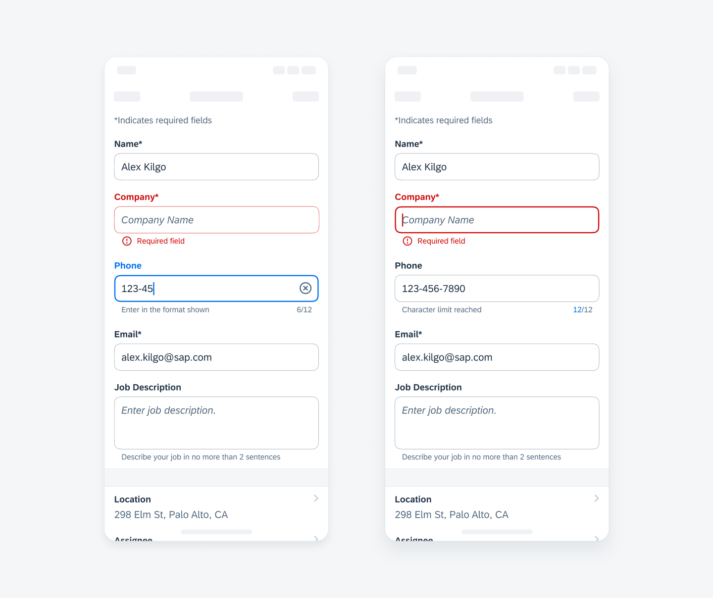
Examples of text inputs
SAP Fiori for iOS 9.2 UI Kit
Updated Figma UI Kit with new components and enhancements for this release, including:
- New Updates page documenting release updates in UI Kit.
- Go to SAP Fiori for iOS 9.2 UI Kit to learn more.
 Your feedback has been sent to the SAP Fiori design team.