
Updates in 10.0
This article provides an overview of the new and enhanced topics for SAP SDK for iOS version 10.0.
Foundation
Design Tokens
New Guideline! Design tokens are our cross-platform solution to managing color across iOS and Android. Design tokens are stored pieces of UI information such as color, spacing, sizing, and typography that collectively make up our design system’s visual identity. Additionally, design tokens help us to maintain visual consistency, scale design decisions, and are simple to maintain and update.
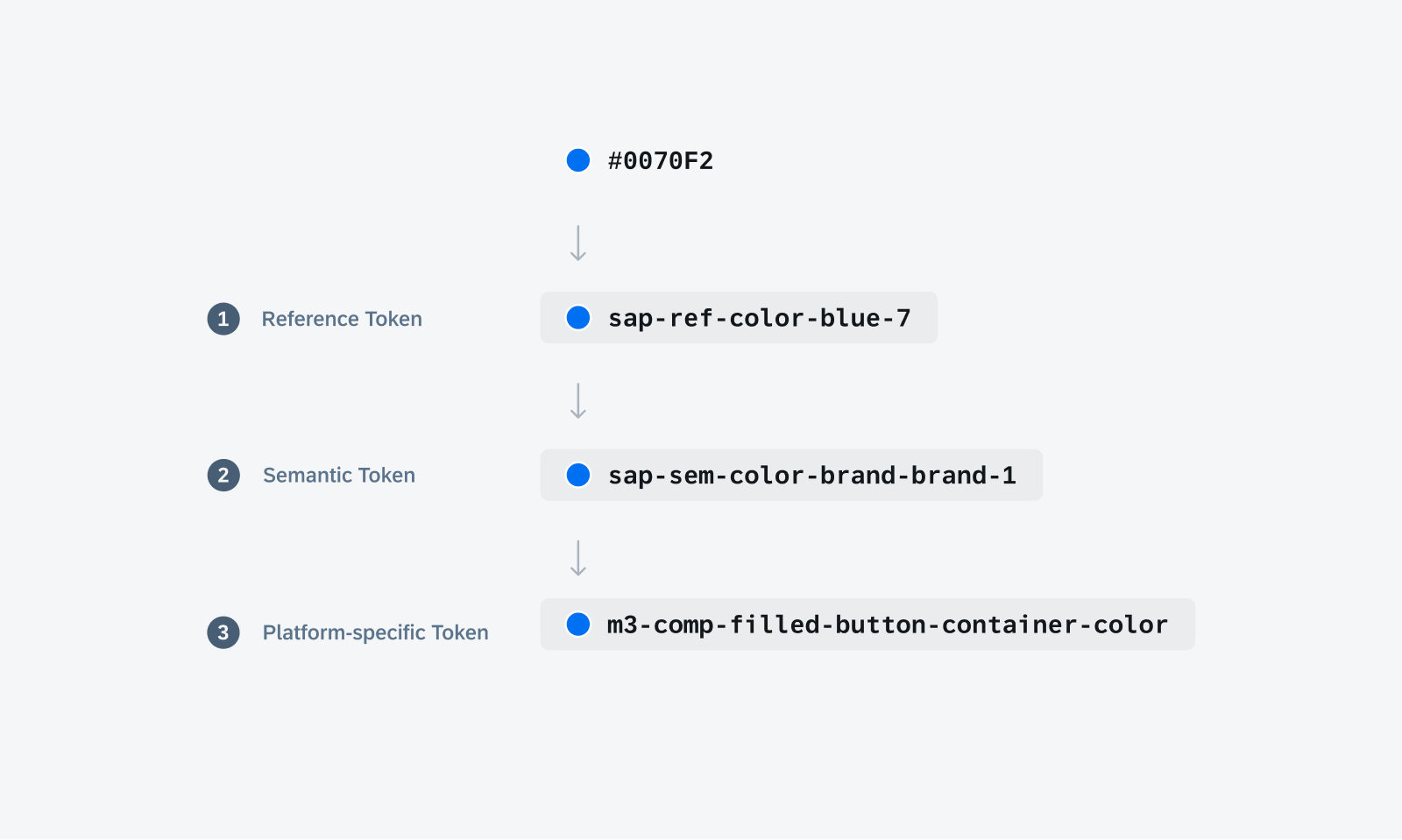
Token hierarchy shows the different levels of design tokens.
Iconography
Updated Iconography! By utilizing the SAP Fiori Icon Library, we have created an SAP Fiori custom symbol library, which is part of the SDK. This library offers a diverse selection of SAP Fiori custom symbols in various weights and scales, enabling you to design with flexibility and adaptability. Some of the weight options include thin, light, bold, heavy, etc. The image shows the weights available.
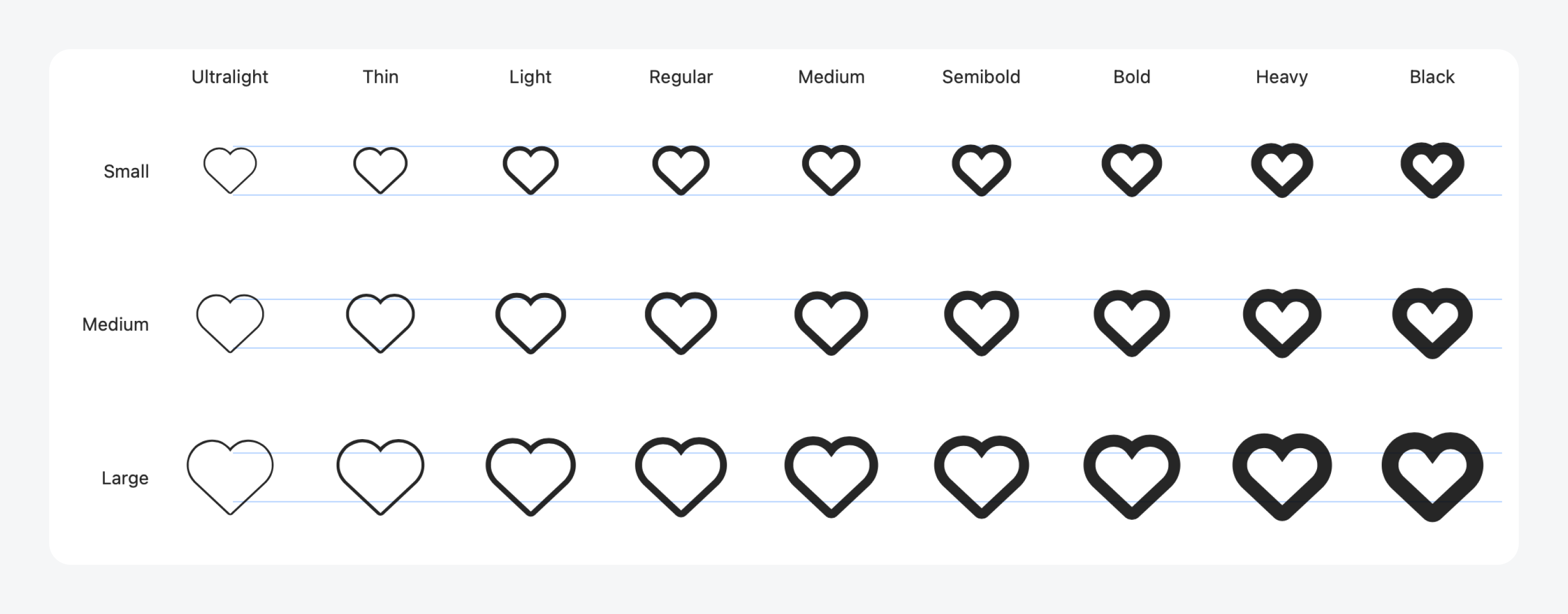
Example of SAP Fiori custom symbols
UI Components & Patterns
Attachments Form Cell
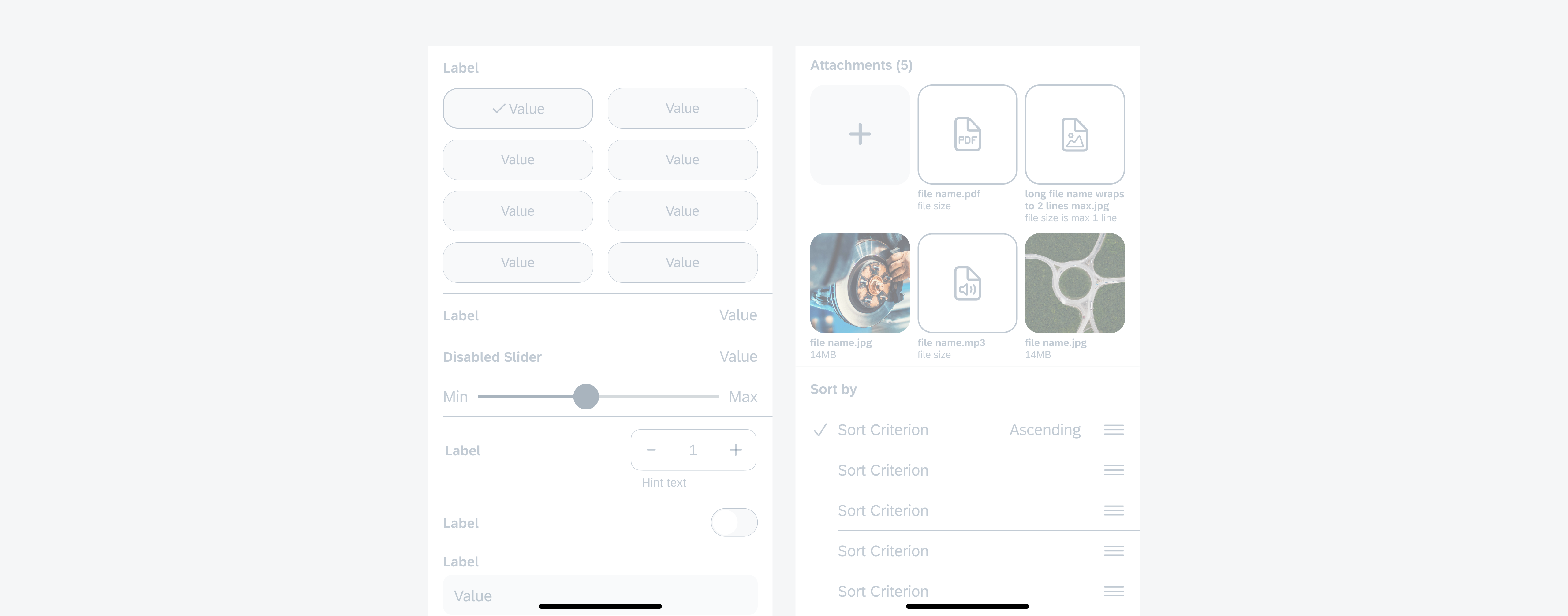
Updated component! The redesigned attachments form cell moves the text content from within the attachment cell to below. We added additional optional fields to display file size and other relevant file information. For a more intuitive user experience, we have also introduced updated active, read-only, and disabled states.
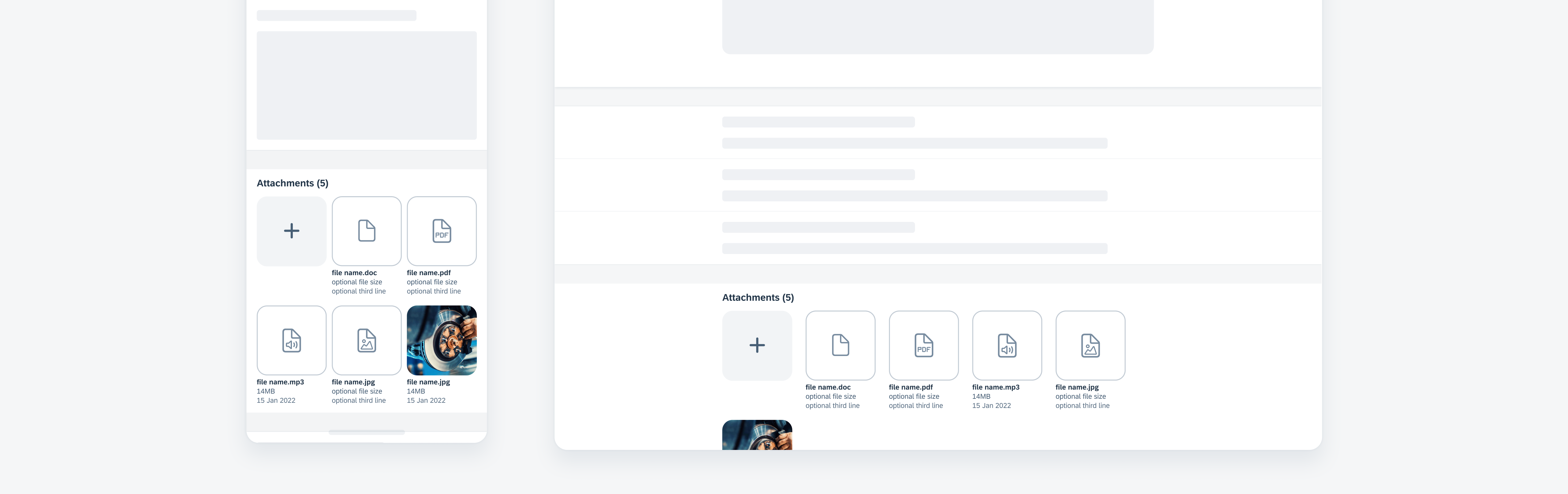
Example of an attachments form cell
Calendar
Updated pattern! Calendars now support alternate calendars and date icon indicators with their respective legend.
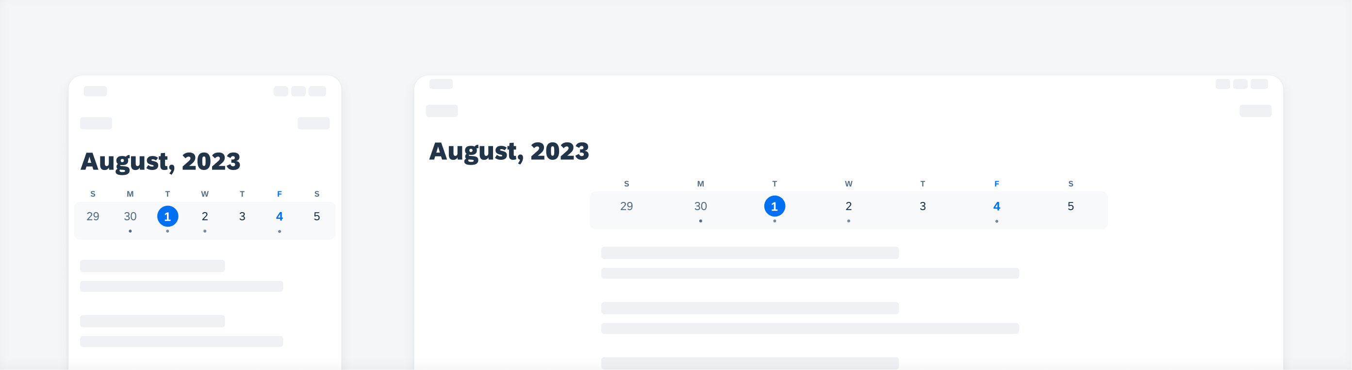
Example of a calendar
Card
New component! The new card component introduces an advanced approach to utilizing cards. It is part of a new “card system” that consists of a toolkit of nested components that enable the creation of diverse card types using one and the same card container.
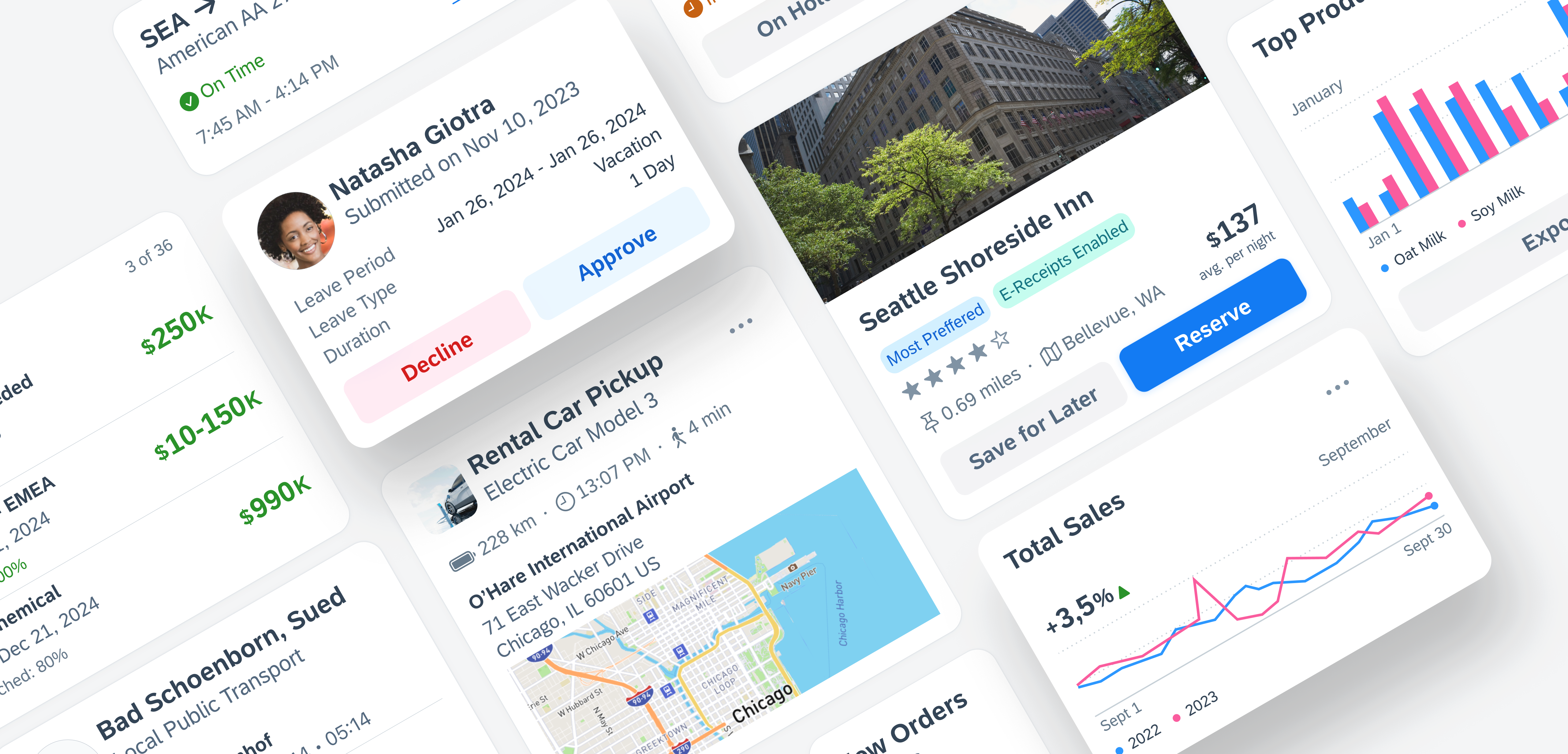
Example of cards
Key Value Table View Cell
New component! The key value table view cell is an uneditable read-only table view cell that fits inside the table view container. It may also contain actionable text in certain use cases.
Example of key value table view cells
Filter Feedback Bar
New component! Filter buttons now have more style variations as well as the addition of modal sheets for when more complex filters are applied using the filter feedback bar.
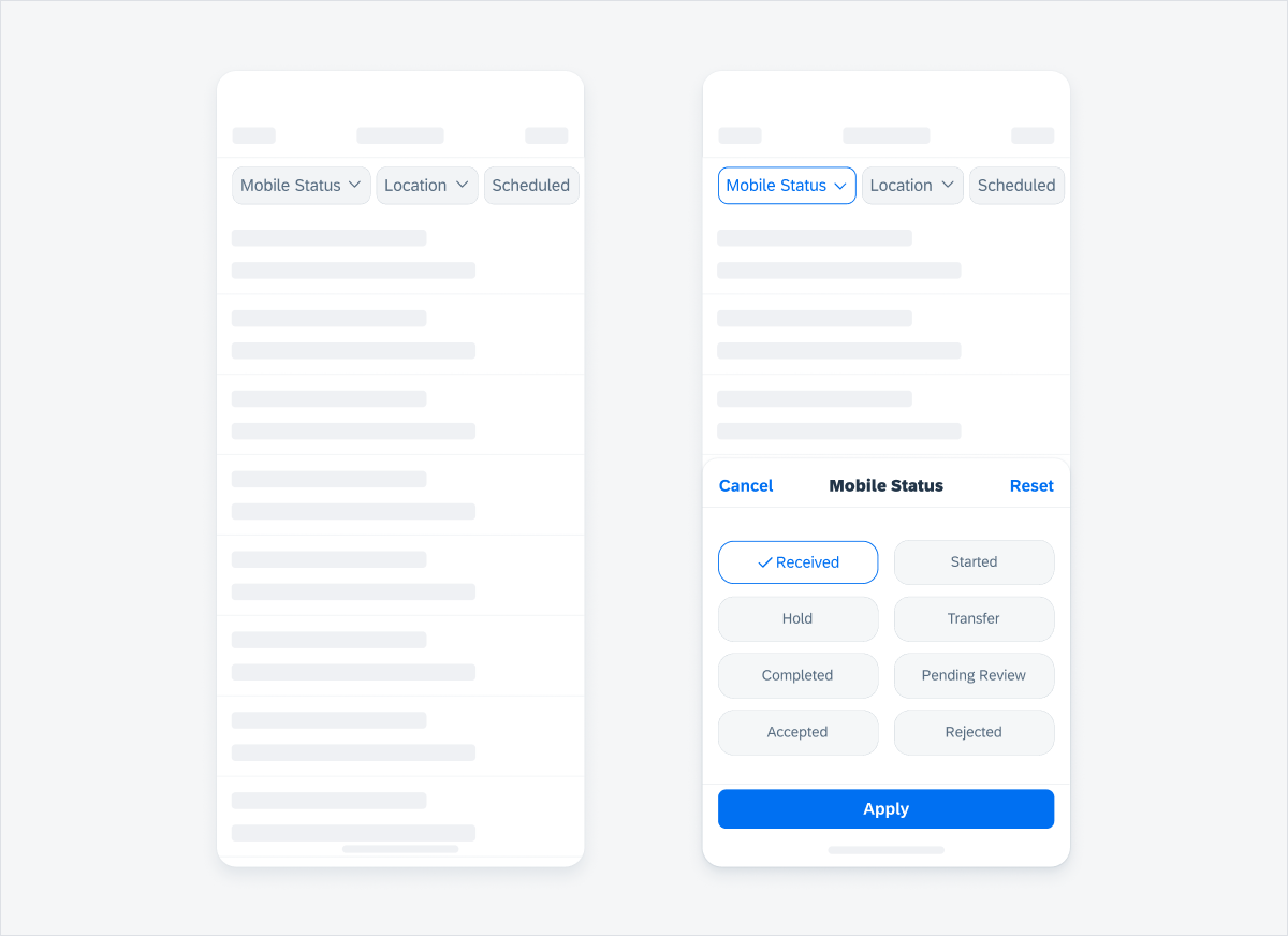
Example of a filter feedback bar
Form Cells: Disabled States
Updated components! All form cells’ disabled states are checked and updated for consistency.
Examples of disabled form cells
Form Cells: Error Handling
Updated pattern! All form cells have an updated inline error handling approach. The new approach is more accessible and is now consistent with the existing Android approach.
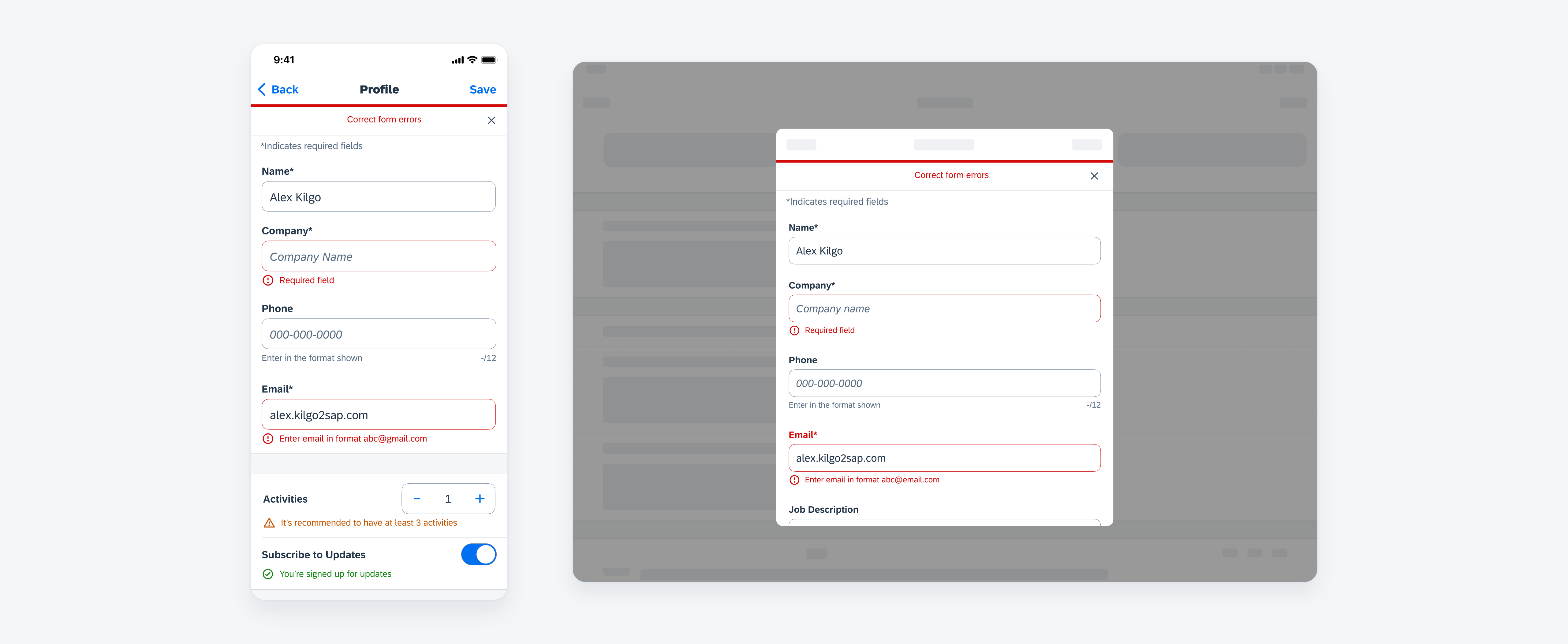
Examples of new error handling approach
Inline Validation
Updated and new pattern! Inline success messages and warning messages are now available in addition to error messages. Hint text is also enhanced for multiline messages.
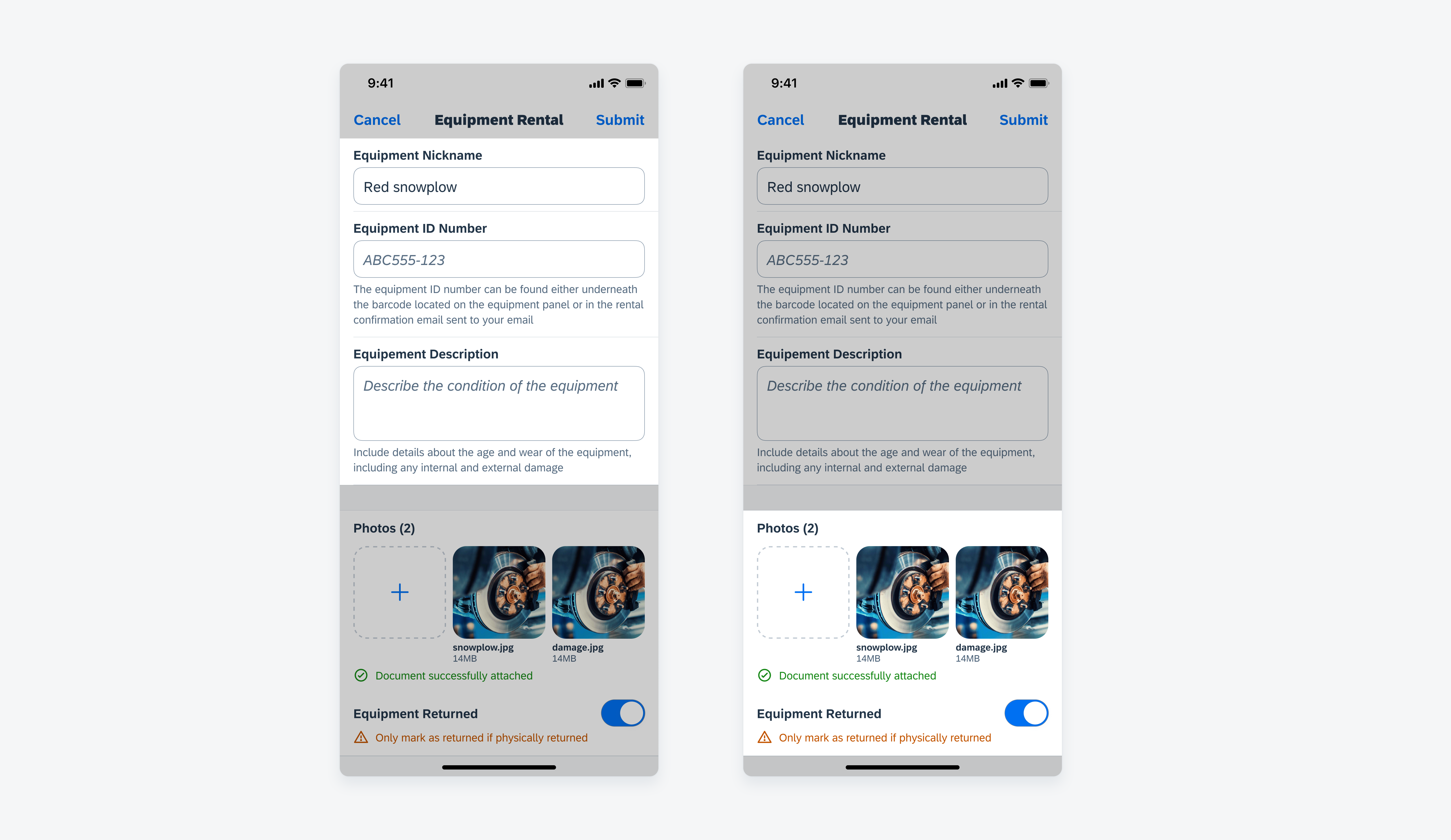
Example of multiline hint text (left) and success and warning messages (right)
Illustrated Message
New component! The illustrated message is a new type of feedback component that helps to inform users about various system states and suggests actions they can take to resolve an issue.
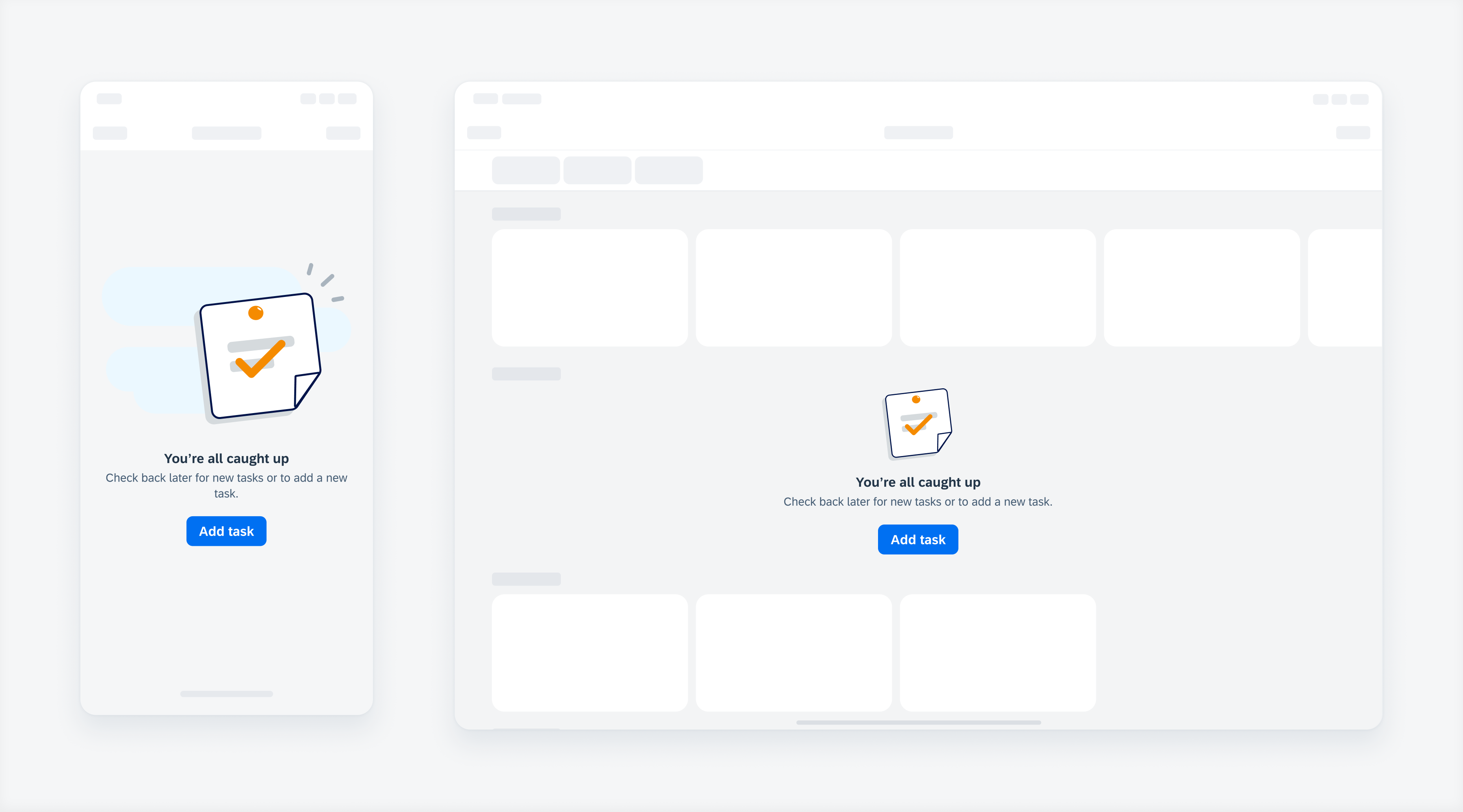
Example of an illustrated message
List Picker
Updated pattern! A new “typing” search pattern has been added to the half and full screen modal sheet views. You can now also choose to have a transparent background for section headers.
Example of a list picker
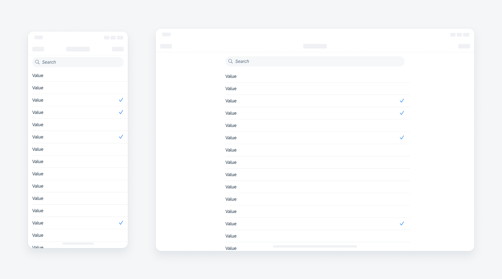
Skeleton Loading
New component! Skeleton loading is a progress indicator that is used when a screen or part of a screen is loading. It is best used when the structure and layout of a container are known, such as a page or card, and the system requires time to fetch and display the actual data.
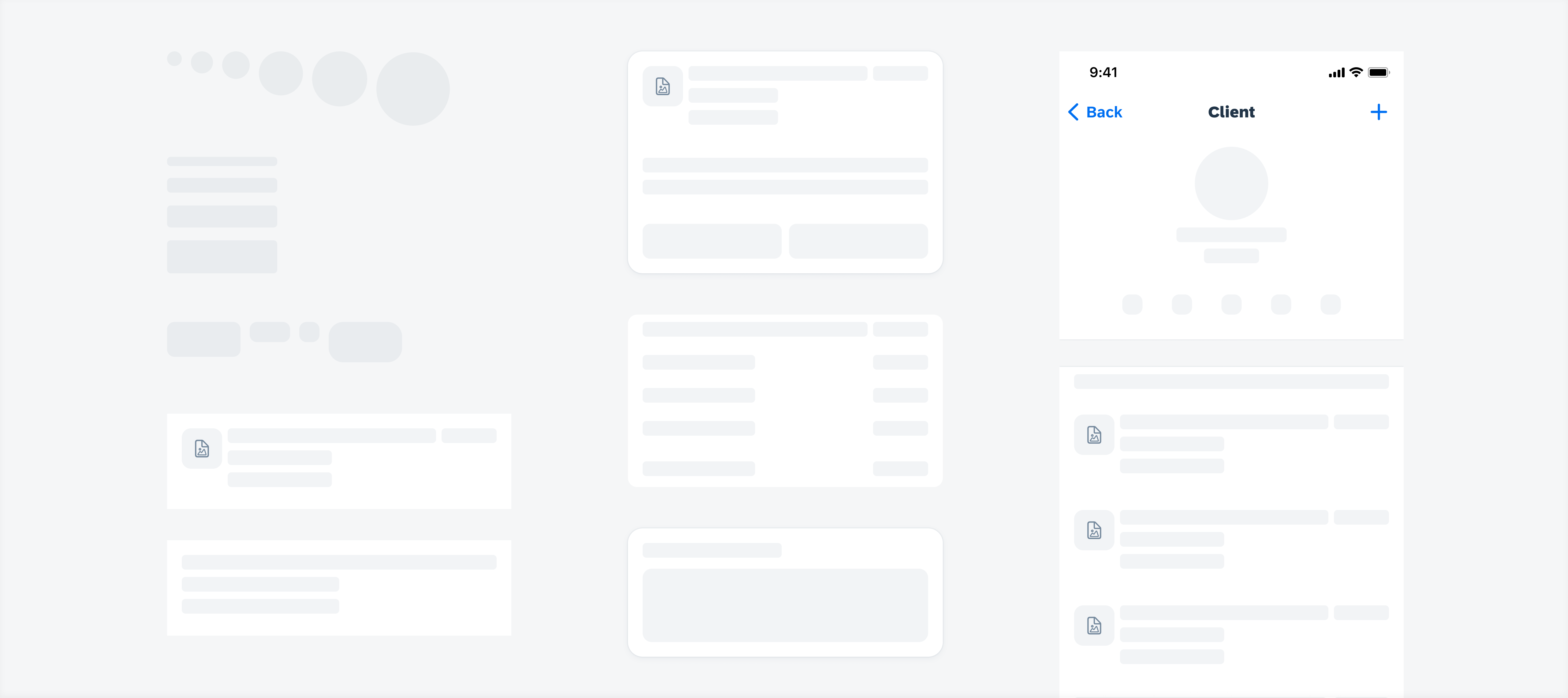
Example of skeleton loading
Stepper Form Cell
Updated component! Hint text for stepper form cells is now aligned to the form cell label for better consistency.
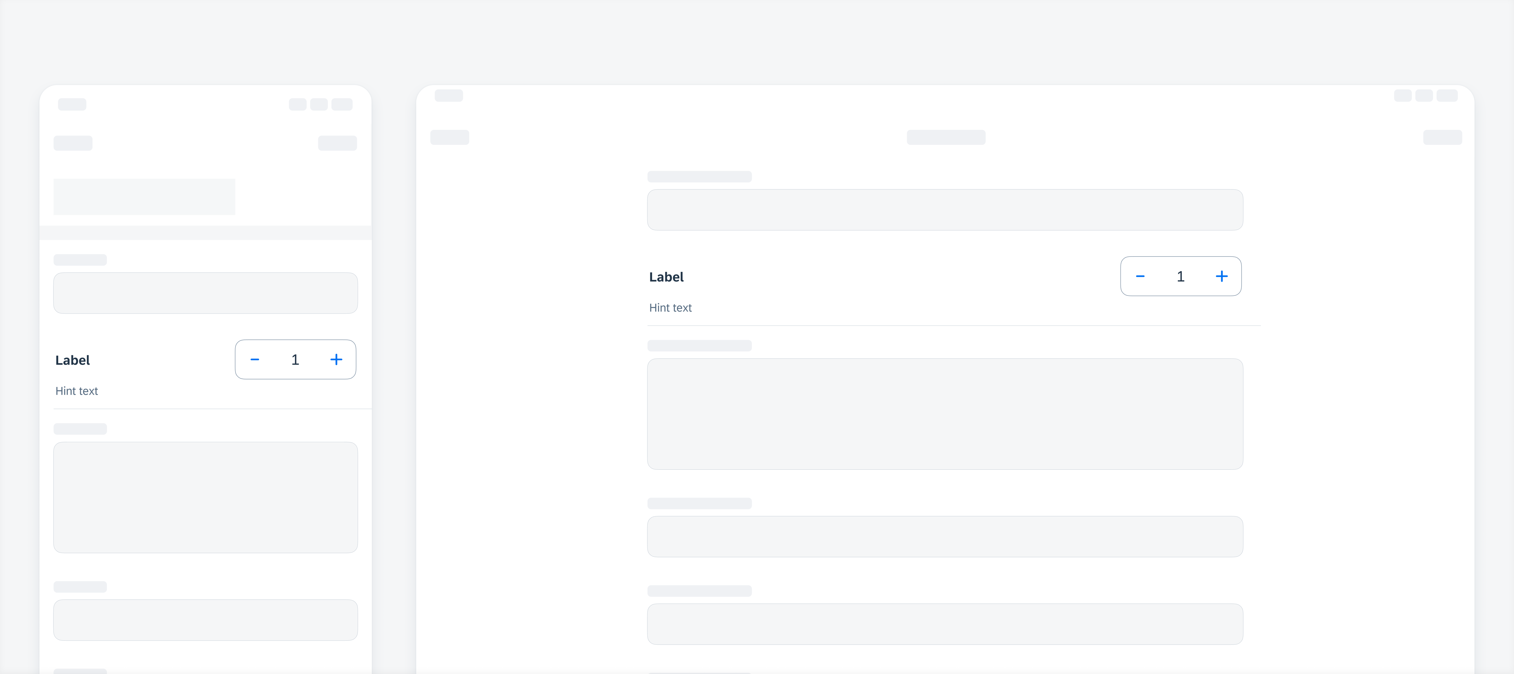
Example of a stepper form cell
Tab Bar
Updated component! When there is not enough space to display all tabs, the trailing tab becomes a “More” tab, displaying the remaining items in a list on a separate screen.
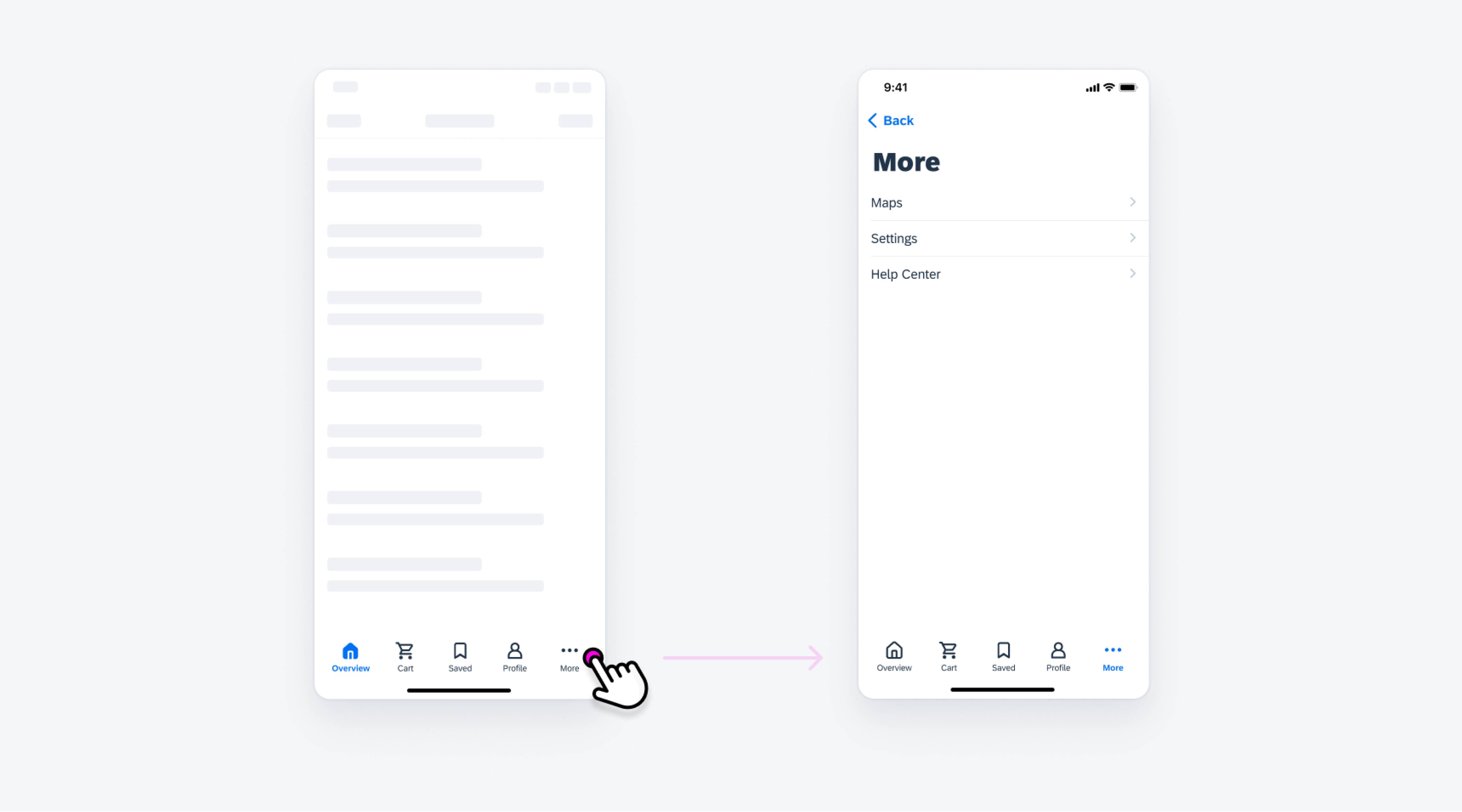
Example of a tab bar
Tags
New guideline article! Tags are used to display quick and useful bits of information to the user, such as keywords, labels, categories, or statuses.
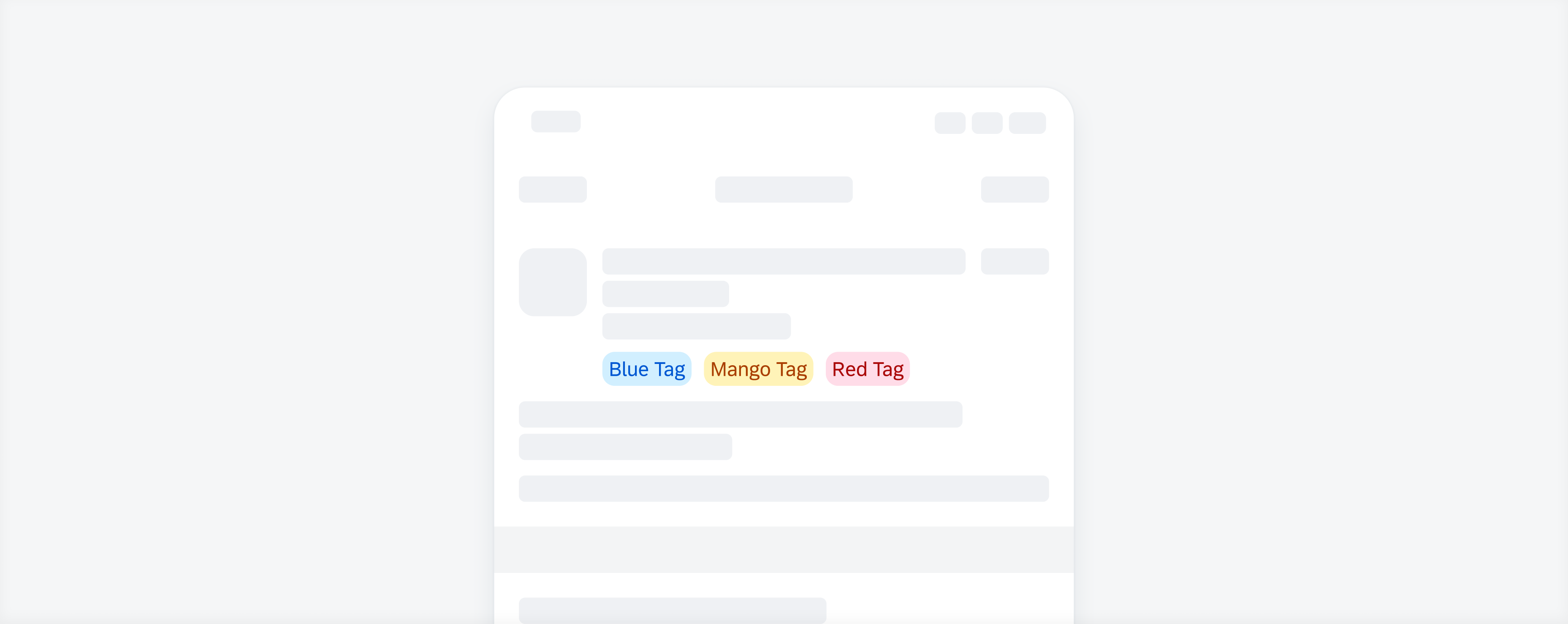
Example of a tags
Toast Message
Updated component! Toast messages now have a more distinct color difference for light and dark mode.
Example of a toast message
Toolbar
Updated component! When the toolbar variant with helper text is used, the buttons within the toolbar adjust their width to the label length instead of filling the container.
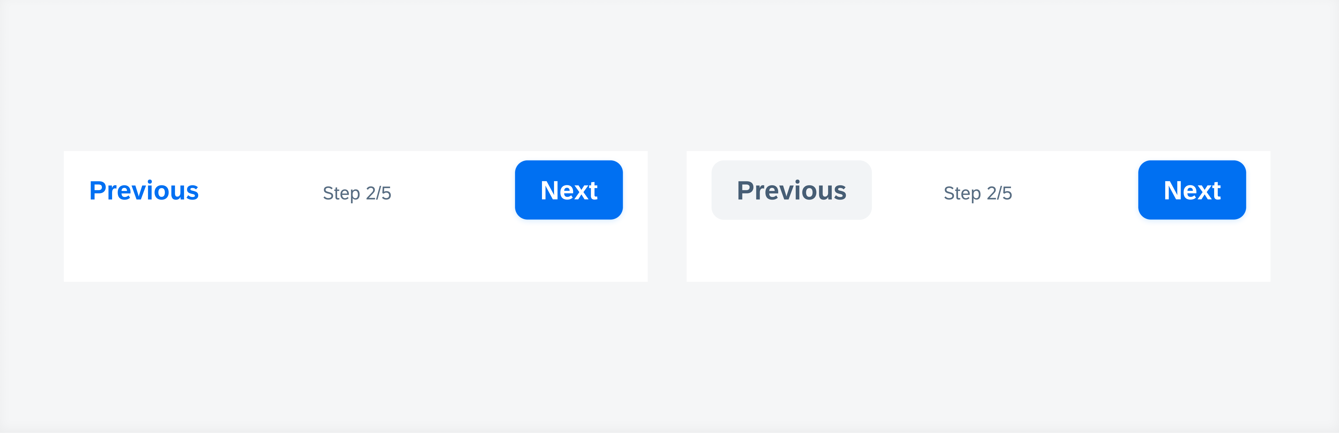
Example of a toolbar with helper text
SAP Fiori for iOS 10.0 UI Kit
Updated Figma UI Kit with new components and enhancements for this release, including:
- New Updates page documenting release updates in UI Kit.
- Go to SAP Fiori for iOS 10.0 UI Kit to learn more.
 Your feedback has been sent to the SAP Fiori design team.