
New Updates in 24.4
This article provides an overview of the new and enhanced topics for SAP BTP SDK for iOS 24.4.
Updates to Guidelines & Design Kit
New Release Naming Convention
Starting in 2024, the SAP BTP SDKs for iOS and Android have changed their release naming from “Major.Minor.Patch” format to “Year.Month.Patch” format. For example, a release in April 2024 is named 24.4.0. The first patch for this release will be named 24.4.1, the second will be named 24.4.2, and so on. If the release gets delayed by a month to May, it will be named 24.5.0.
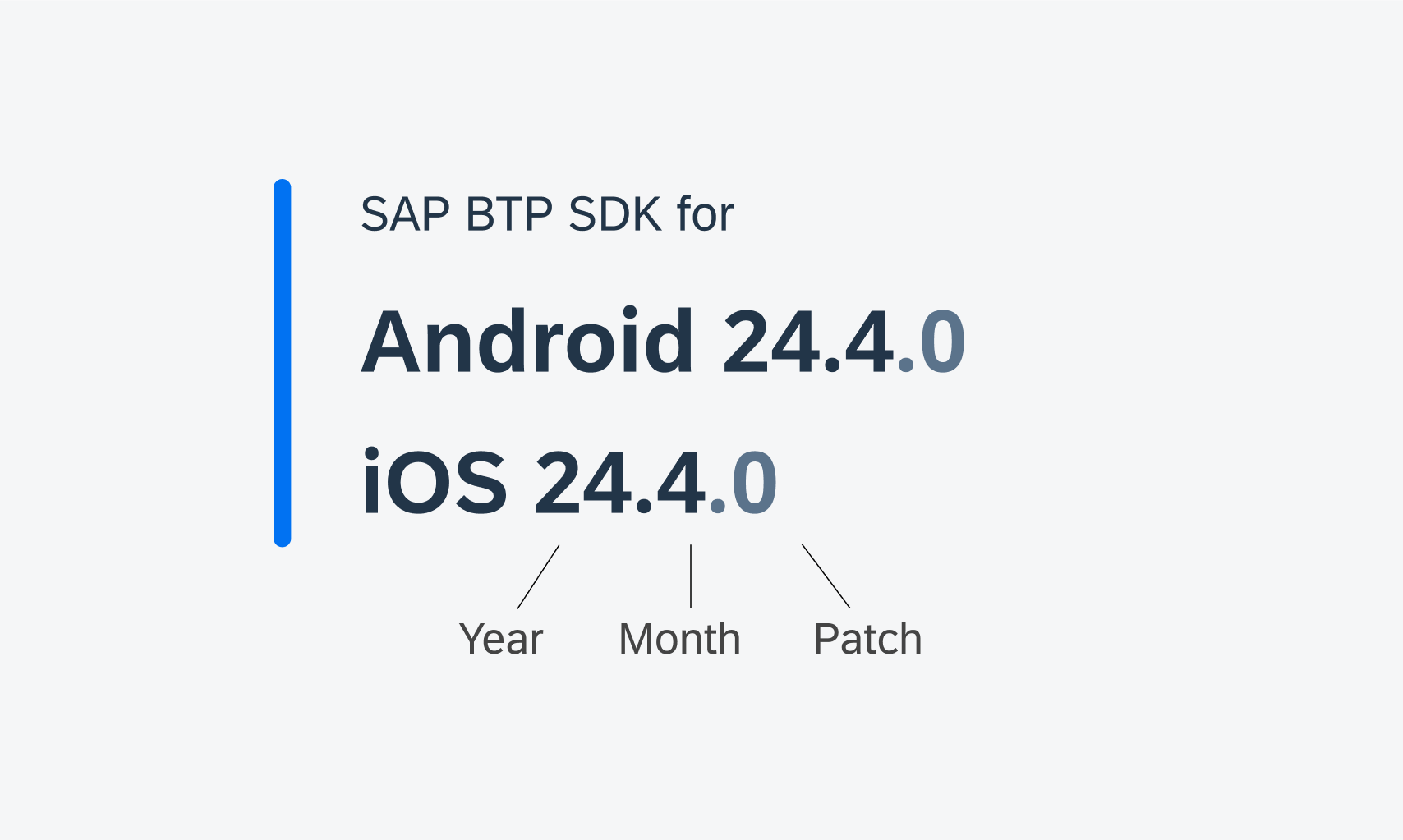
New naming convention for SDK versions
24.4 Design Kit Revamp
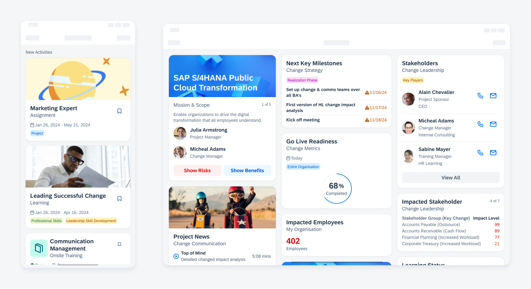
Updated Design Kit! The SAP Fiori for iOS 24.4 Design Kit (formerly known as “UI Kit”) has undergone significant changes, including variables, page hierarchy, in-page layout, component properties, info card, and more. Find out more details on the What’s New In Design Kit page.
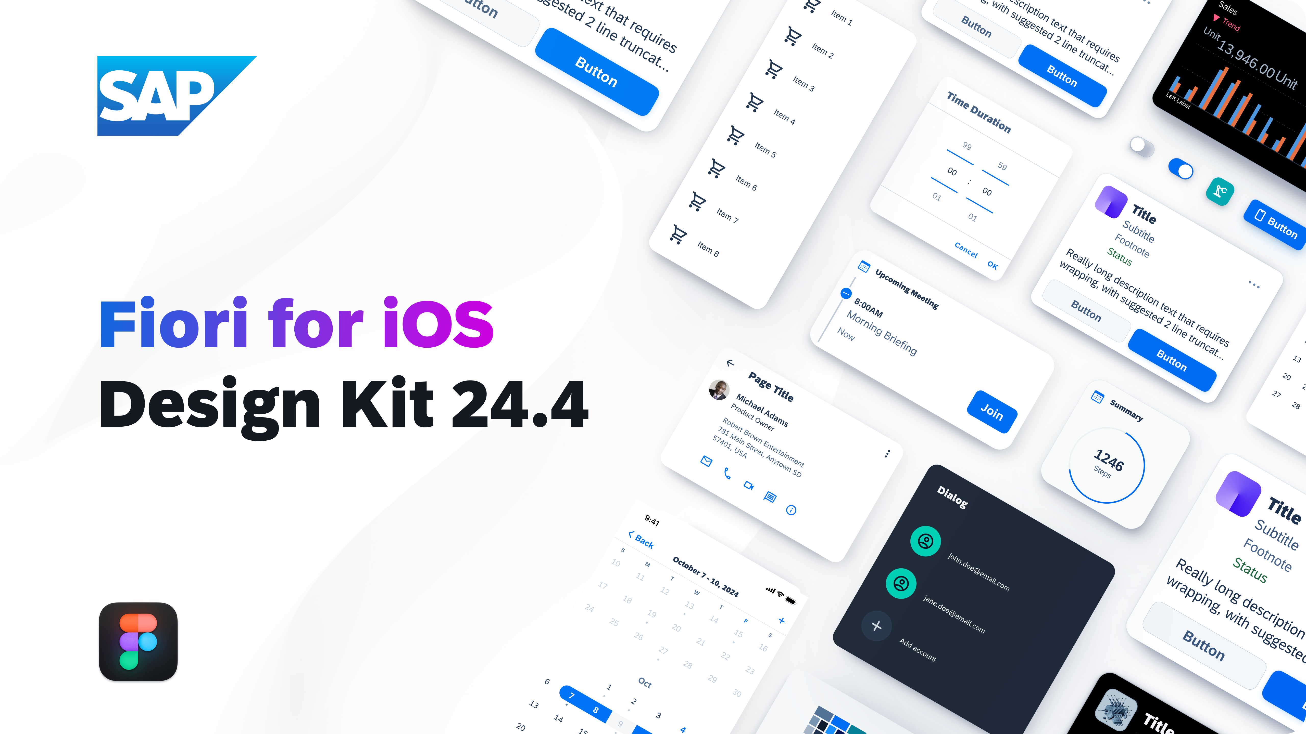
SAP Fiori for iOS Design Kit 24.4
Foundation
Colors
Updated Design Kit and Guideline! The SAP Fiori for iOS color system has been refined to better harmonize with Apple’s established color system and design principles. This update leverages SAP Fiori’s design system colors while supporting alignment with Android for overall consistency. These changes include updates to label, fill, and background colors as well as adding the Materials Chrome blur effect for navigation bars, tab bars, and toolbars.
SAP Fiori for iOS color system
UI Components & Patterns
Carousel Layout
Updated Pattern! A carousel layout displays multiple cards horizontally with a glimpse of the next card visible. All cards have the same height by default, with the carousel container’s height determined by the tallest card. To scroll through the carousel, either snapping behavior or simple scrolling can be activated.
Carousel layout on a compact (left) and regular screen size (right)
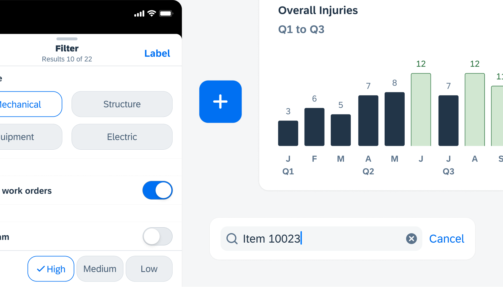
Data Table
Updated Design Kit and Guideline! Read-only state has been added to data tables in edit mode. The read-only cell has a grey background. If the user taps on it, a toast message pops up to indicate that it can’t be edited. The blue background in active state data table cell is removed.
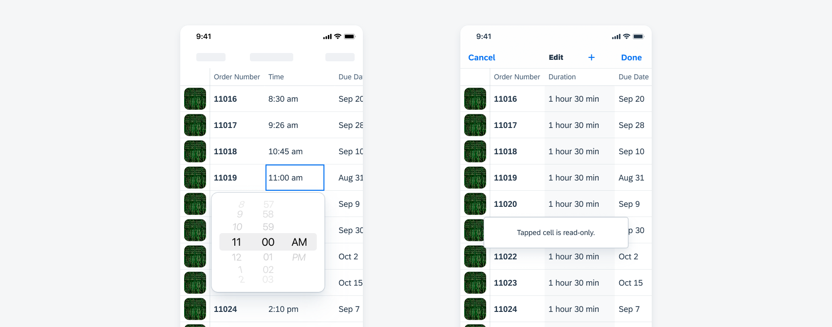
Data table active state (left) and read-only state (right) in edit mode
Feedback Indicators
Updated Design Kit and Guideline! Partial loading with loading indicator has been added, which can be used when part of the screen is being loaded. We have also added the checkout indicator to the feedback indicators with full-screen and in-a-modal variants, and processing/success/error states. The processing indicator and progress indicator are combined as a set of feedback indicators.
Checkout indicator (left) and partial loading of loading indicator (right)
Illustrated Message
Updated Design Kit and Guideline! We have added more use cases and clarifications on customizations to the illustrated messaging guideline. The horizontal layout variant is now limited to being only left-aligned instead of centered.
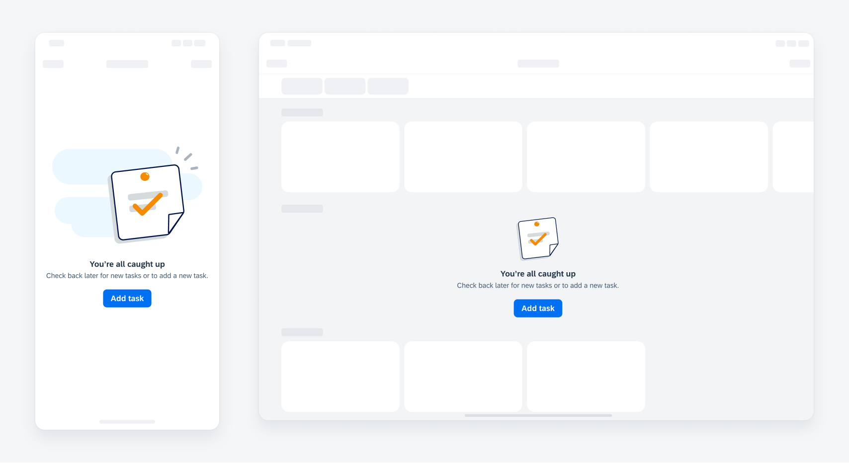
Illustrated message on a compact (left) and regular screen size (right)
Linear Progress Indicator
New Component! The linear progress indicator component has been added to the design kit and guideline. A linear progress indicator informs users about the status of ongoing processes, such as login progress, uploading files, or refreshing content. There are two types of linear progress indicator: determinate and indeterminate.
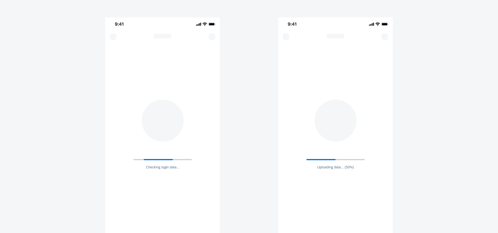
Indeterminate linear progress indicator (left) and determinate linear progress indicator (right)
Masonry Layout
New Pattern! The masonry layout arranges cards flexibly in a grid-like structure, with consistent width but varying heights based on content. Customizable columns determine the number of cards displayed. Cards prioritize positioning from the top left corner in this asymmetric layout.
Masonry layout on a compact (left) and regular screen size (right)
Single-User Onboarding
Updated Design Kit and Guideline! Inconsistent text input fields have been replaced with ones that match our current design system. Some of the labels for the welcome screen variants have been updated to match Android. A legal agreement feature that allows app teams to require users agree to legal policies (EULA, data privacy, terms of service) before being able to continue with onboarding has also been added.
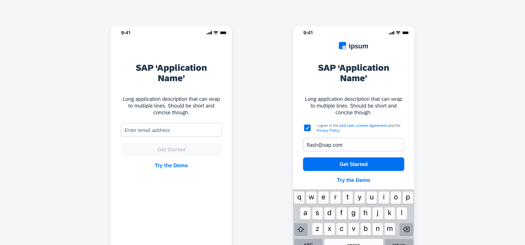
Welcome screen with discovery basic (left) and with legal agreement (right)
SAP Fiori for iOS 24.4 Design Kit
Updated Figma Design Kit with new components and enhancements for this release, including:
- New Updates page documenting release updates in Design Kit.
- Go to SAP Fiori for iOS 24.4 Design Kit to learn more.
 Your feedback has been sent to the SAP Fiori design team.