
Updates in 9.1
This article provides an overview of the ongoing topics for SAP SDK for iOS version 9.1.
Updates to Guideline Structure
Feedback
The Error Handling, Feedback, Offline, and Empty State View guideline articles are now grouped within the Feedback pattern.
Navigation & Search
The Navigation Bar, Sibling Navigation, Tab Bar, Side Bar, Search Bar, and Search to Select guideline articles are located within the Navigation & Search component grouping.
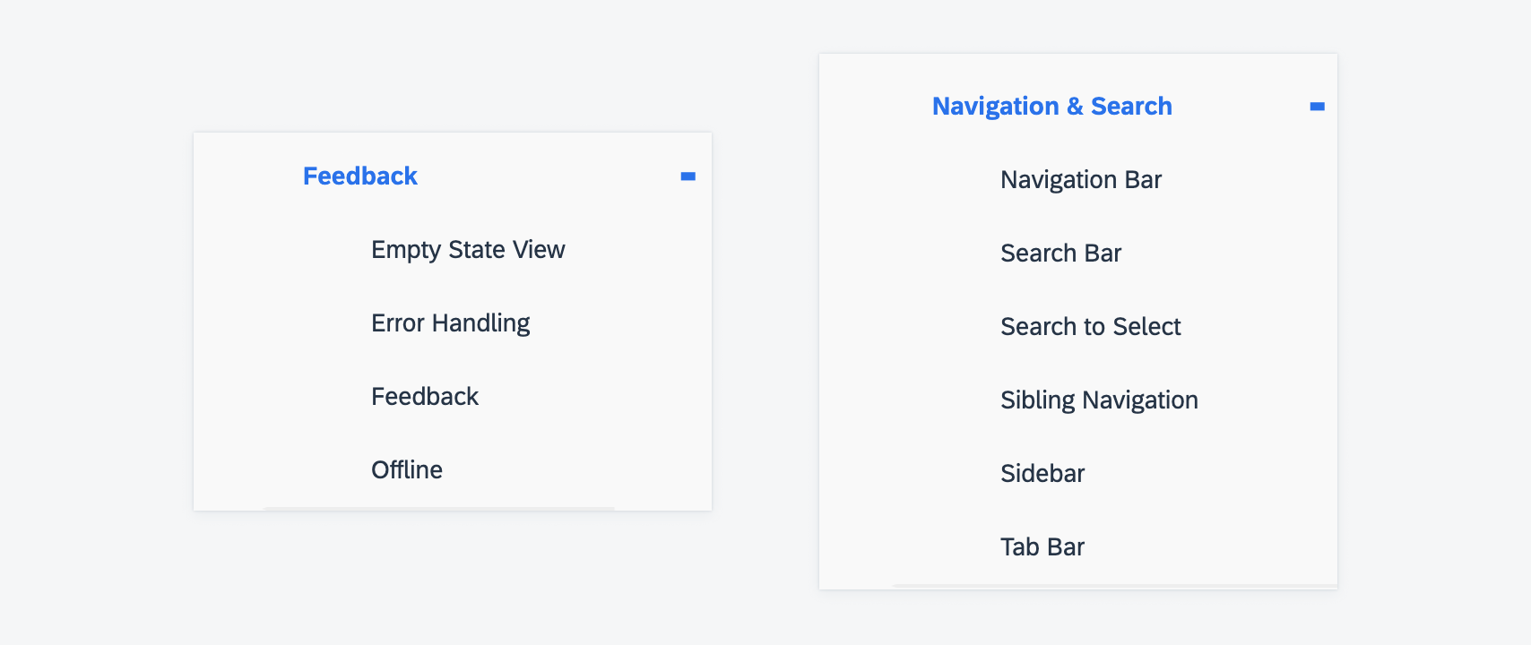
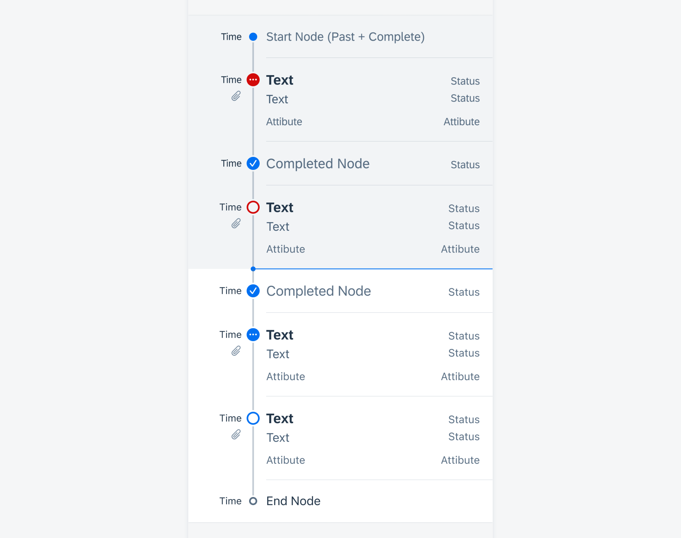
Example of the new guideline structure
Foundation
Iconography
SAP icons have been redesigned for the Horizon visual theme. Navigate to Iconography to learn more.
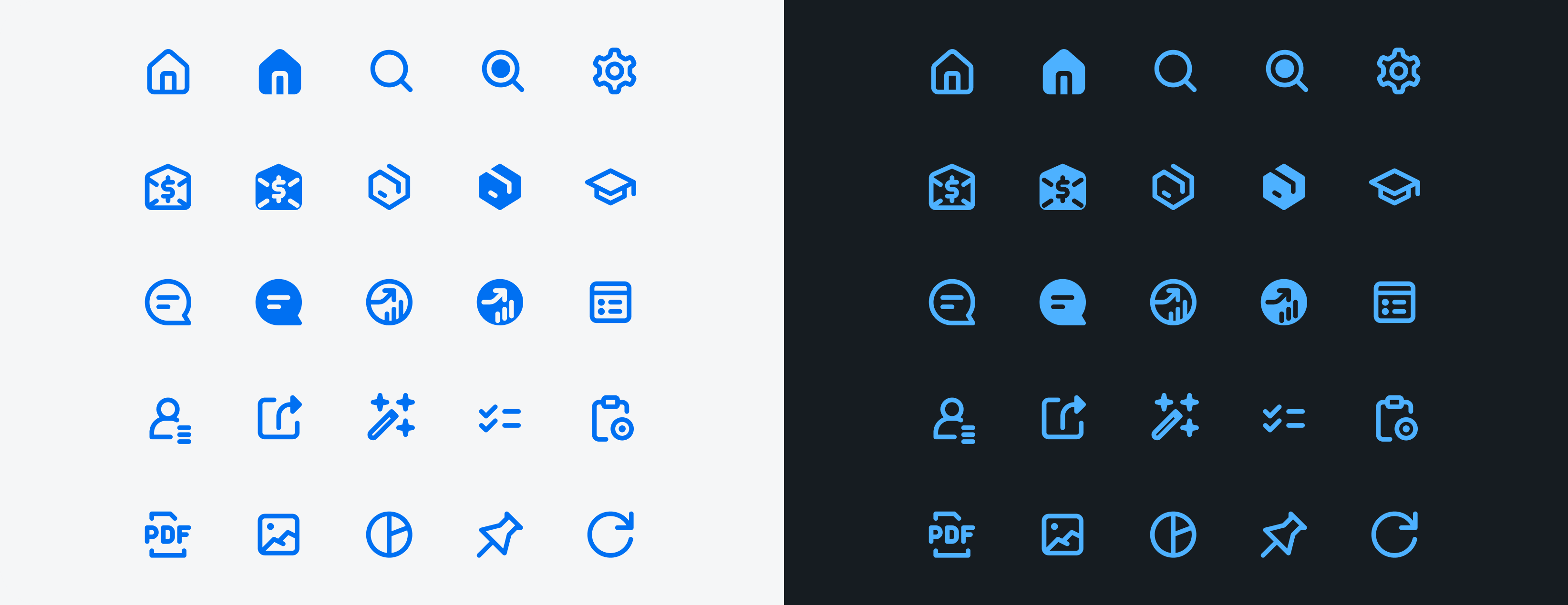
Example of the new iconography
UI Components & Patterns
Analytic Data Table Card
The analytic data card got a visual update. Additionally, the height is now flexible, and the card can contain up to three entries from the data table. It is also possible to show a thumbnail image in the header. To learn more, refer to Analytic Data Table Card.
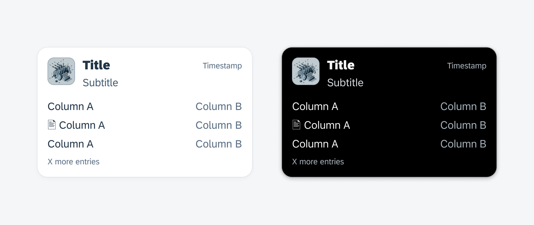
Example of analytic data table card
In-Line Editable Data Table
As an enhancement, the data table now comes with interaction behavior that enables in-line editing. Refer to Data Table to learn more.
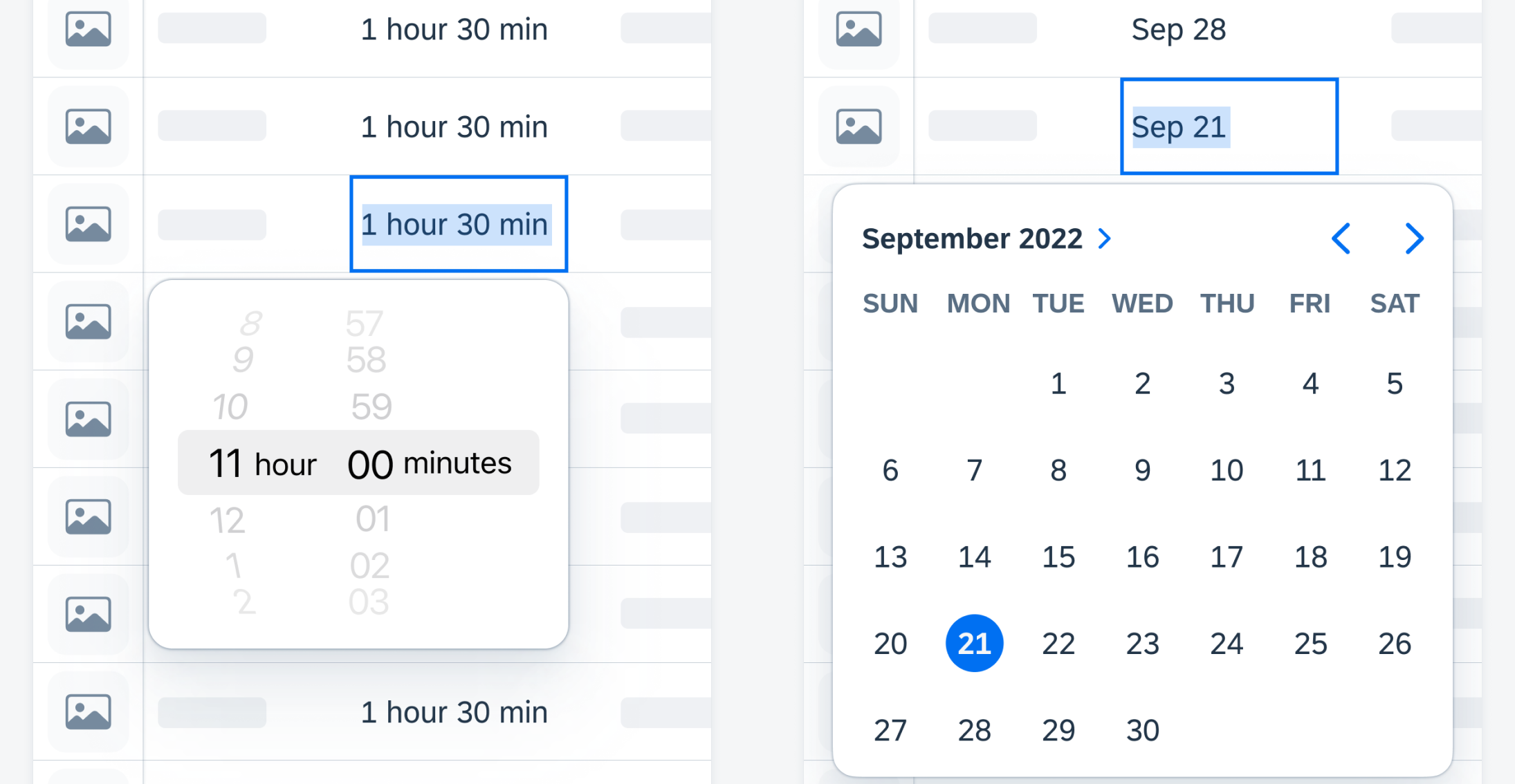
Example of the in-line editable data table
Empty State View
New illustration and copy added. Refer to Empty State View to learn more.
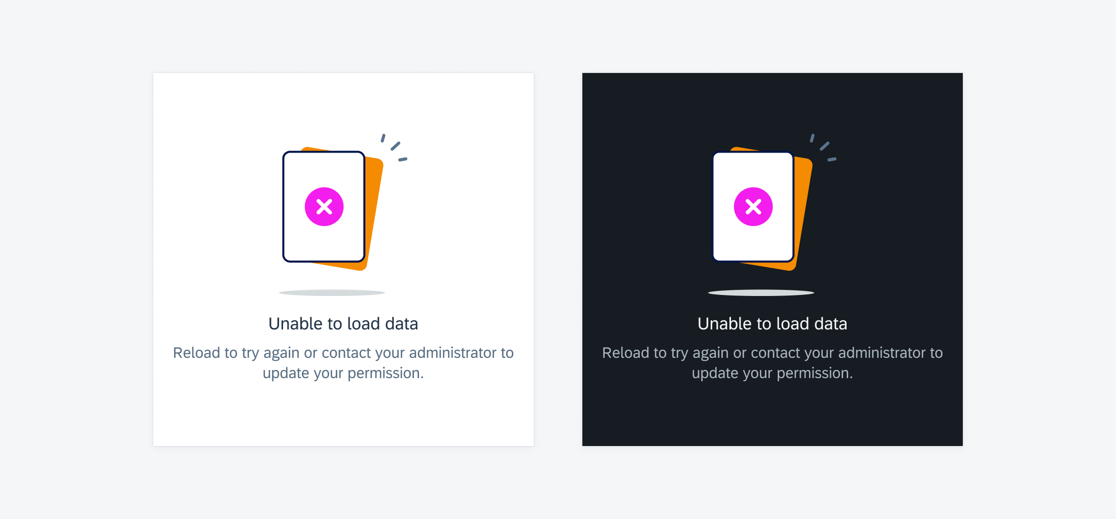
Example of empty state viewer
Form Cell
The slider form cell label has changes in label color and label font to match other form cells. Text Input will implement an interim label. Refer to Slider Form Cell and Text Input Form Cell to learn more.
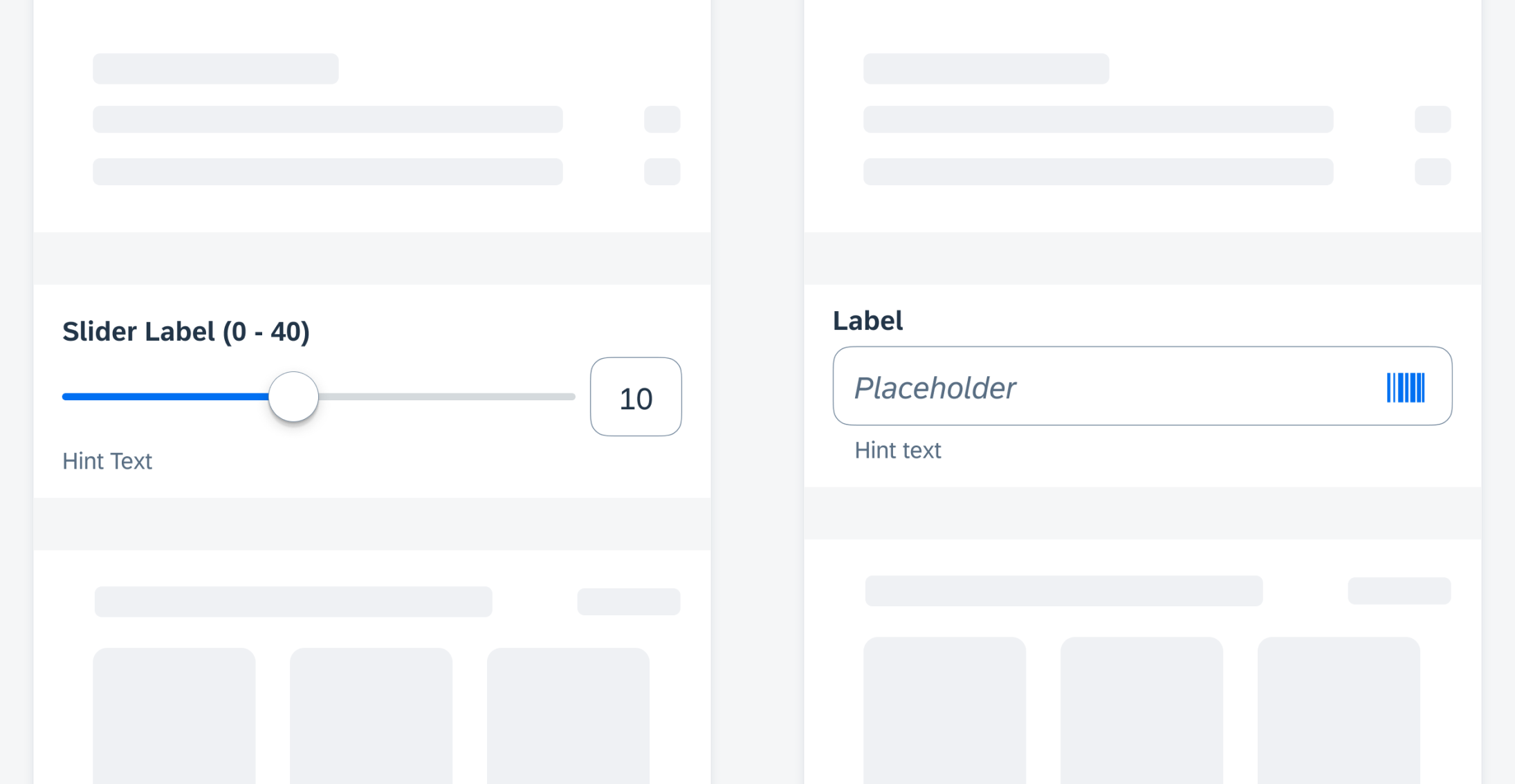
Example of slider form cell and text input form cell
Quick Sort
Quick sort is a contextual sort pattern that allows users to change the sort criteria of a component. It can be implemented on component level to allow sorting list cards or to preview table views. It can also be implemented in fullscreen view, for example, in list reports. To learn more, see Quick Sort.
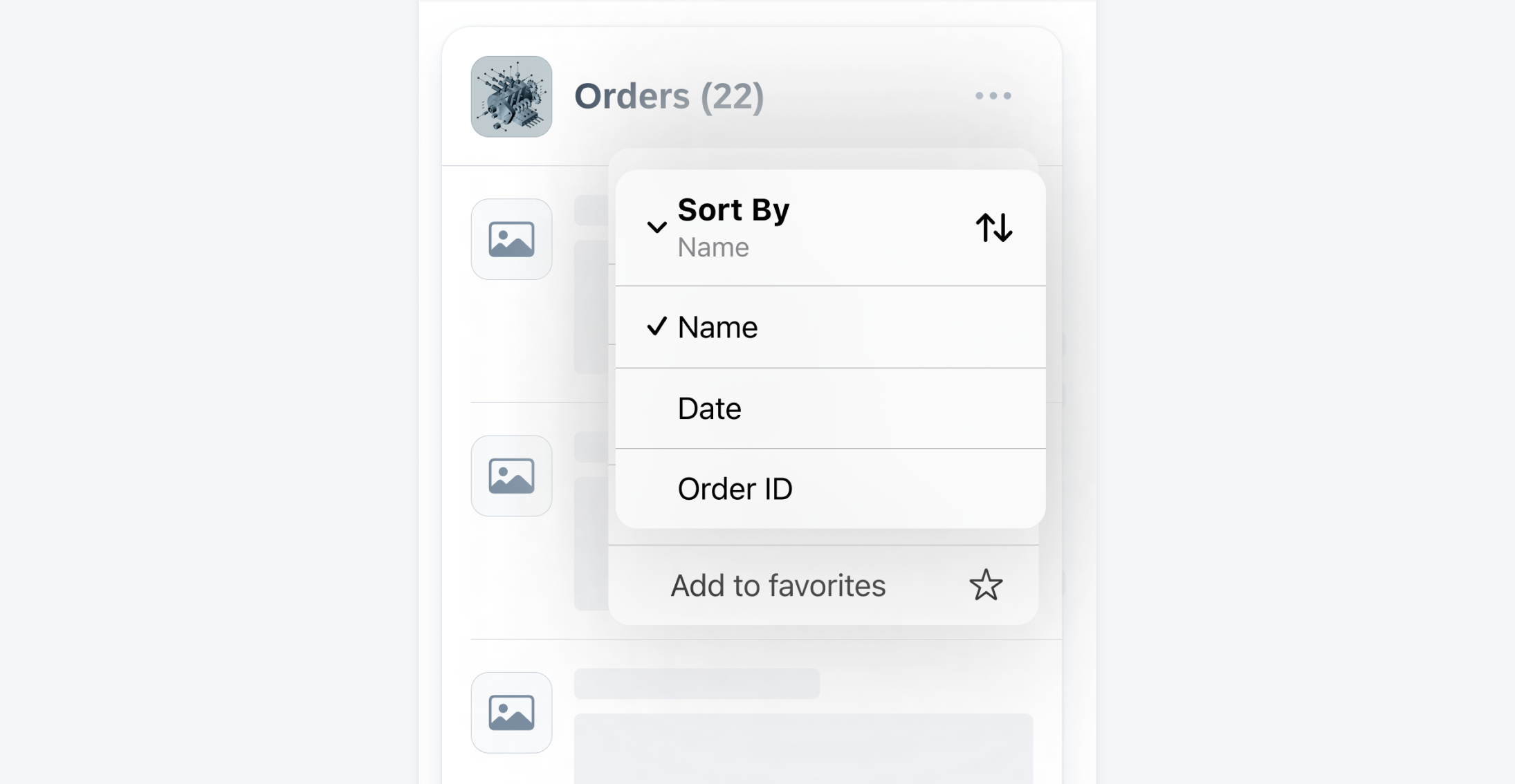
Example of quick sort
Semantic Buttons
Semantic buttons are now available. The tint button style can emphasize available actions and encourage users to interact with them. The negative button style indicates destructive actions and warns users to take extra precautions when interacting with the buttons. Refer to Buttons to learn more.
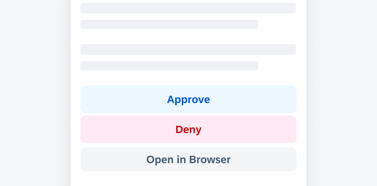
Example of semantic buttons
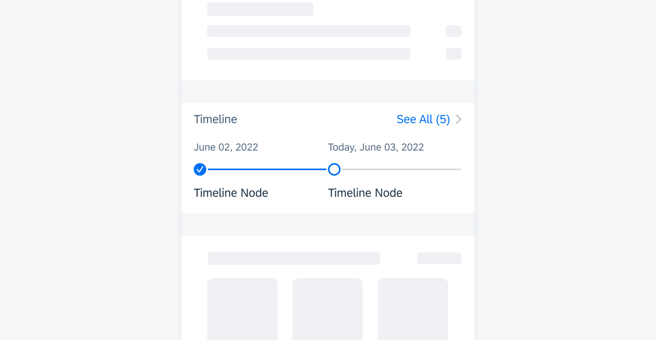
Timeline
The timeline component has been redesigned. Refer to Timeline to learn more.
Example of timeline
Timeline Preview
The timeline preview component has been redesigned. Refer to Timeline Preview to learn more.
Example of timeline preview
Toolbar
The toolbar is a component with one or more buttons that is always located at the bottom edge of the screen. To learn more, refer to Toolbar.
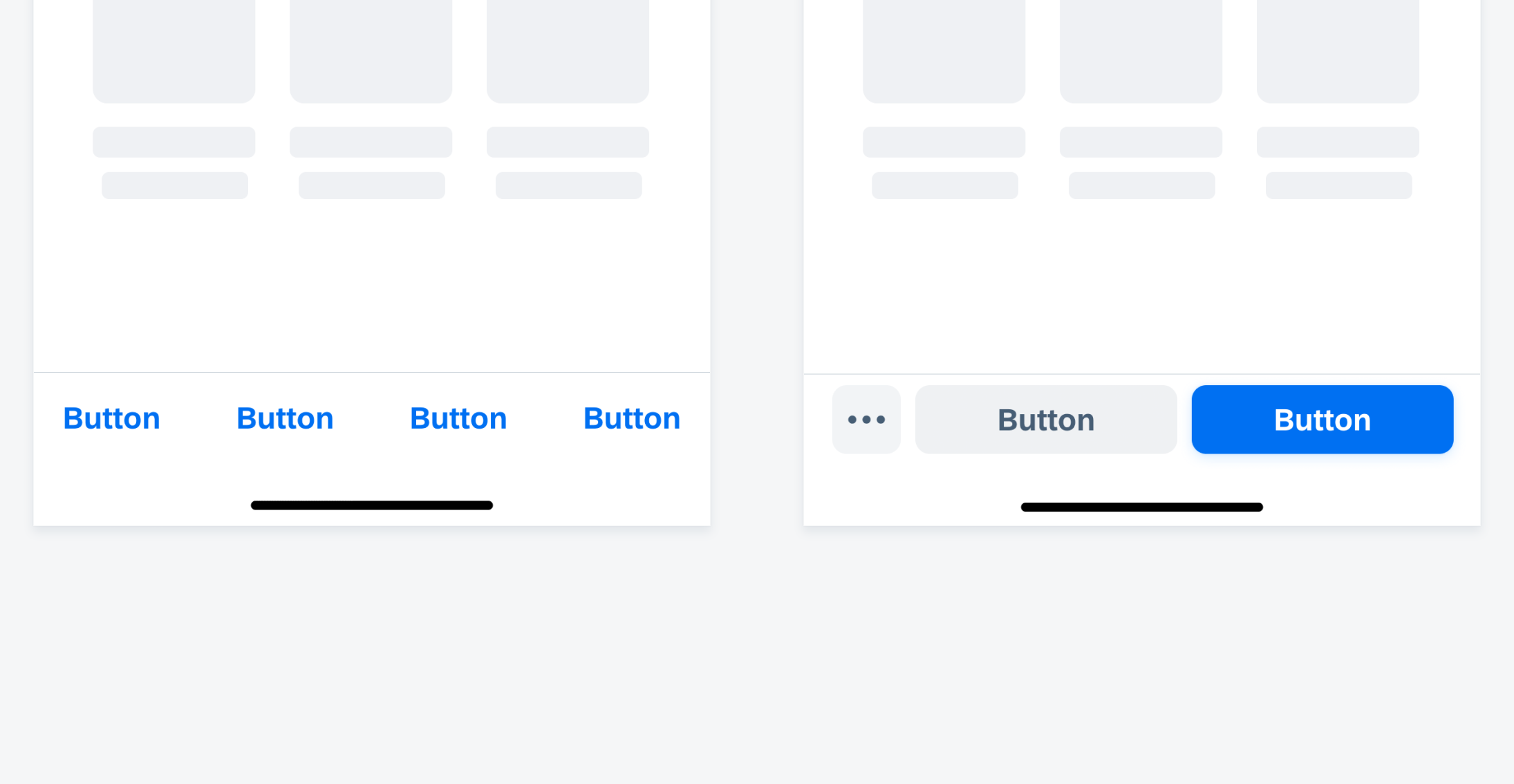
Example of toolbar
SAP Fiori for iOS 9.1 UI Kit
Updated Figma UI Kit with new components and enhancements for this release, including:
- New Updates page documenting release updates in UI Kit.
- Tutorial for theming under Foundations section.
Go to SAP Fiori for iOS 9.1 UI Kit to learn more.
 Your feedback has been sent to the SAP Fiori design team.