
List Card
Intro
The list card gives a preview of a set of items or objects in a vertical list format. Similar to the object card, the list card is also highly customizable but does have a few best practices guides on list item usage for better organization.
List card view examples
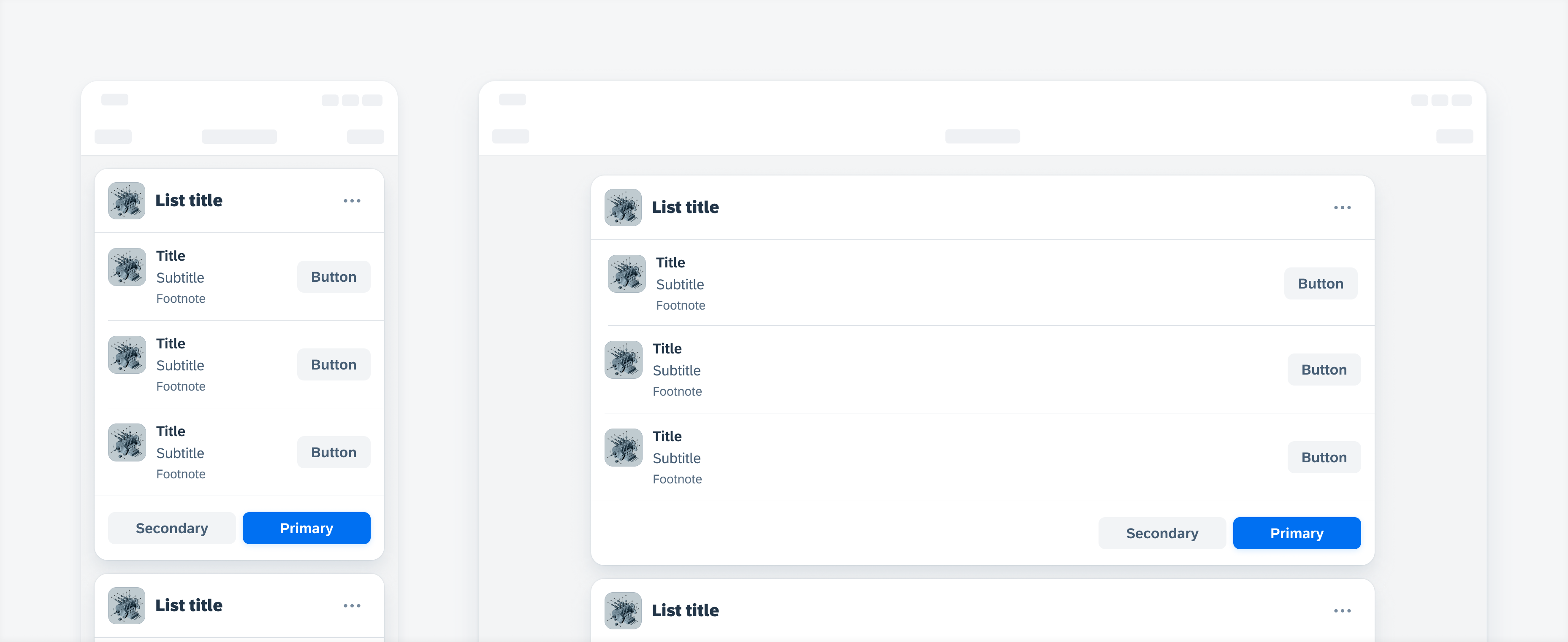
A. Header
The header area of a list card opens to the full list report, which shows the list of all the objects apart of that preview set.
B. List Items
Tapping on the list item on the card opens the object detail page for that specific item. We recommend using the same format for all the list items inside of the same list, as well as keeping list items to a maximum of five items.
C. Footer
In the footer area, users can quickly access and perform up to two select actions on the list.

List card anatomy
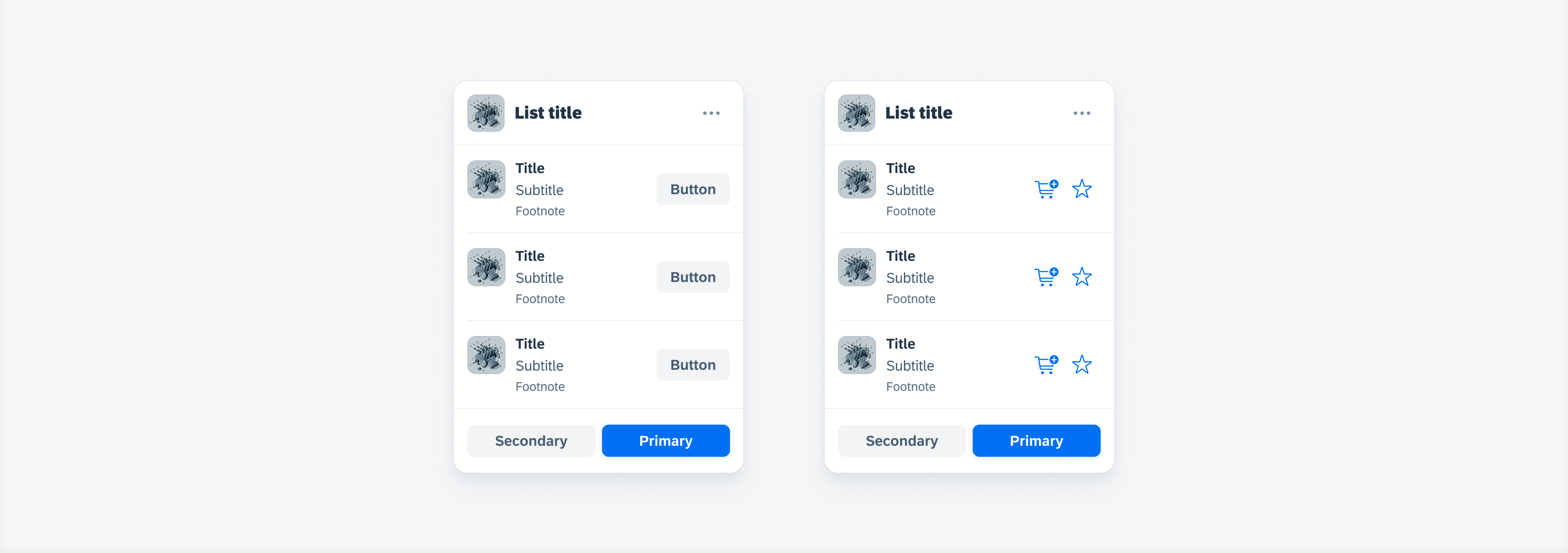
List card variations: shape buttons, symbol buttons
Development: Mobile Cards
SAP Fiori for Android: List Card
Related Components/Patterns: Cards Overview, Object Cell
 Your feedback has been sent to the SAP Fiori design team.