
Updated: November 18, 2023
Stepper Form Cell
FUIStepperFormCell
Intro
A stepper is a control that displays and allows users to incrementally increase or decrease a select value.
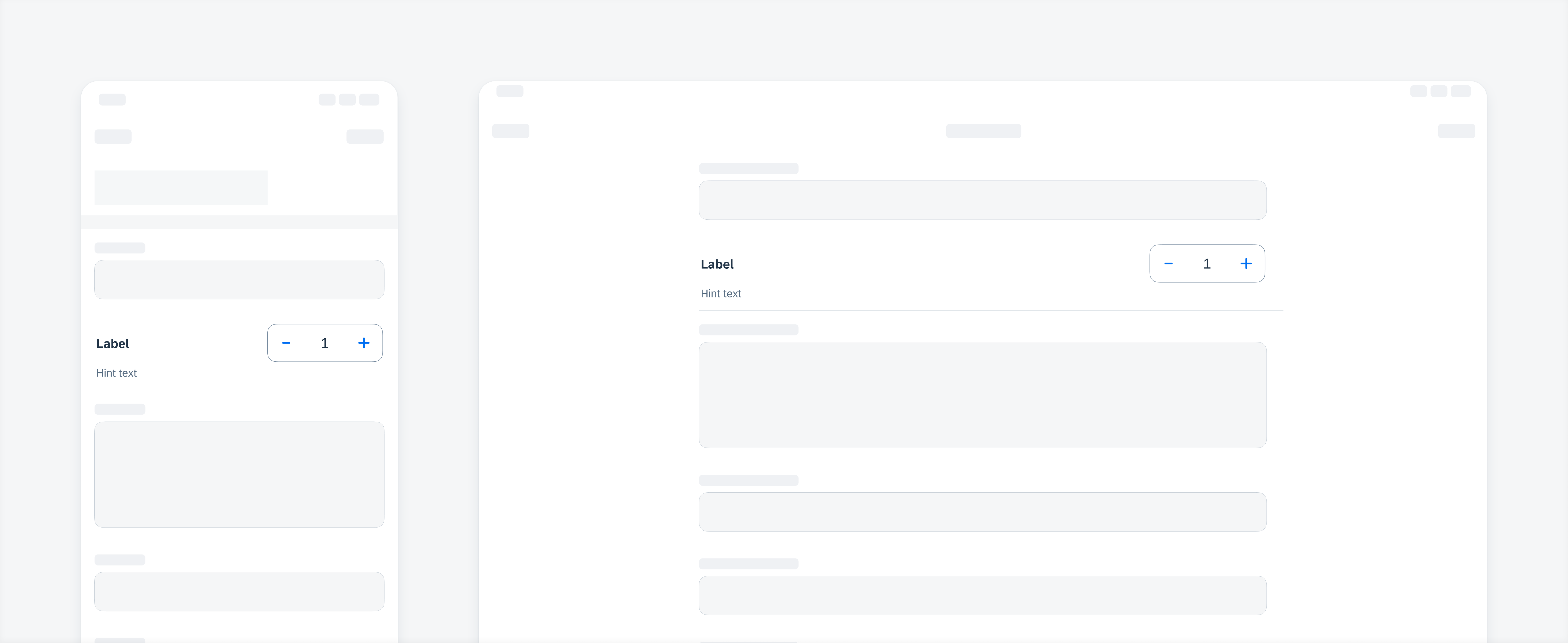
Stepper examples
A. Label
Describes the intent or desired value of the stepper form cell.
B. Hint Text (Optional)
Provides additional information about the stepper form cell.
C. Stepper Container
Houses the actual stepper component.
D. +/- Buttons
Segmented control buttons for incremental increases or decreases of the shown value.
E. Value/Input Field
Indicated tappable area where input values are displayed.
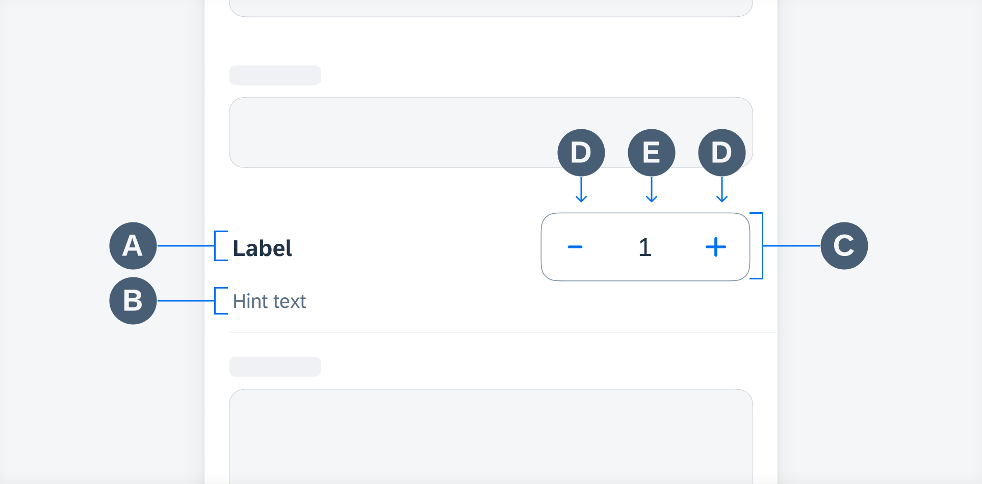
Stepper anatomy
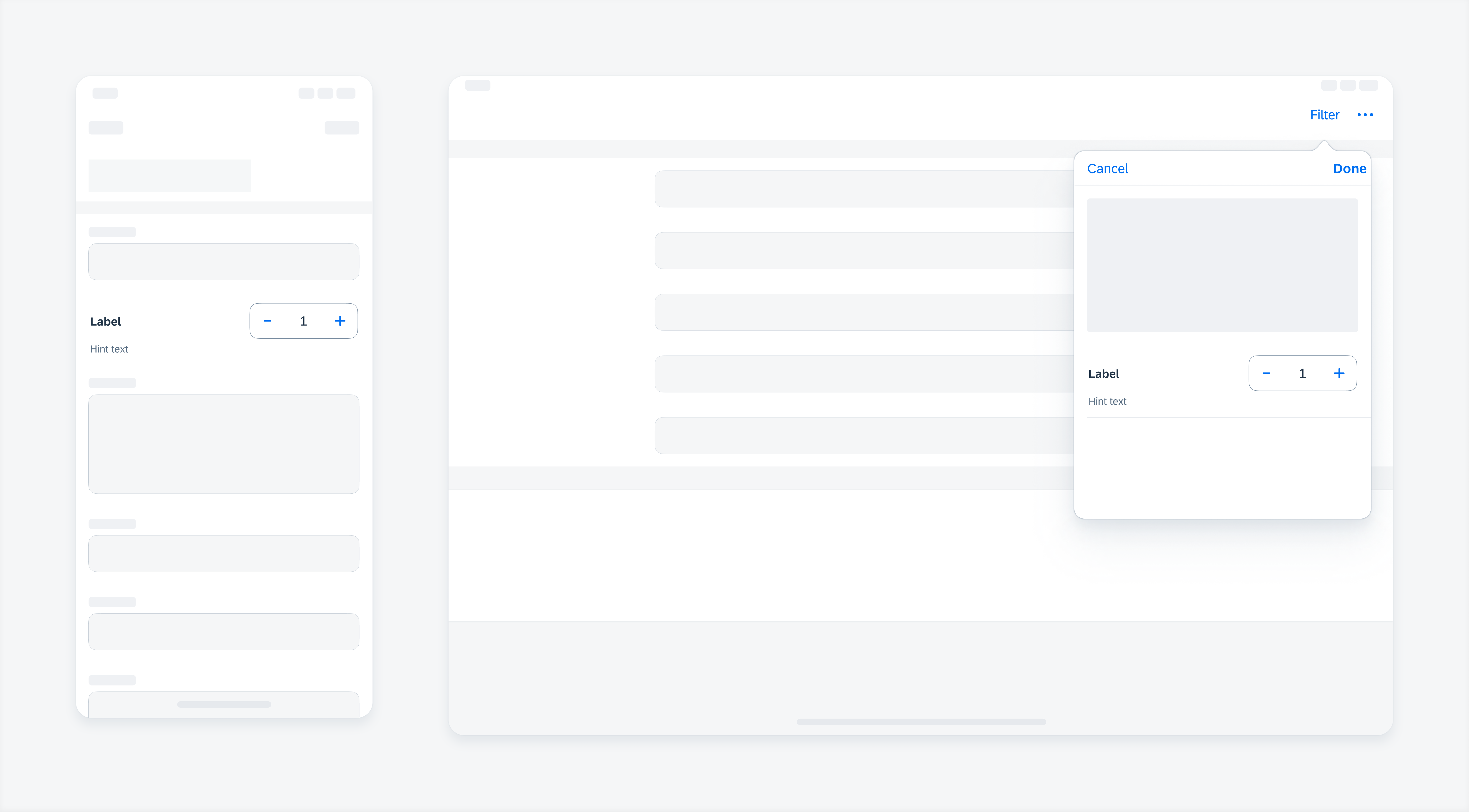
A user can tap on the “+” or “-” control buttons to incrementally increase or decrease the shown value in the stepper container.
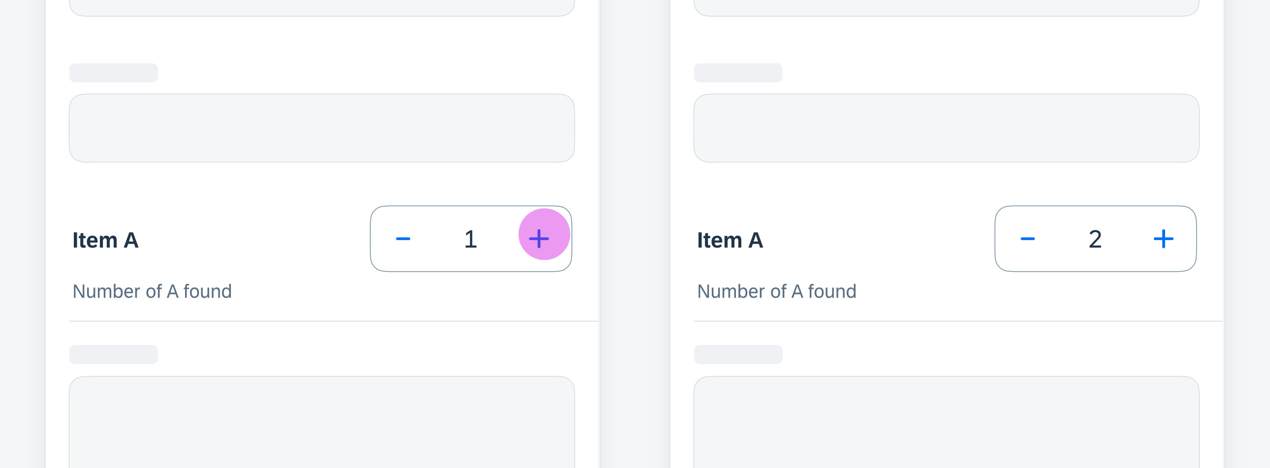
Tap the "+" or "-" buttons to increase or decrease value
A user can also tap on the value/input field to open up the keyboard and enter an exact value.
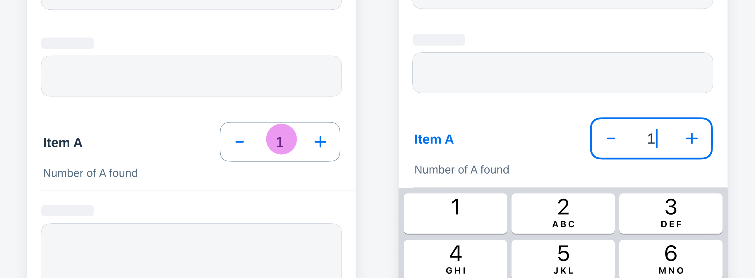
Tap the value/input field to trigger keyboard to enter selected value
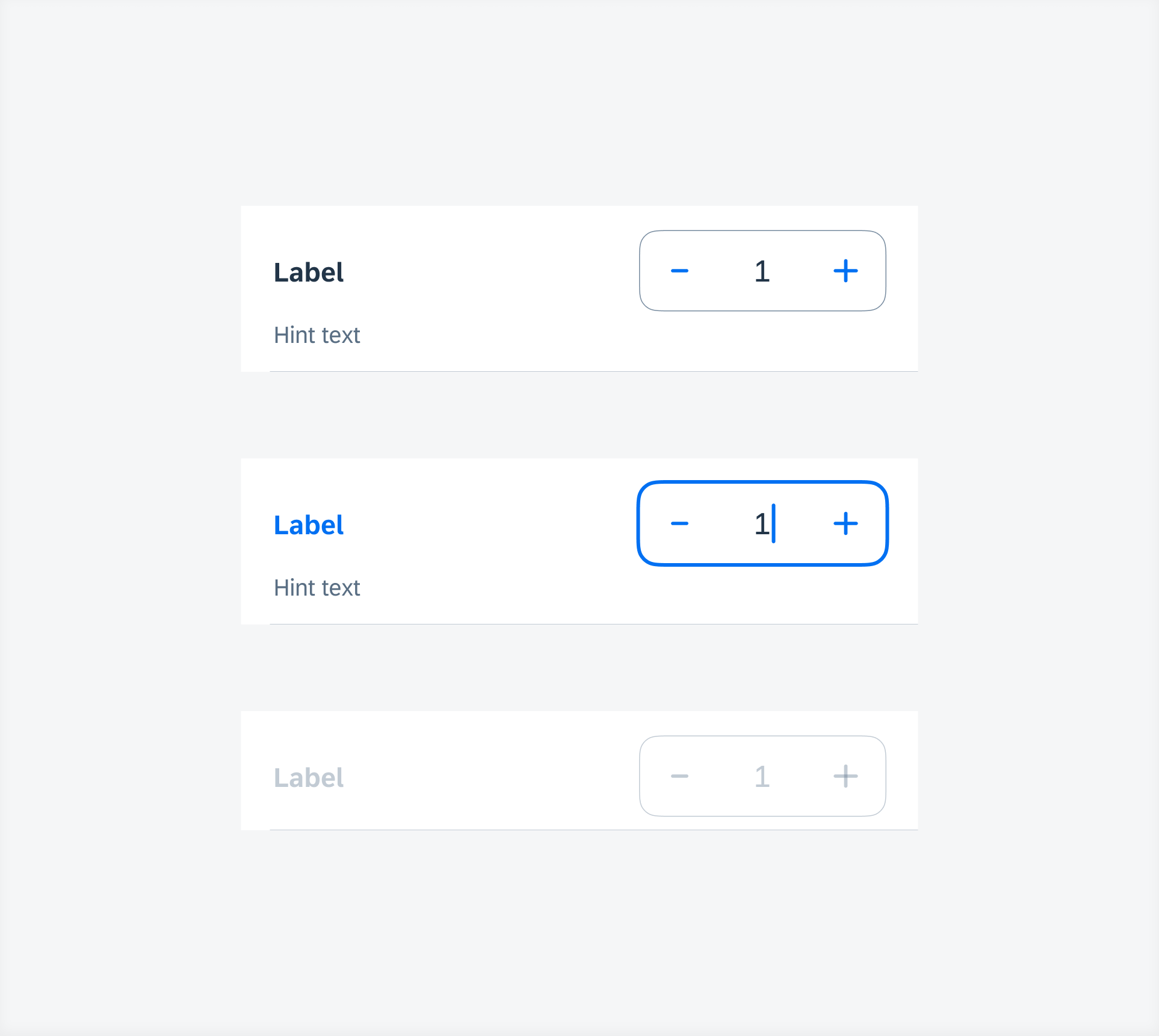
Stepper states (top to bottom) – default, typing, disabled
Development: FUIStepperFormCell
 Your feedback has been sent to the SAP Fiori design team.