
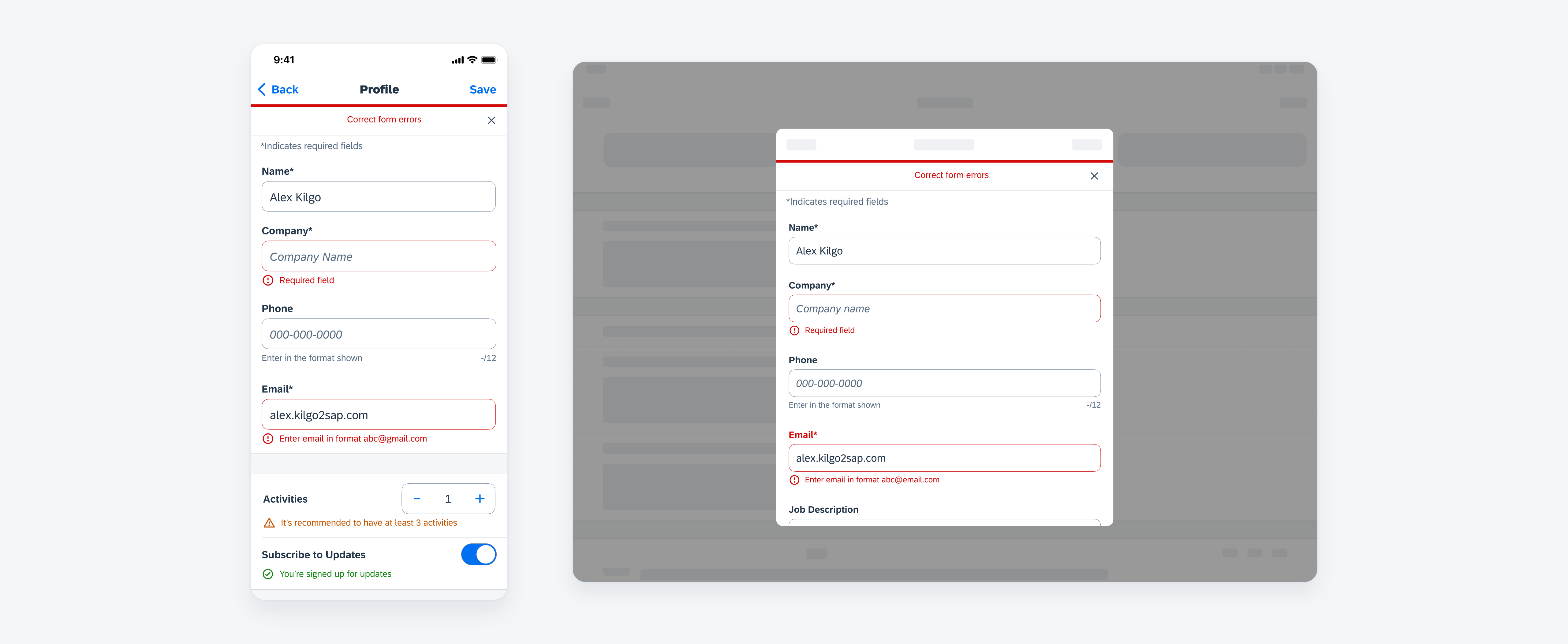
What’s New
This article provides an overview of the topics that have been added or changed based on the controls available in the SAP BTP SDK for iOS.
Design Kit
New Updates via Branches
Updated Design Kit! We’ve transitioned from creating new versions as separate files to updating within the same file using branches. This change ensures a single source of truth, improves collaboration, and simplifies version control by keeping all updates centralized and organized in one place.
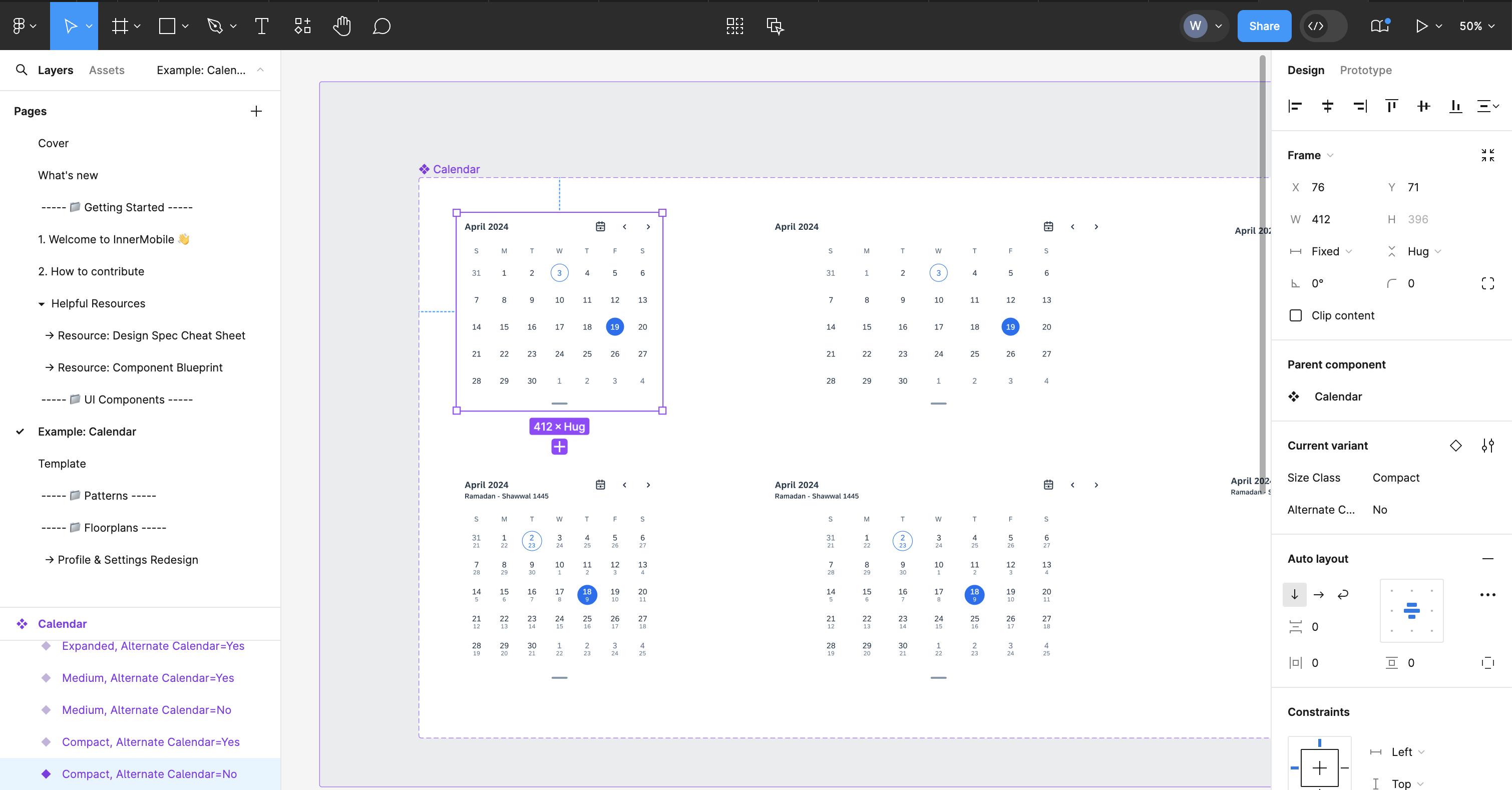
SAP Fiori for iOS Design Kit
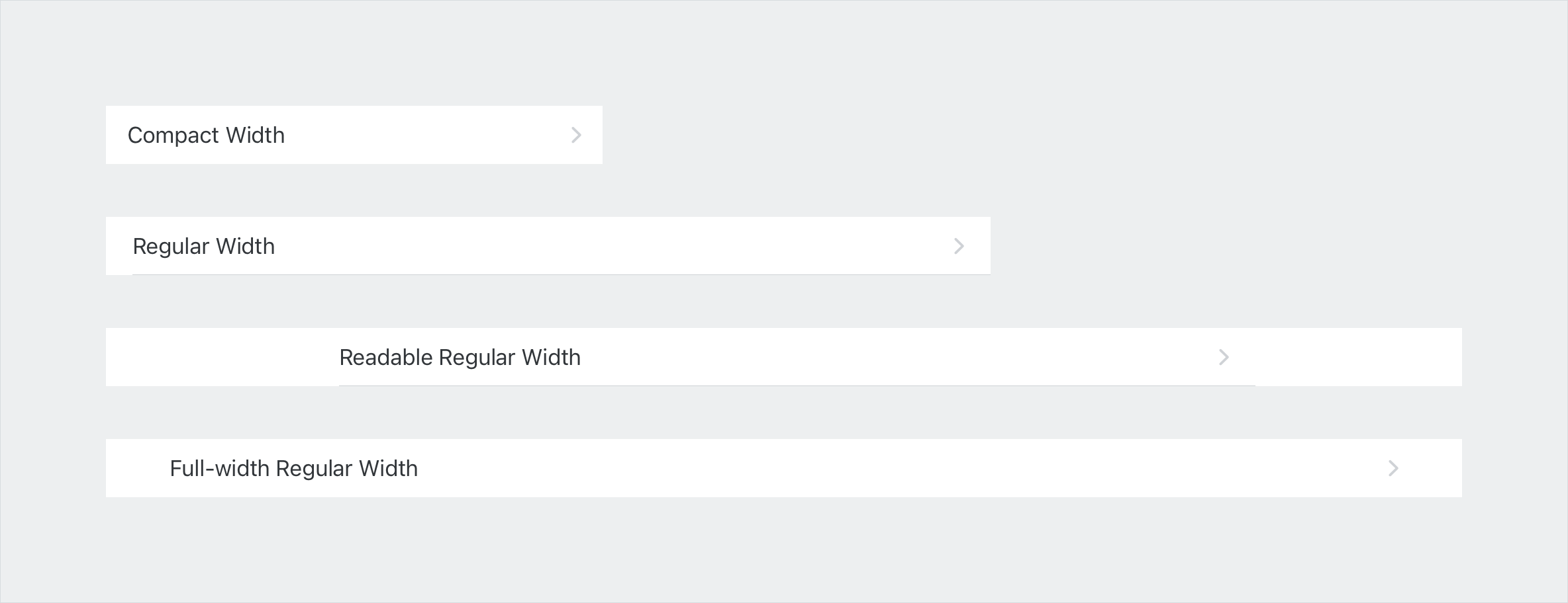
Variables – Cell Style
New variable! Cell style has been added to the variable collection. All the table view cells and form cells can now be switched between a full-width style or an inset grouped style, including the header cell and footer cell. Hairline control has been added to this variable collection as well.
From left to right: full-width cells and inset grouped cells
Foundation
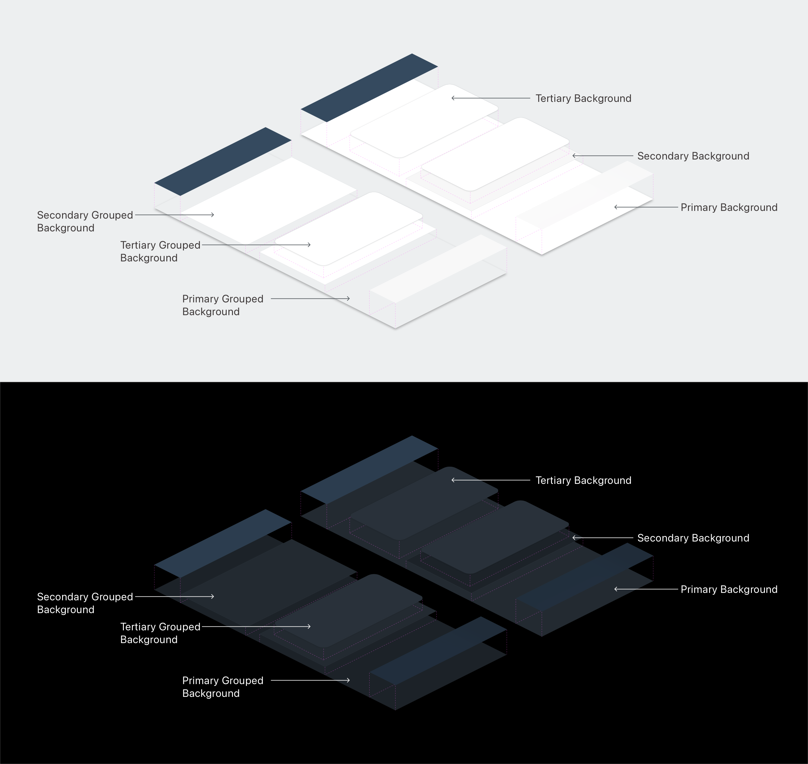
Elevation
New! The Elevation article goes into the details, visual cues, examples, and usage of the elevation system.
Elevation techniques: materials and shadow effect styles
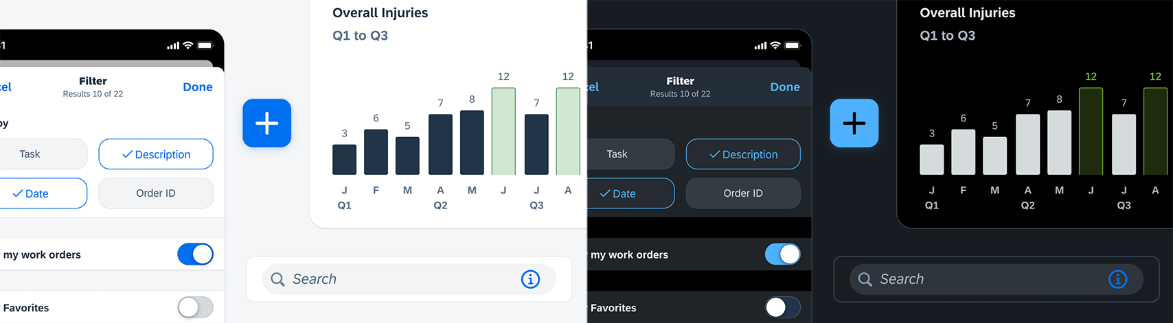
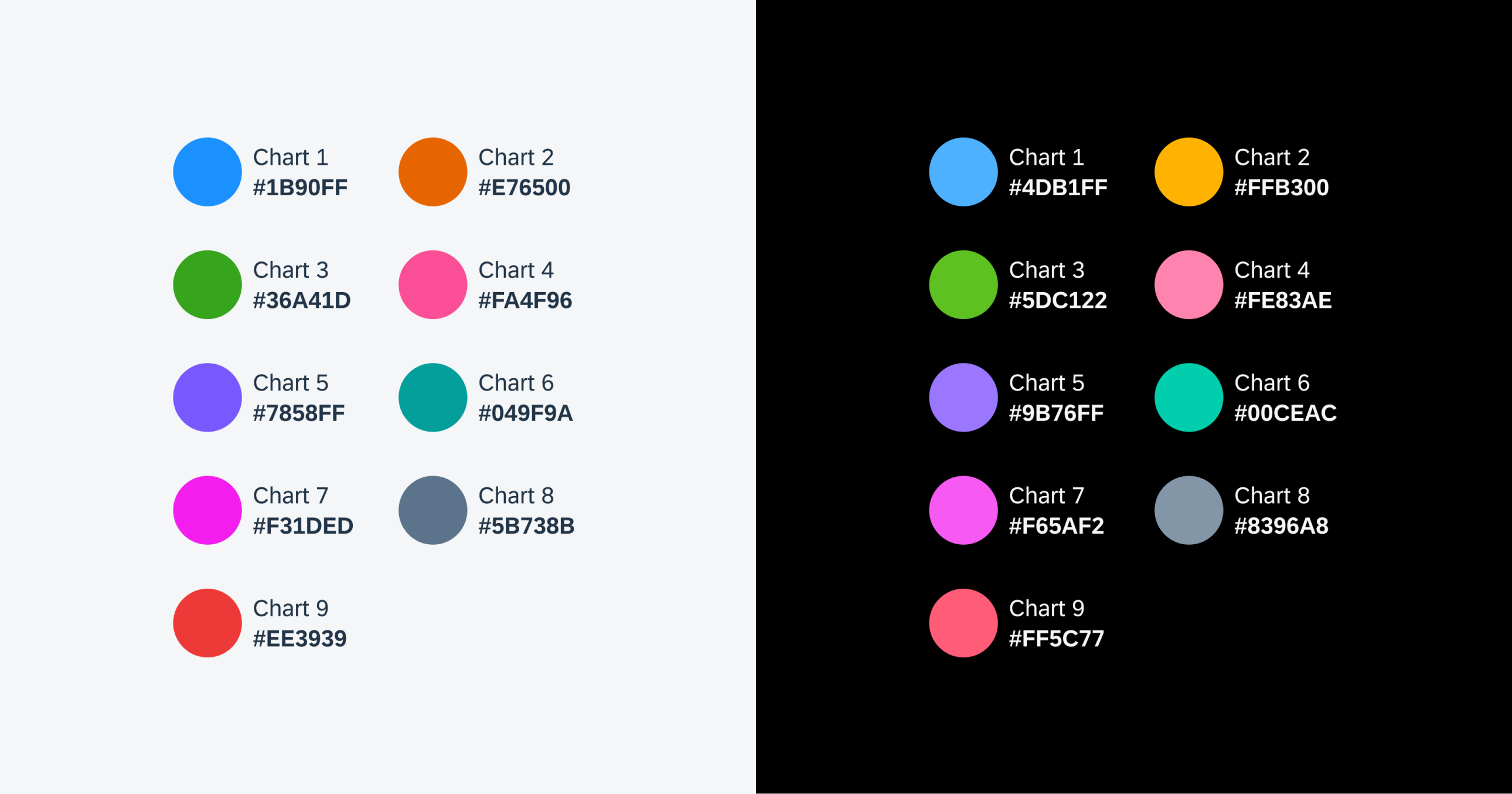
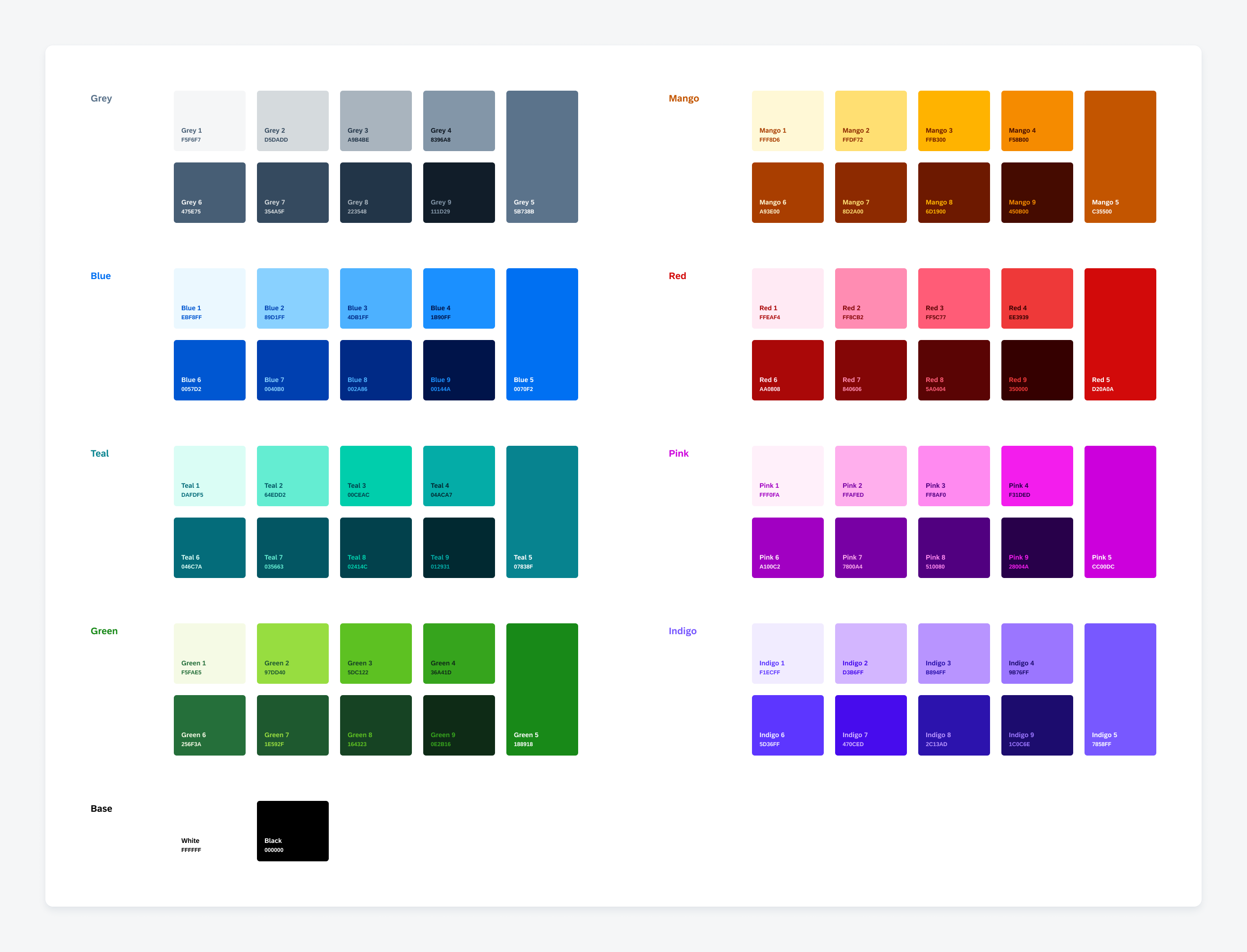
Chart Colors
Update! Chart ordered and semantic colors have been updated to align with new chart colors from web.

Updated chart ordered colors in light and dark modes
UI Components & Patterns
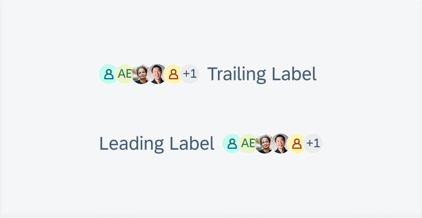
Avatar and Avatar Stack
Feature Enhancements! We have added a grouped layout as well as top and bottom labels for the avatar stack.
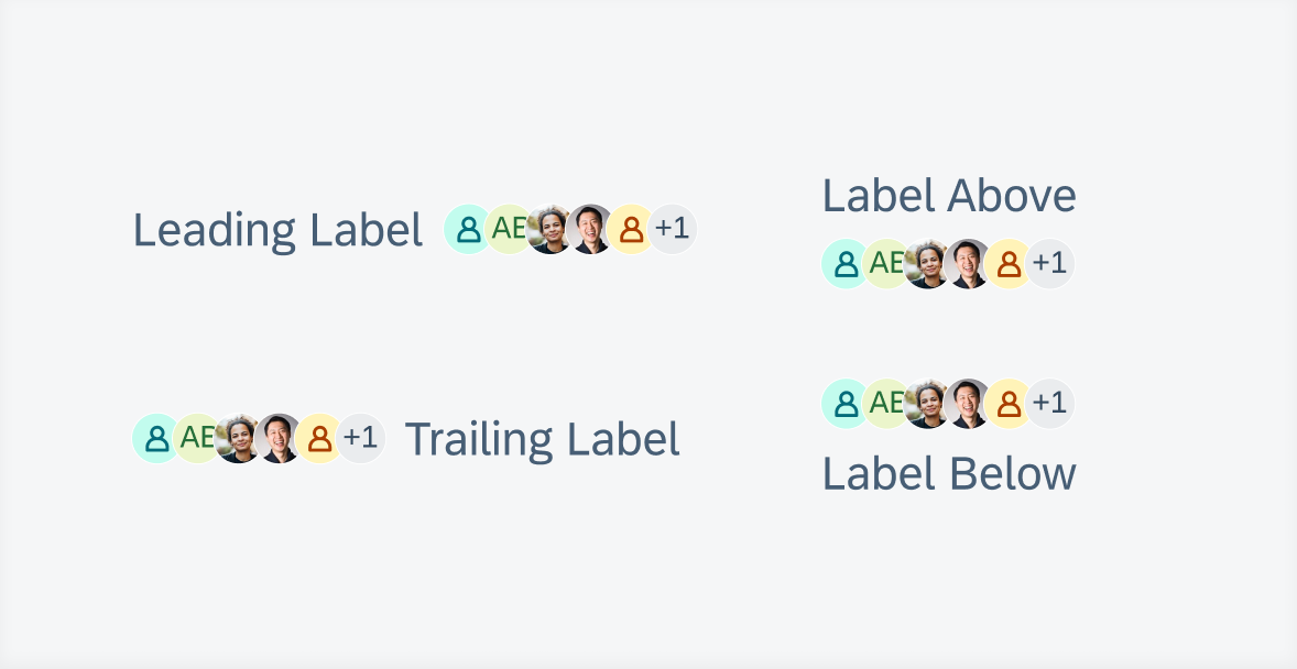
From left to right and top to bottom: leading label, above label, trailing label, and below label
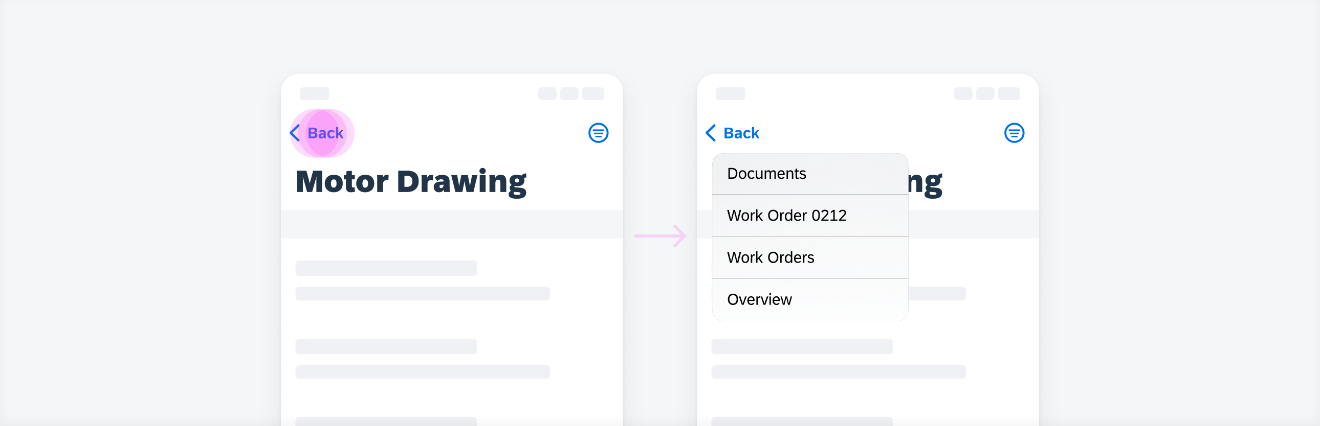
Document Scanner
Feature Enhancements! The document scanner allows for automatic and manual mode scanning with border detection, can also do multiple page scanning and editing.
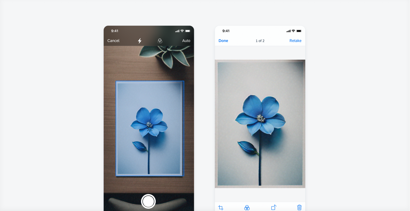
Document scanner views
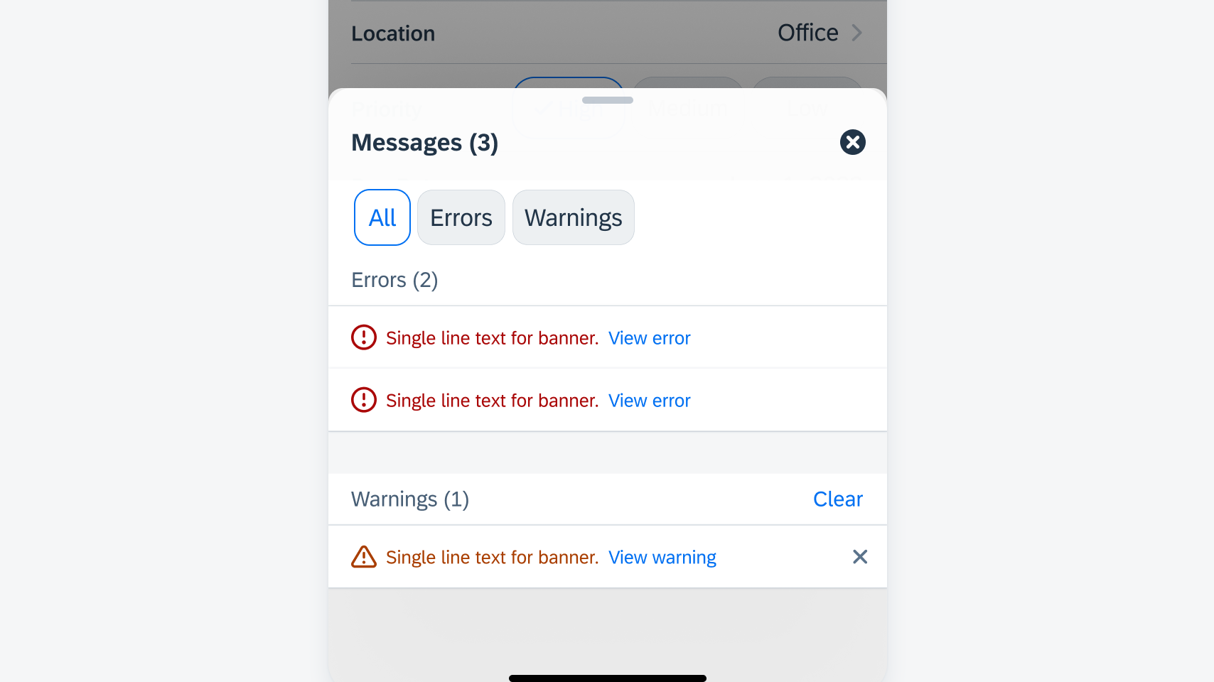
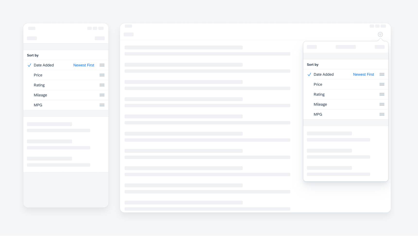
Feedback Patterns
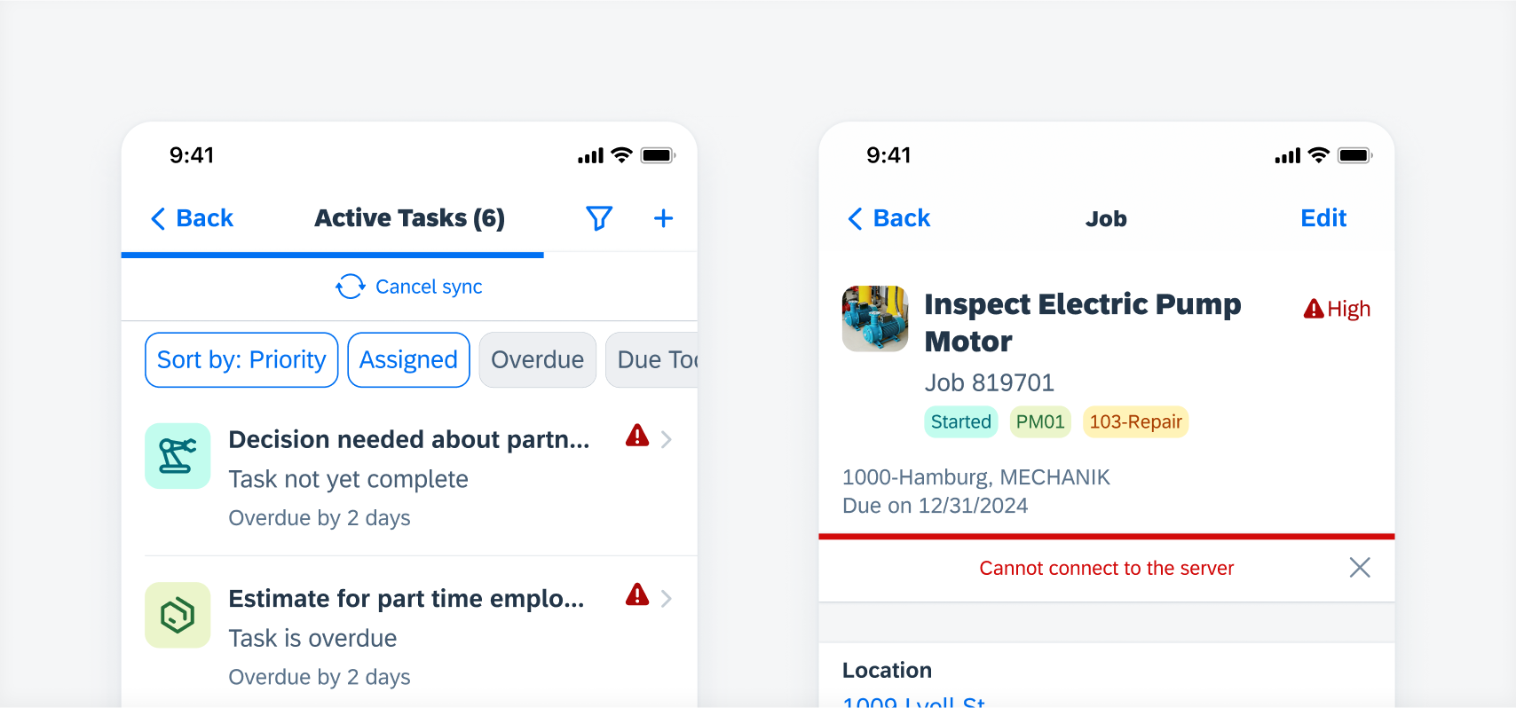
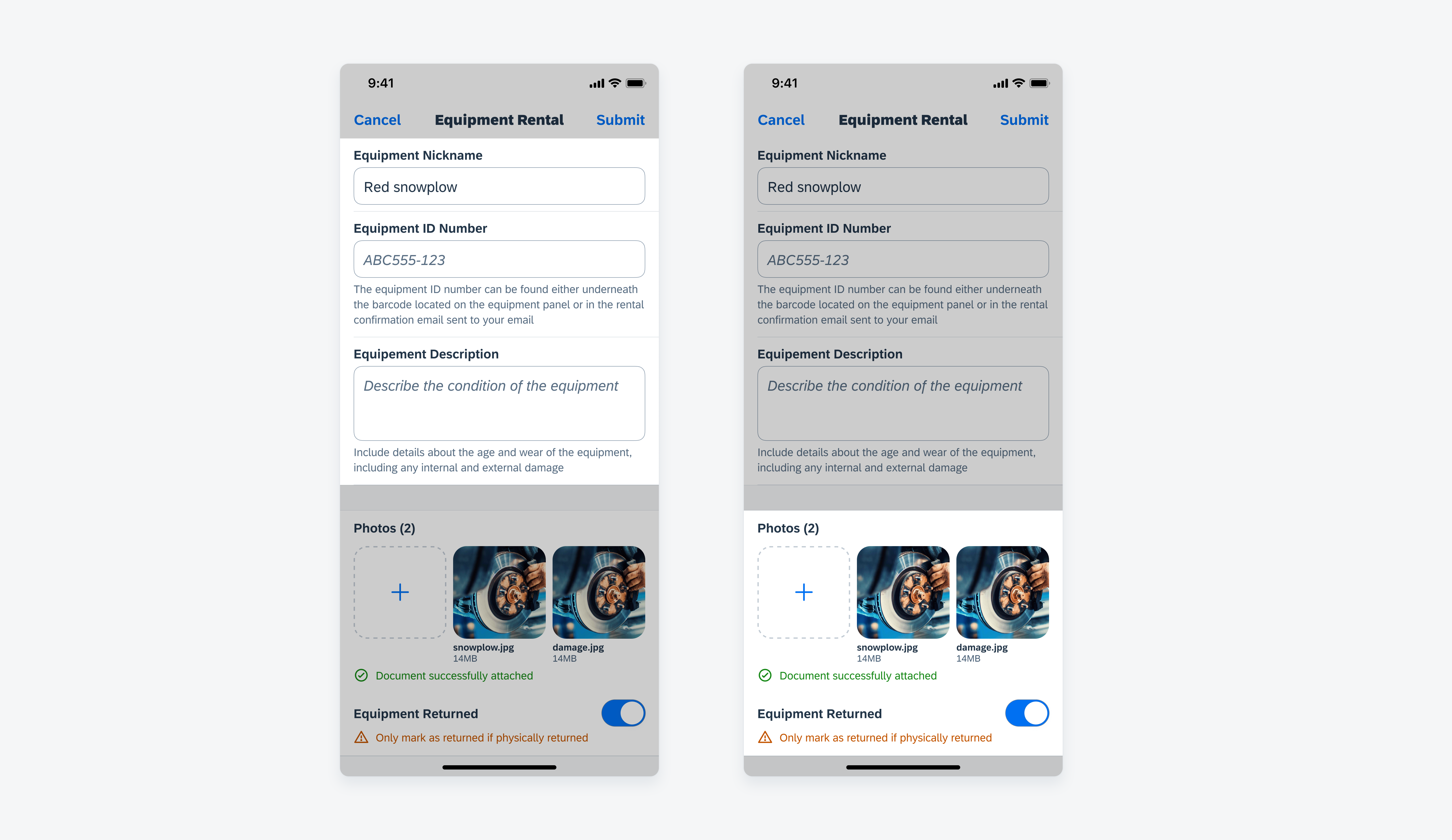
Feature Enhancements! Multi-message handling has been added to the feedback patterns. When a screen contains multiple messages, the banner can show an overview of the type and number of messages with an action link to open a multi-message handling detail view.
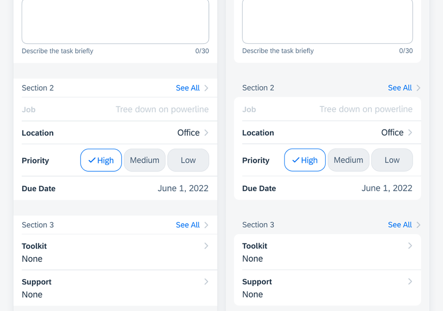
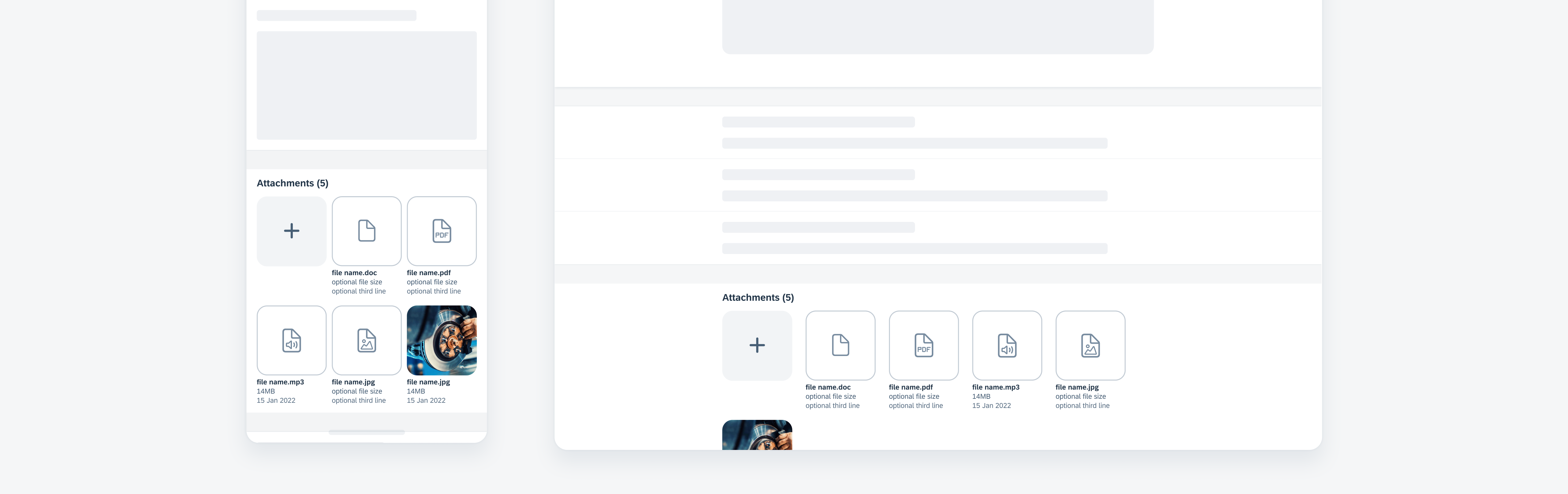
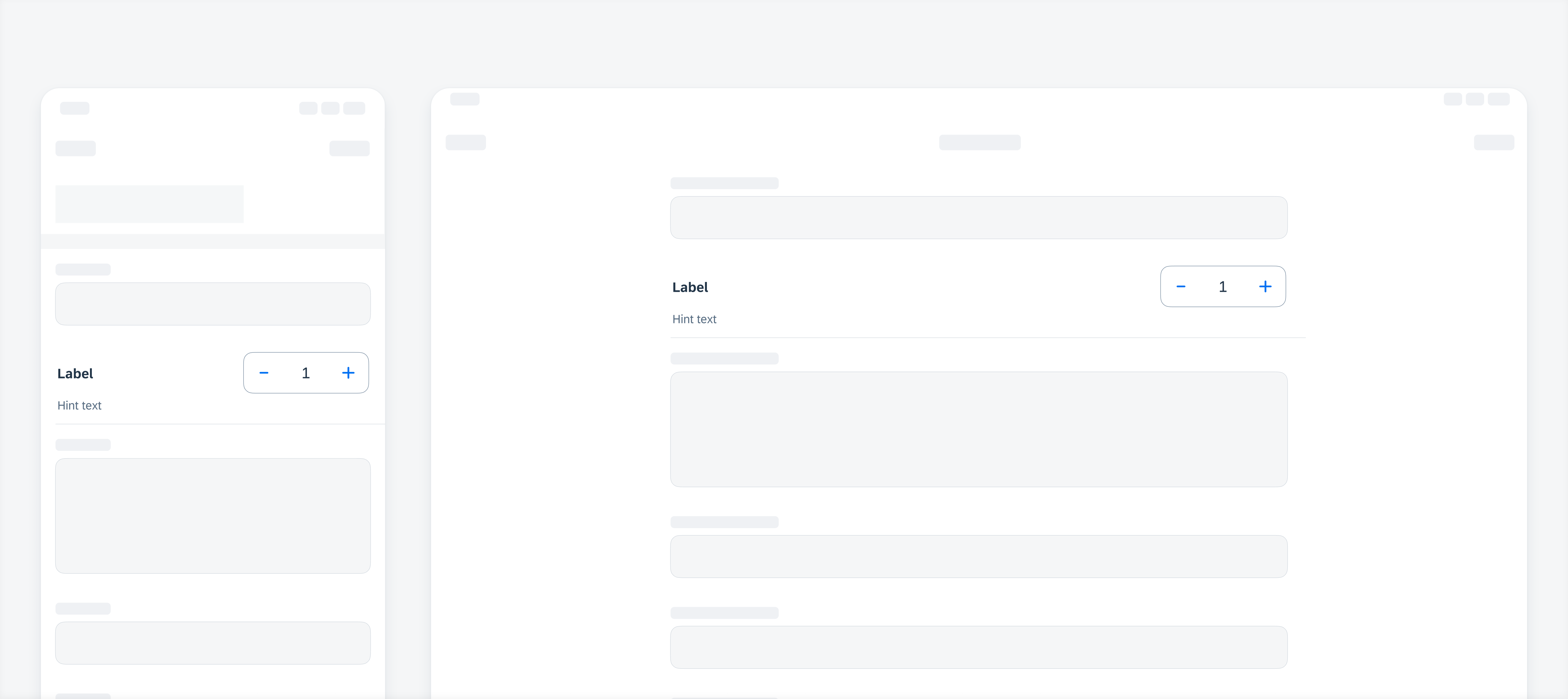
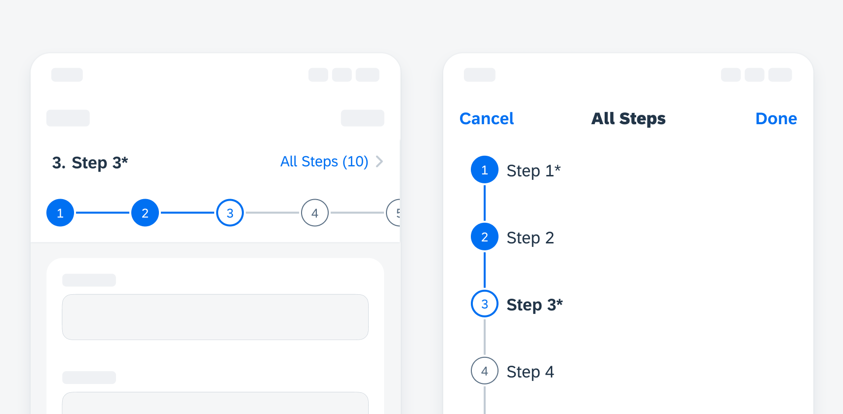
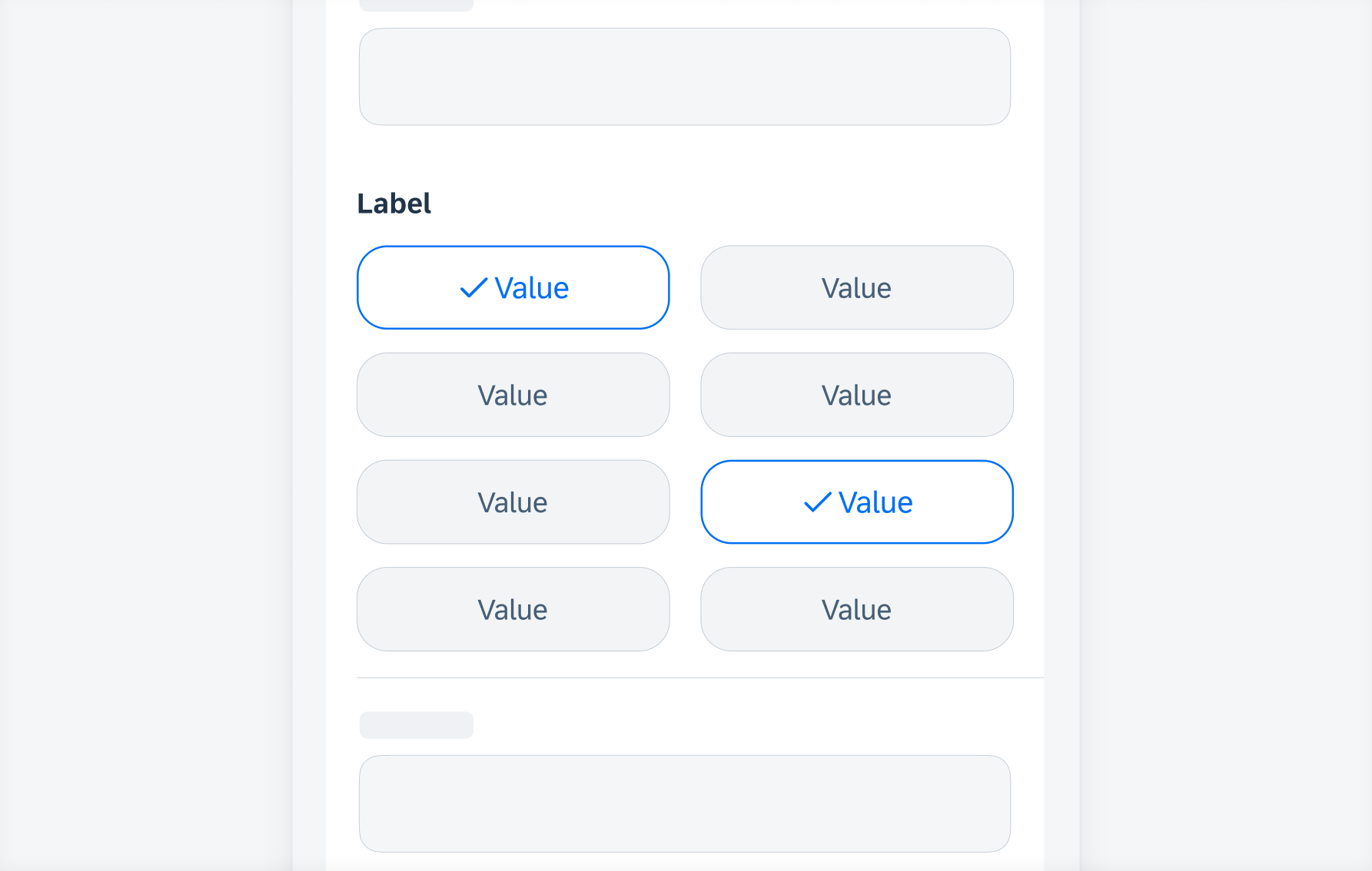
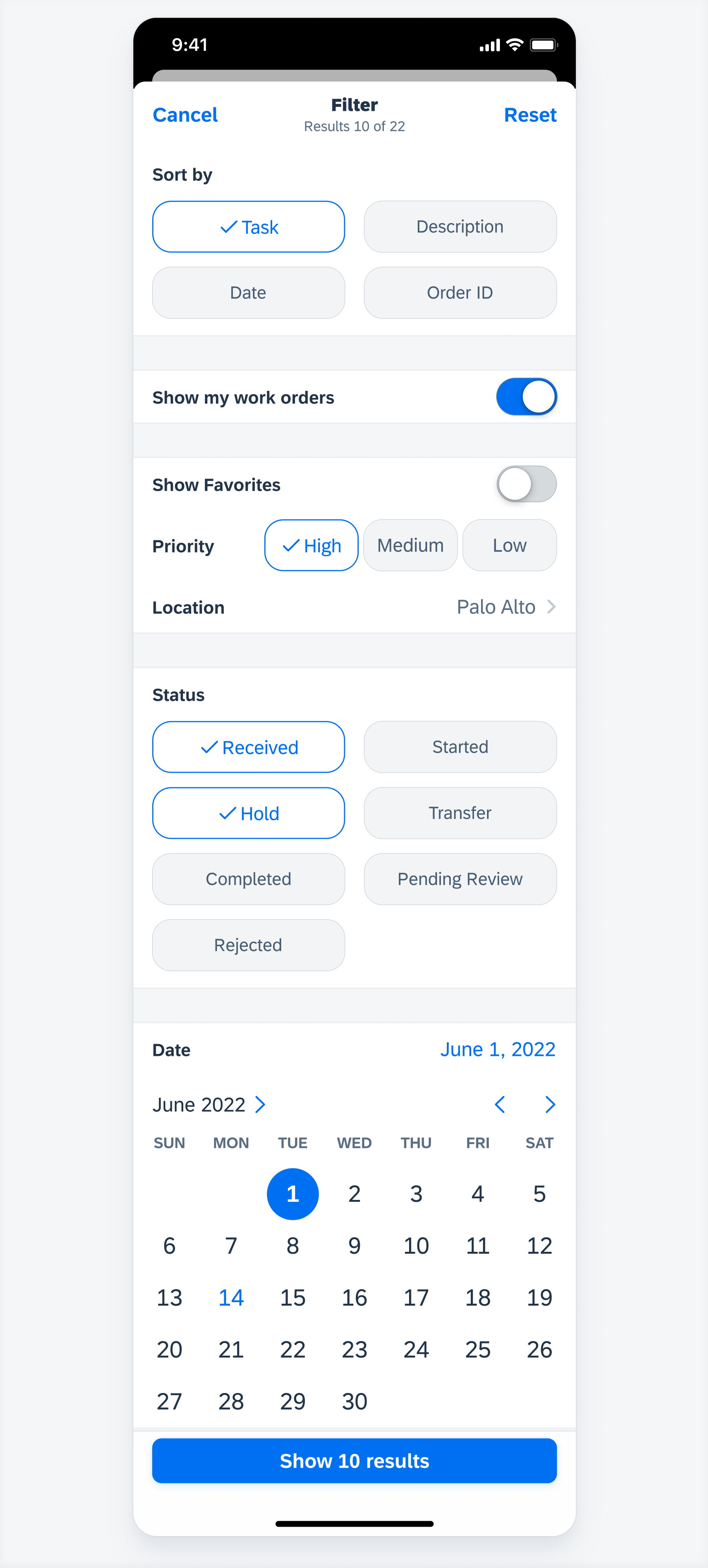
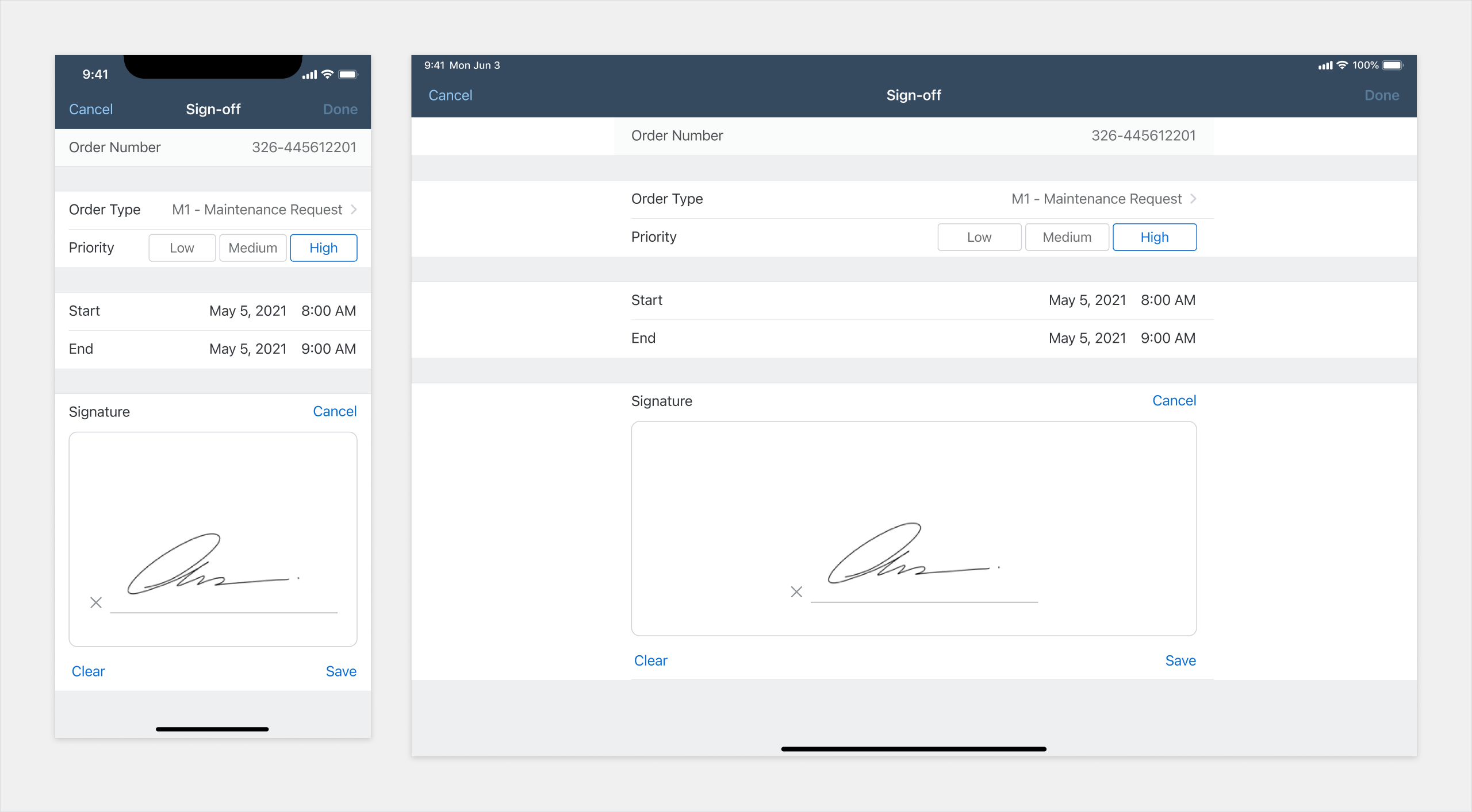
Form Cells
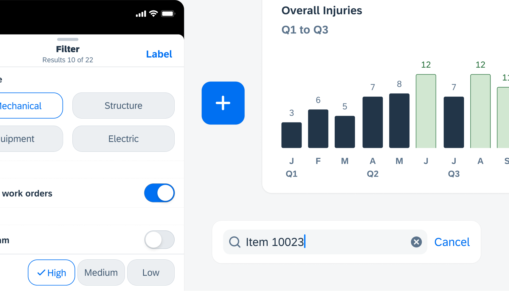
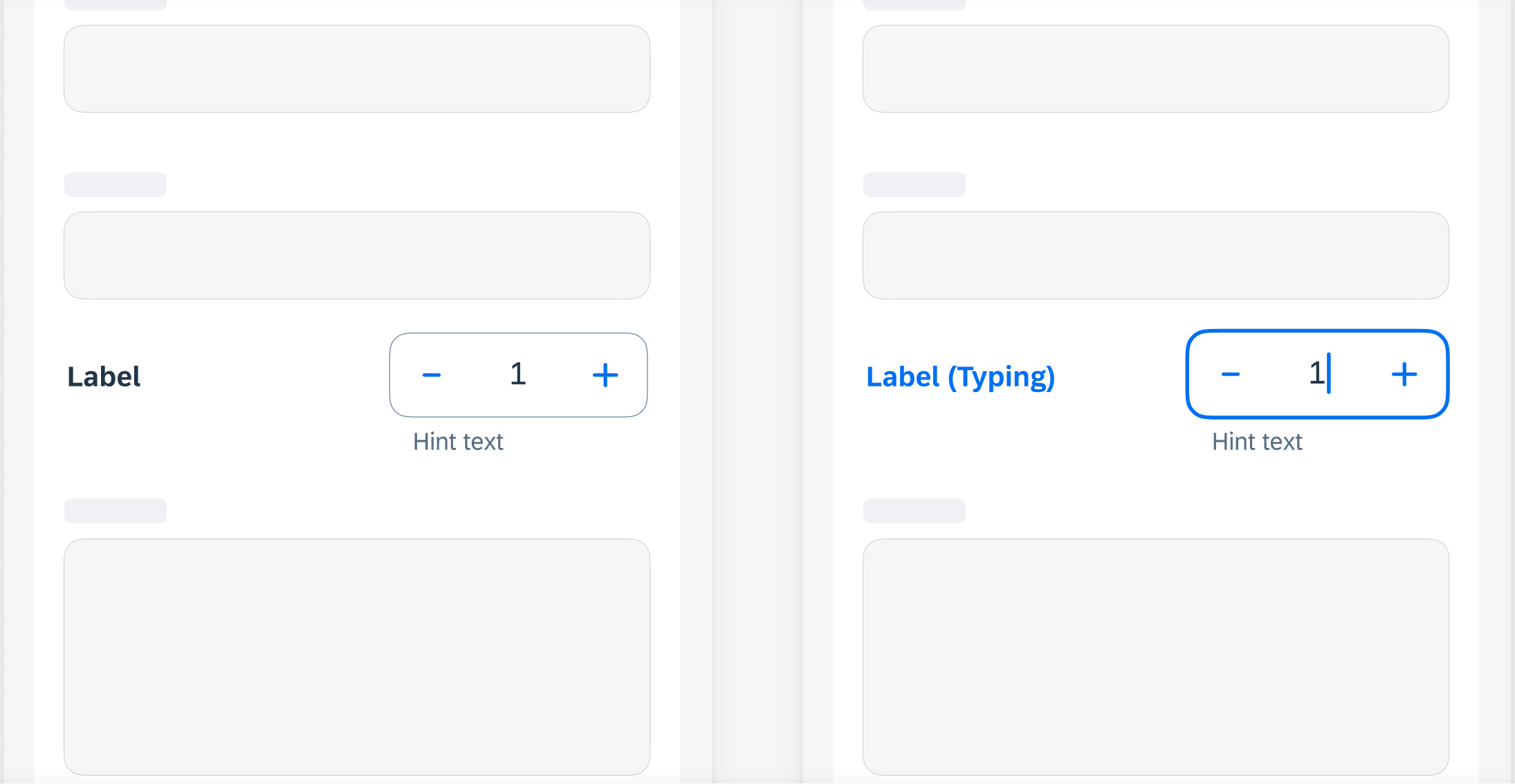
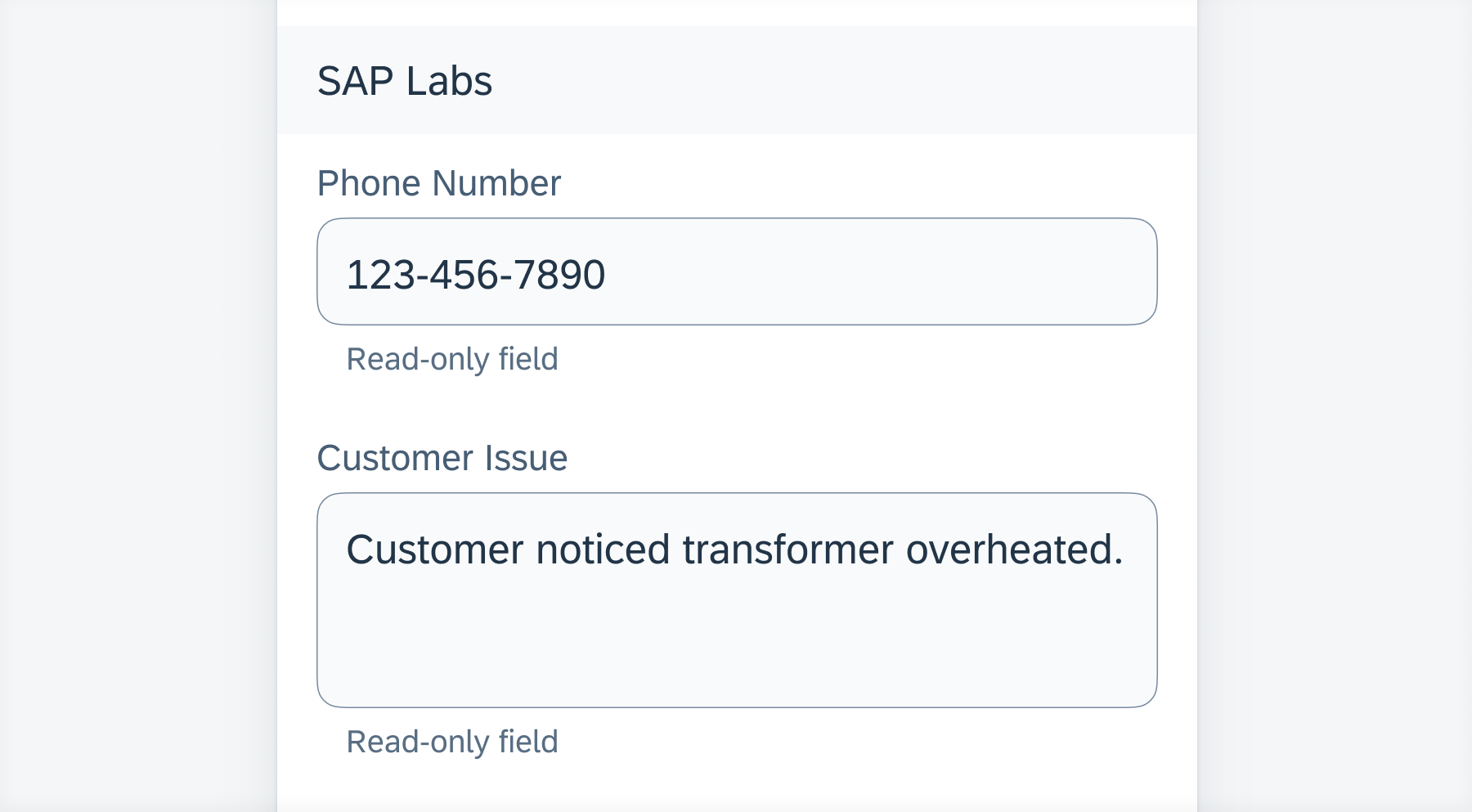
Feature Enhancements! Attachments form cell, filter form cell, and segmented control form cell now have required field behavior available.
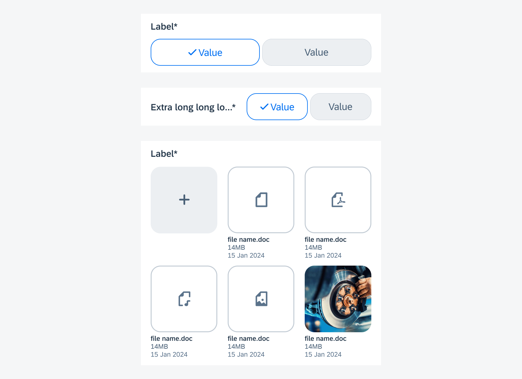
From top to bottom: filter form cell, segmented control form cell, attachments form cell
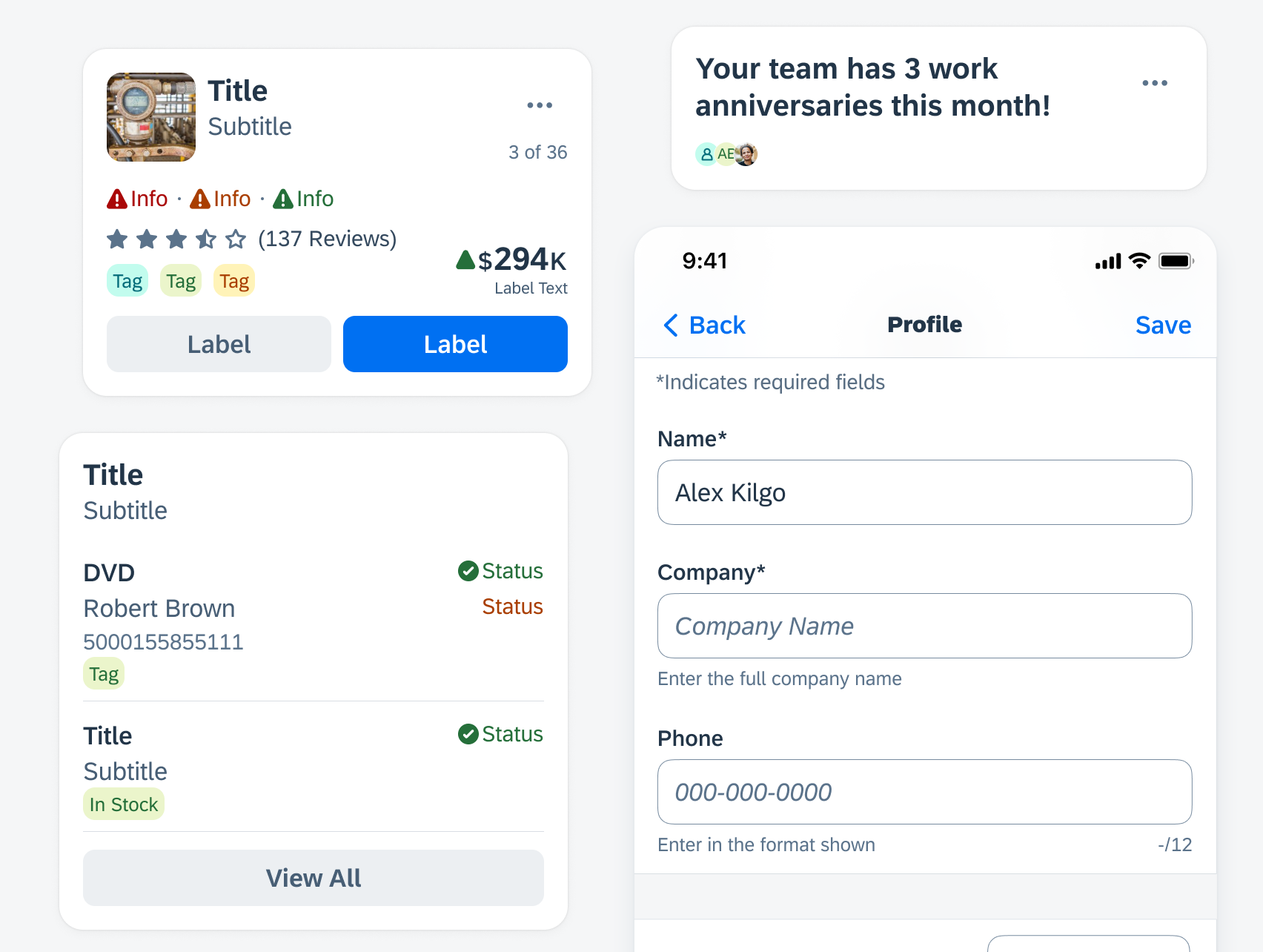
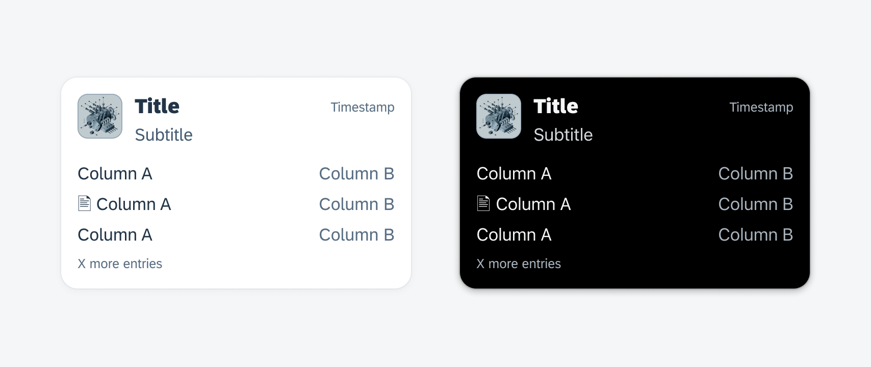
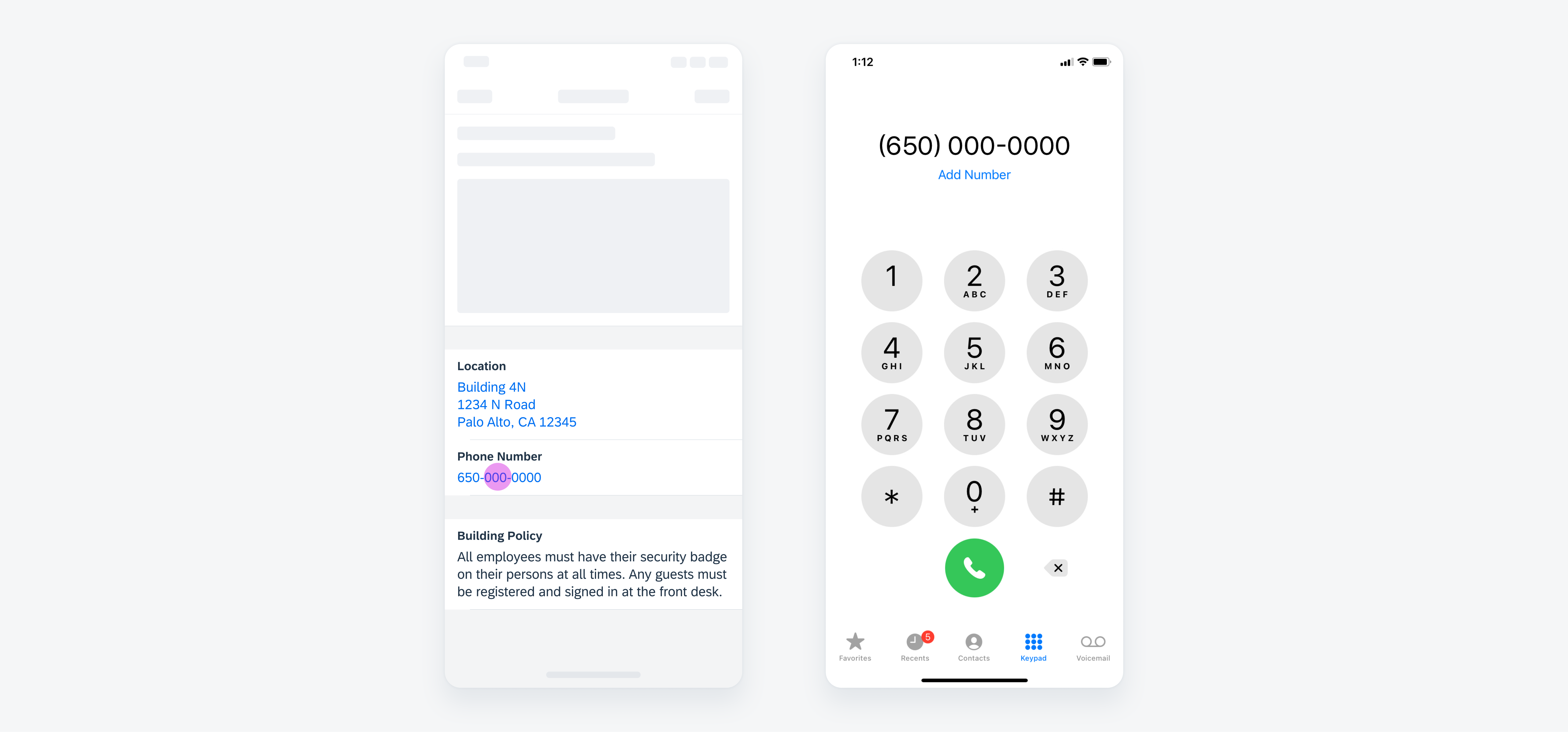
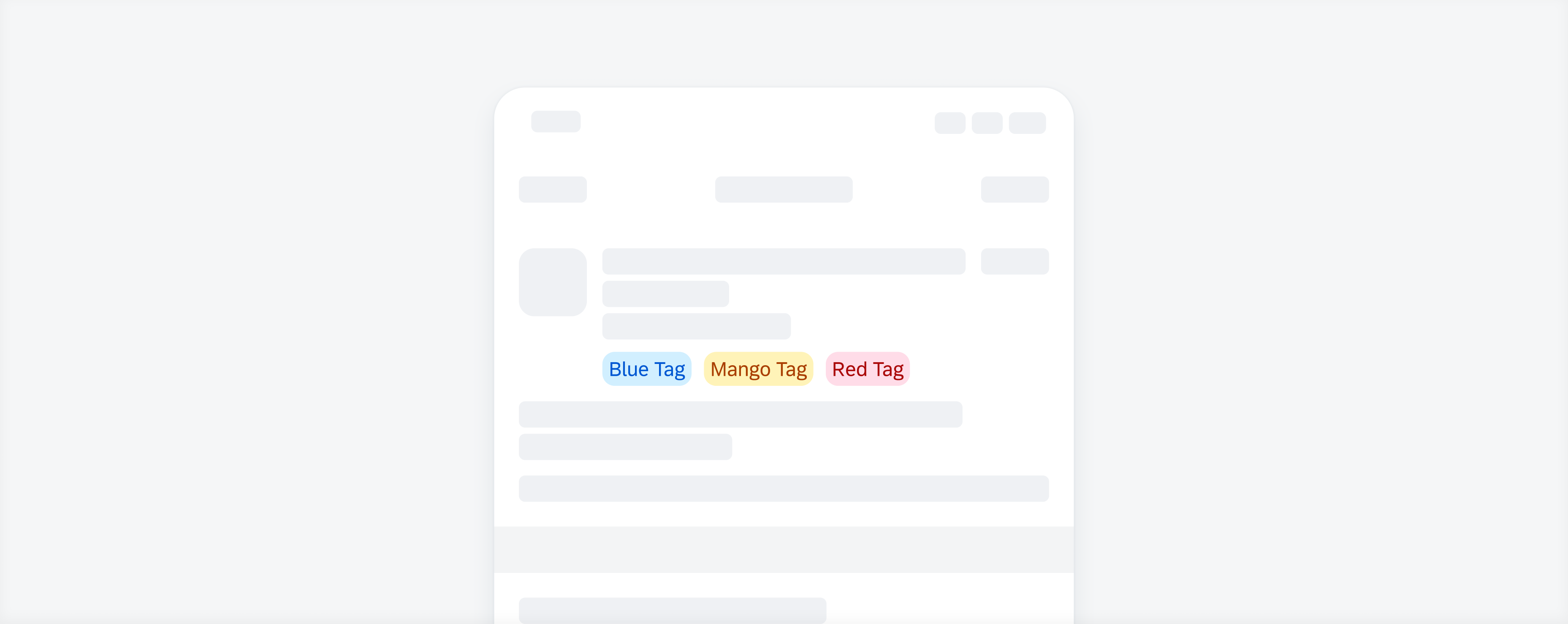
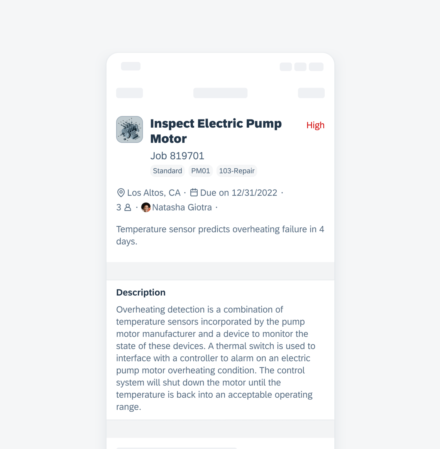
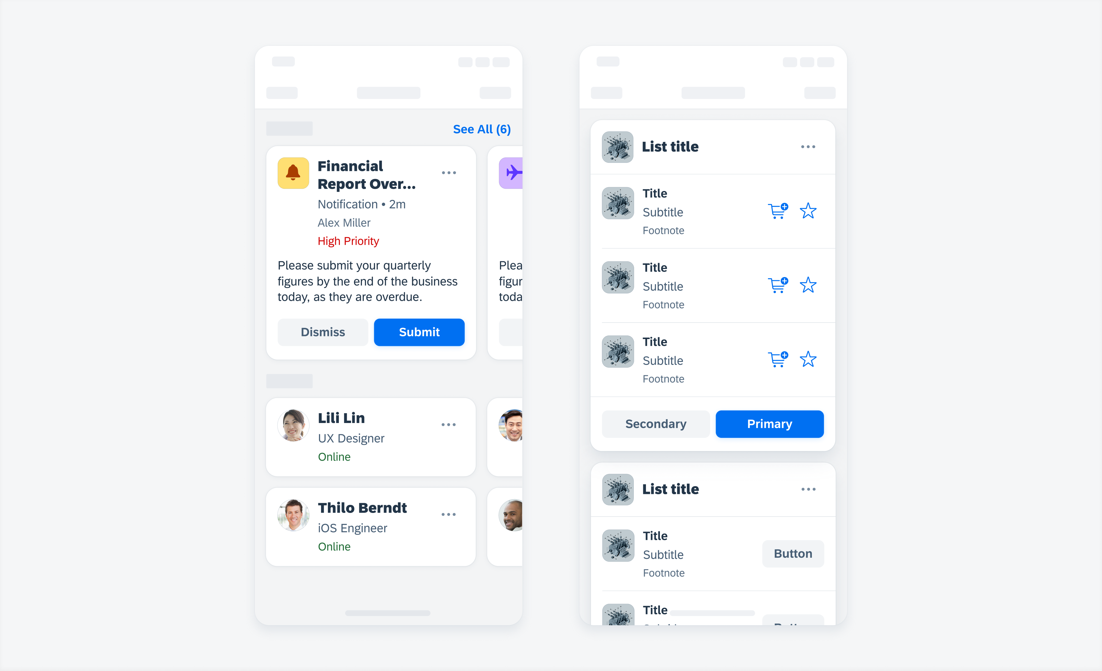
Object Cell
Feature Enhancements! The object cell has been enhanced to provide more flexibility, which mirrors the modular structure of the cards component including swappable nested elements such as the rating control.
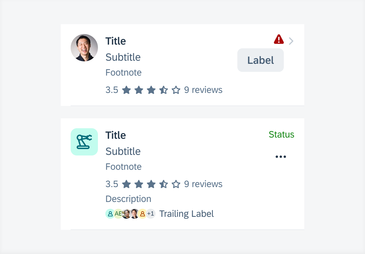
Object cell with label button and rating control (top) and with avatar stack and overflow button (bottom)
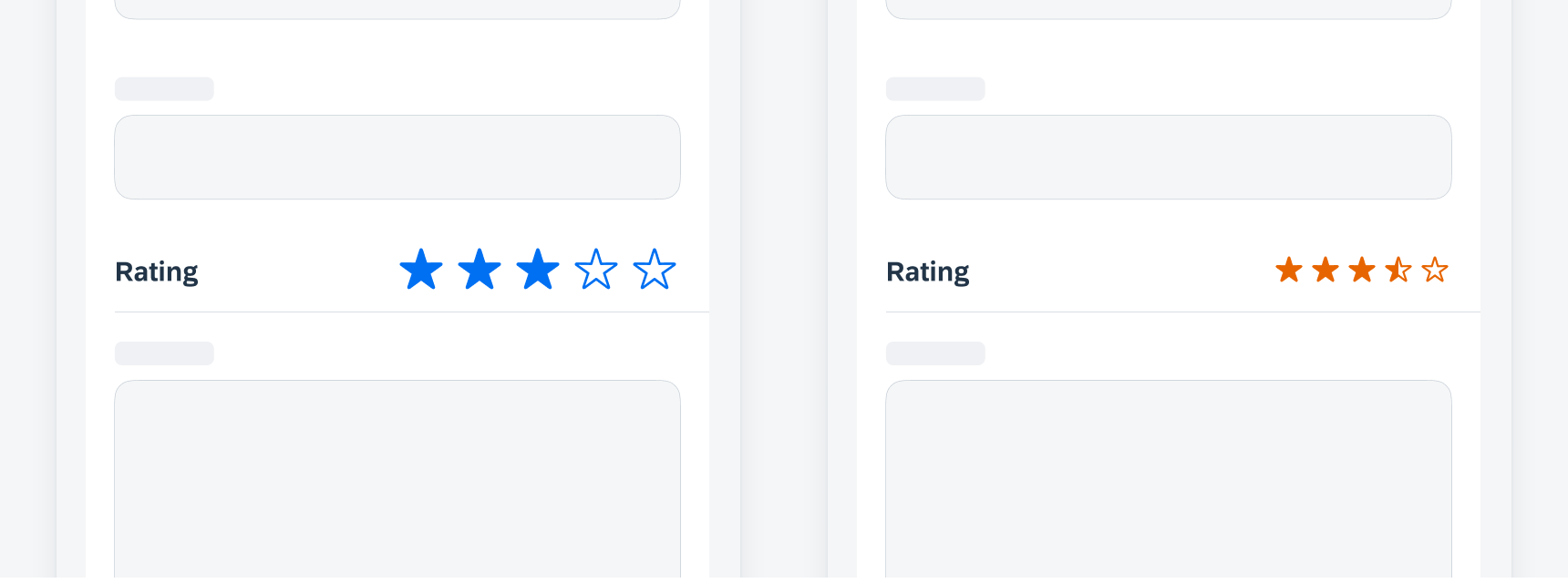
Rating Control
Feature Enhancements! We have added half stars for read-only rating controls as well as optional leading and trailing text. The read-only star sizes have been enhanced and small sized editable and disabled rating controls have been removed for better accessibility.
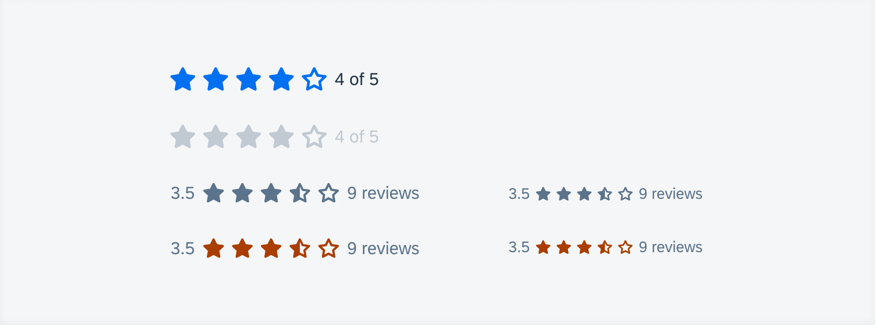
From top to bottom: editable, read-only, disabled, and accented read-only rating controls. From left to right: large sized and small sized rating controls
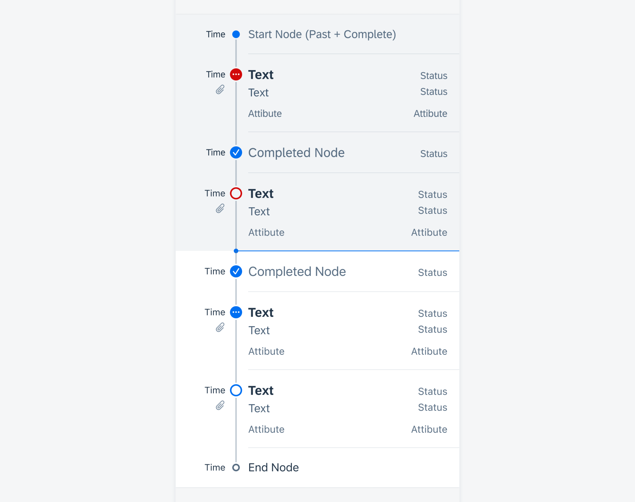
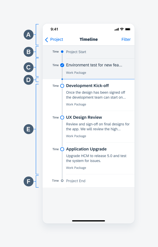
Step Progress Indicator
Feature Enhancements! The step progress indicator has been enhanced with icon nodes as an alternative to numeric nodes.
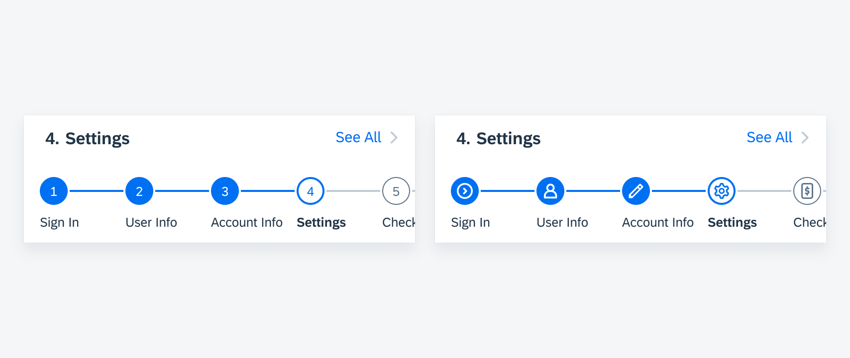
From left to right: numeric nodes and icon nodes
Foundation
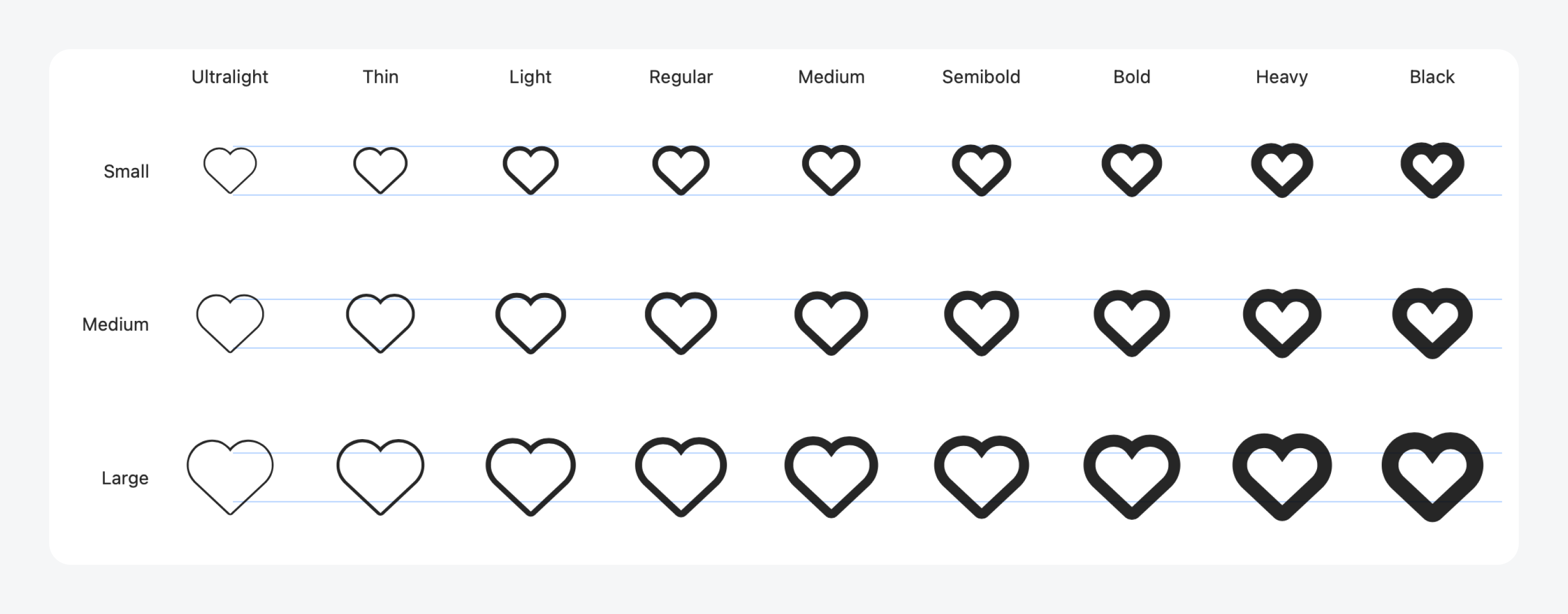
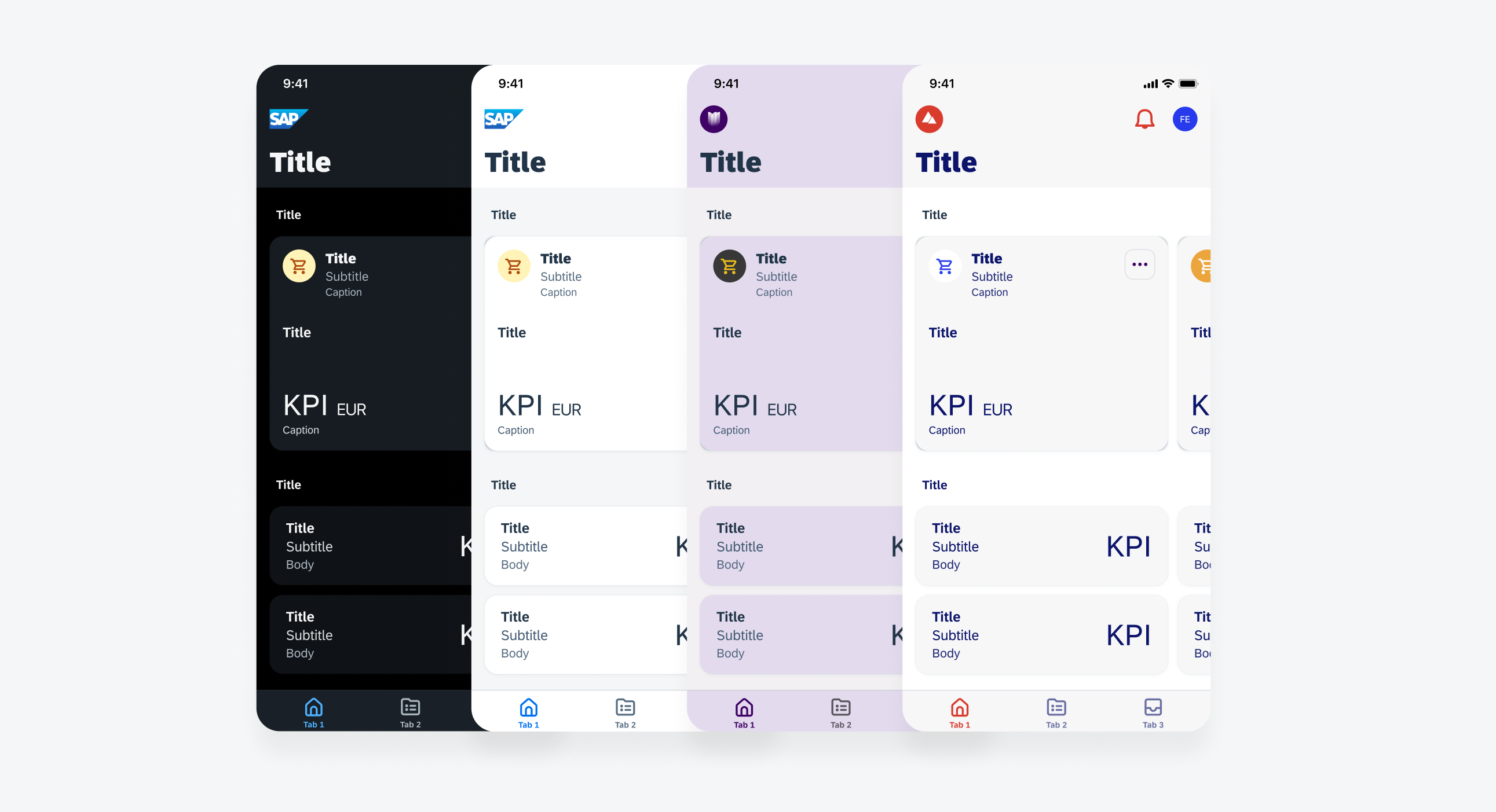
SAP 72 Semibold Weight
Updated Typography! New semibold weight has been applied across the design kit and SDK. Formerly black font weight is now bold, and bold is updated to semibold. Exceptions to the approach include navigation bar title, KPIs, and card headers.
Examples of 72 Semibold type update in cards and form (bottom right)
UI Components & Patterns
Avatars and Images
Updated Component! Multiple avatars can be grouped horizontally in an avatar stack. The avatar stack can now also display an optional label in front of (leading) or after (trailing) the avatar stack. However, we do not recommend using both the leading and trailing labels together.
Avatar stack with a leading (left) and trailing label (right)
Banners
Updated Component! By default, a banner partially covers the content below it. Now, banners can also appear between elements, making sure they don’t cover any content. In this position, the banner pushes the content below it down.
An embedded banner below a navigation bar (left) and an object header (right)
Buttons
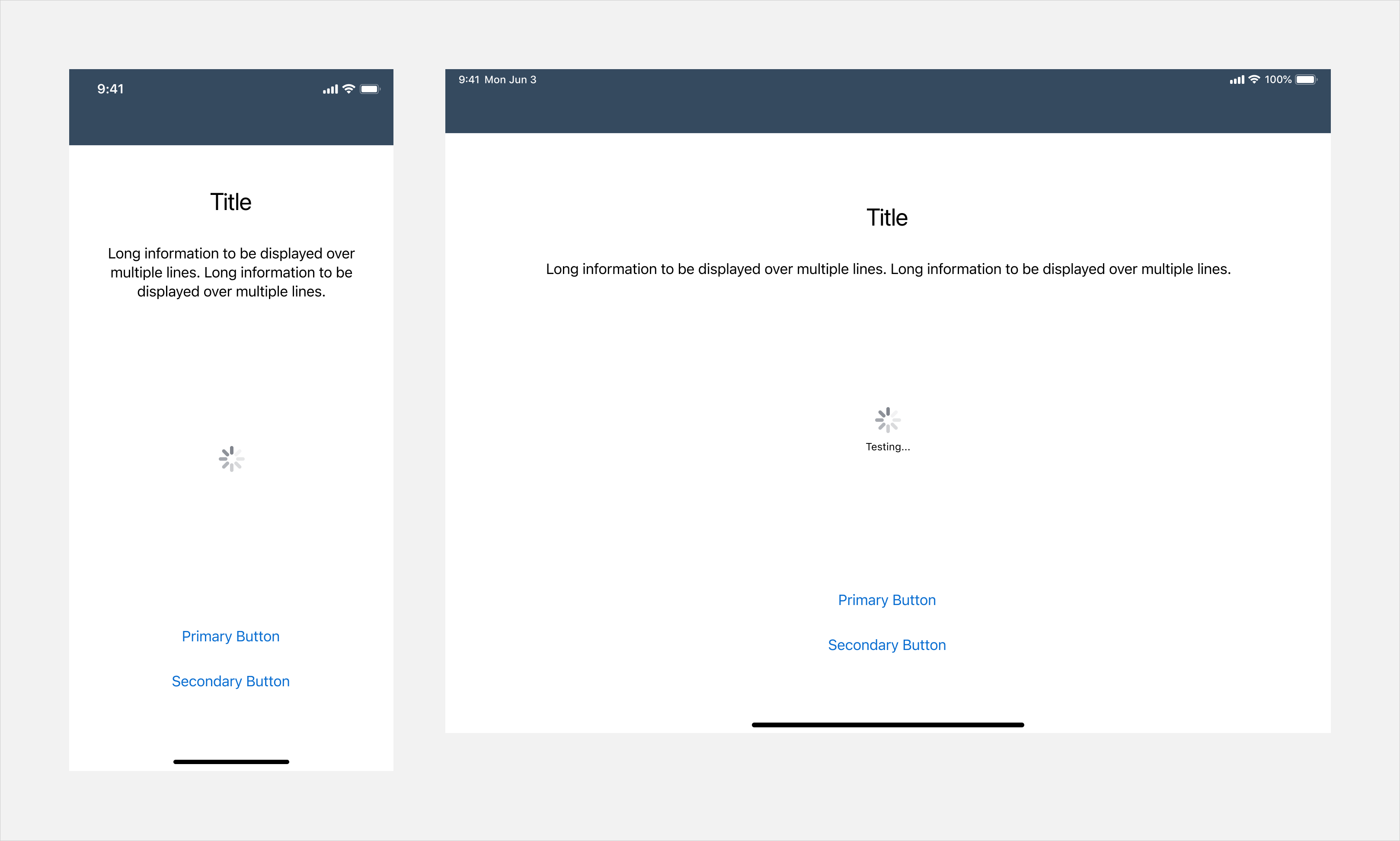
Updated Component! The new variant of loading state in buttons (“FUILoadingButton”) can be applied to a button when a user-triggered non-disruptive progress is being processed. The original icon and/or text is replaced with an activity indicator and/or loading message.
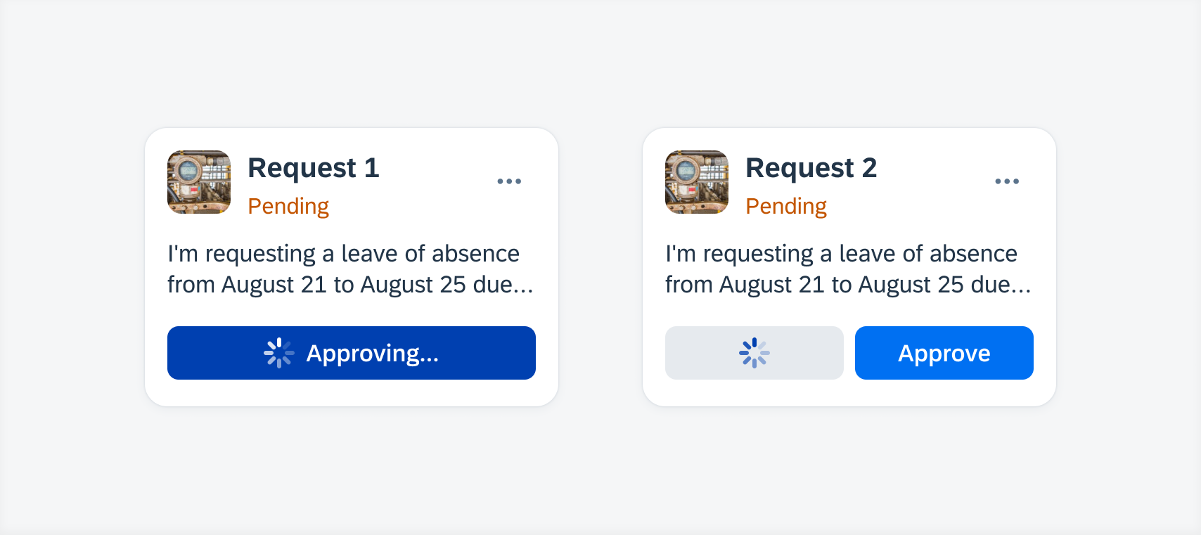
Loading state primary button (left) and secondary button (right)
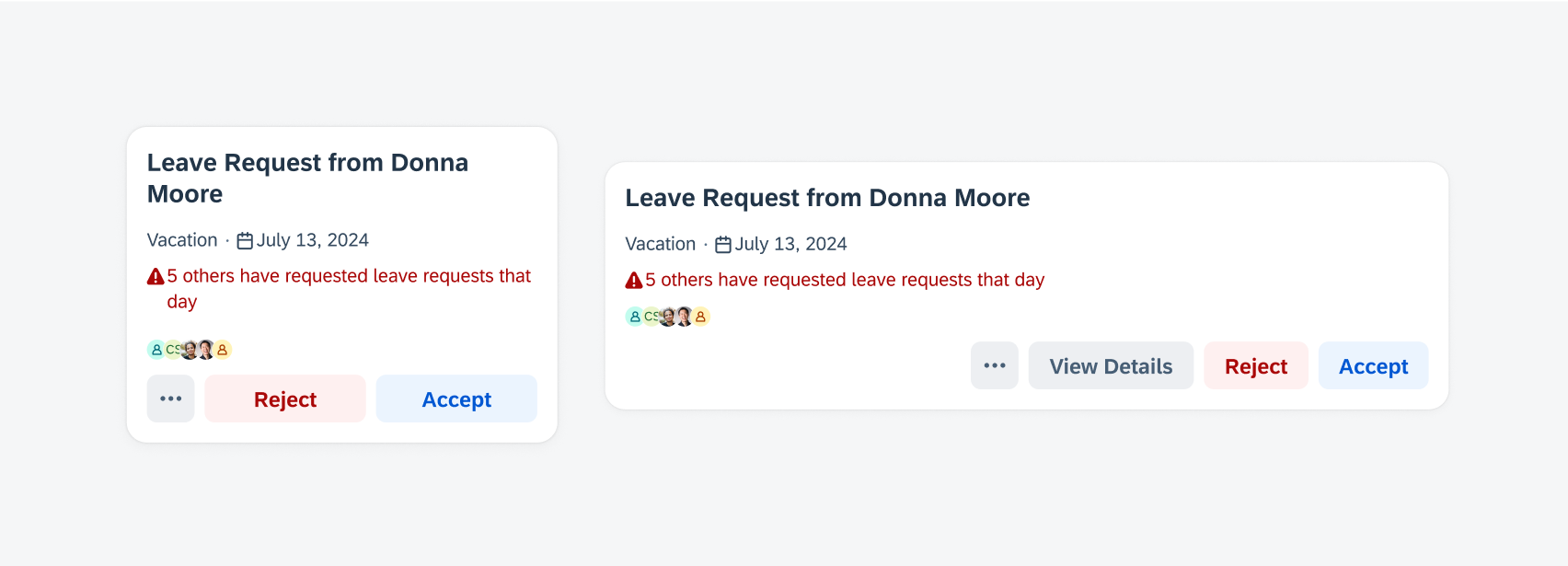
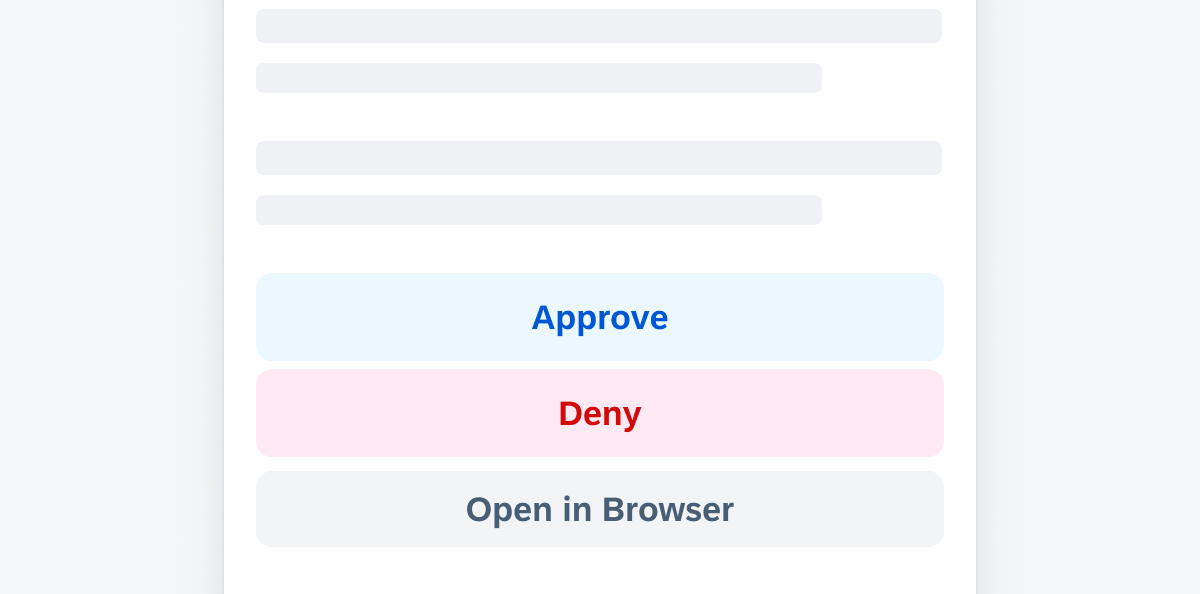
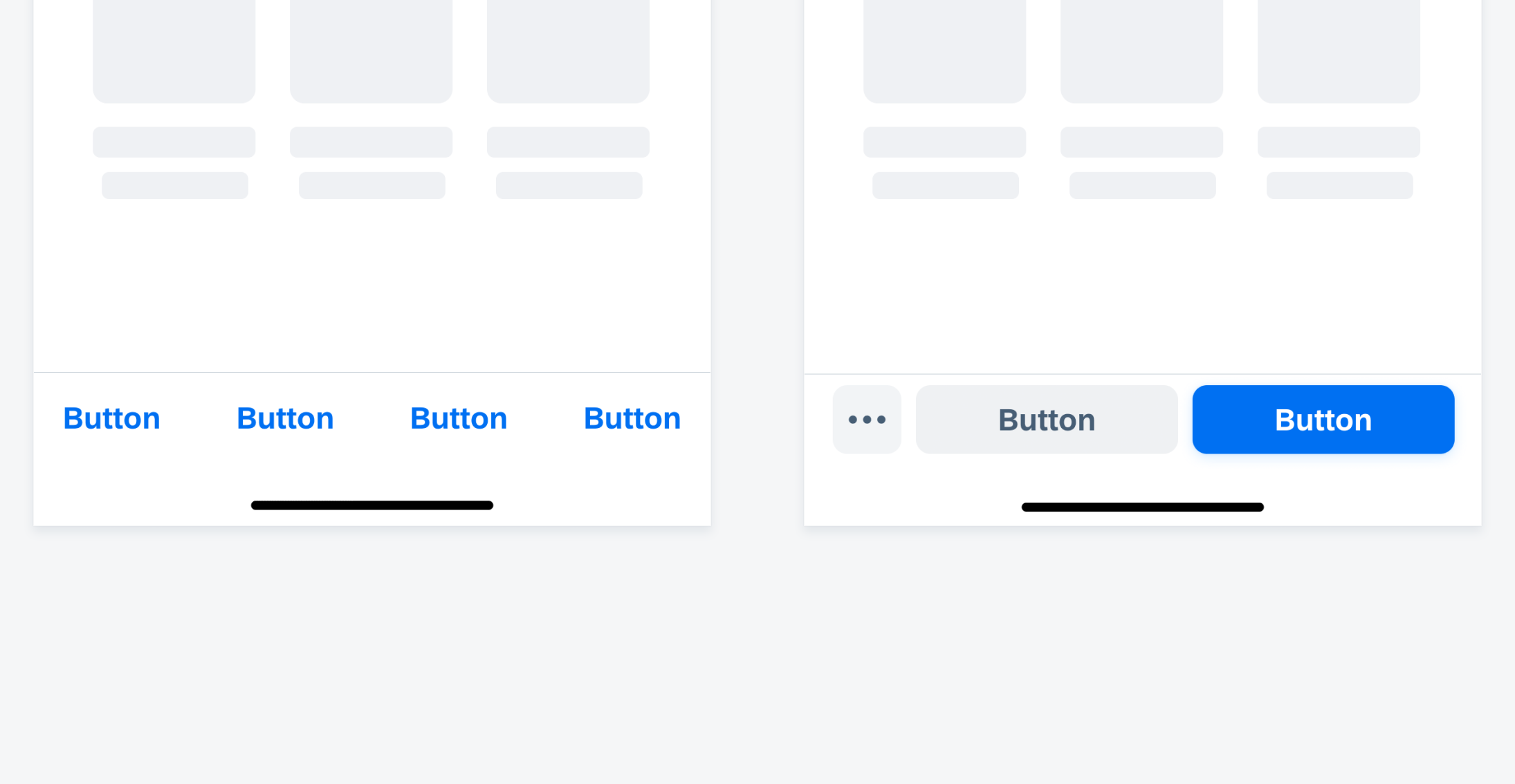
Cards
Updated Component! The card footer now allows using an overflow button if there are more than two buttons or when the buttons do not fit into the footer’s width. Tapping on the overflow button shows the user the additional buttons in a menu.
Loading state primary button (left) and secondary button (right)
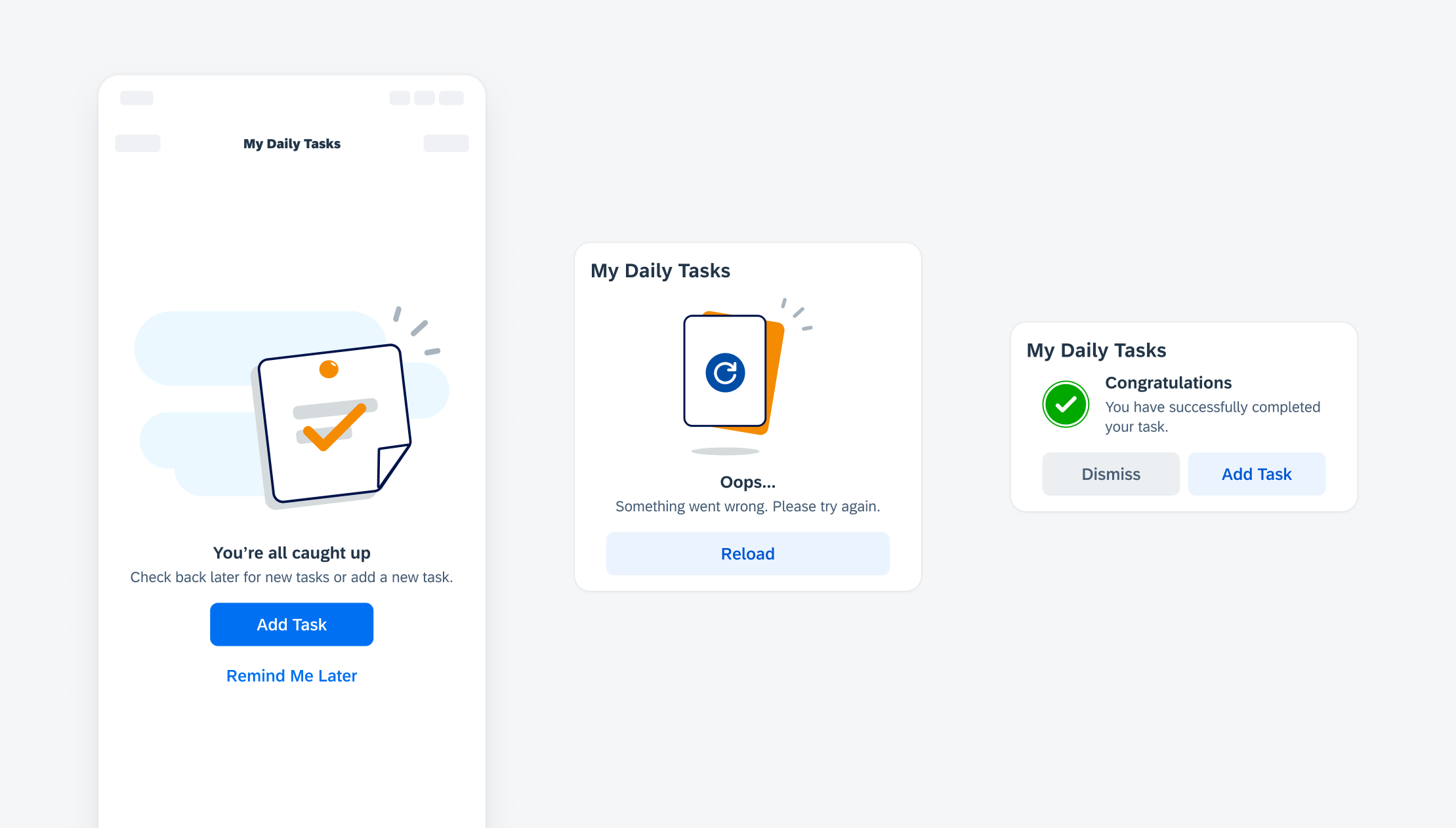
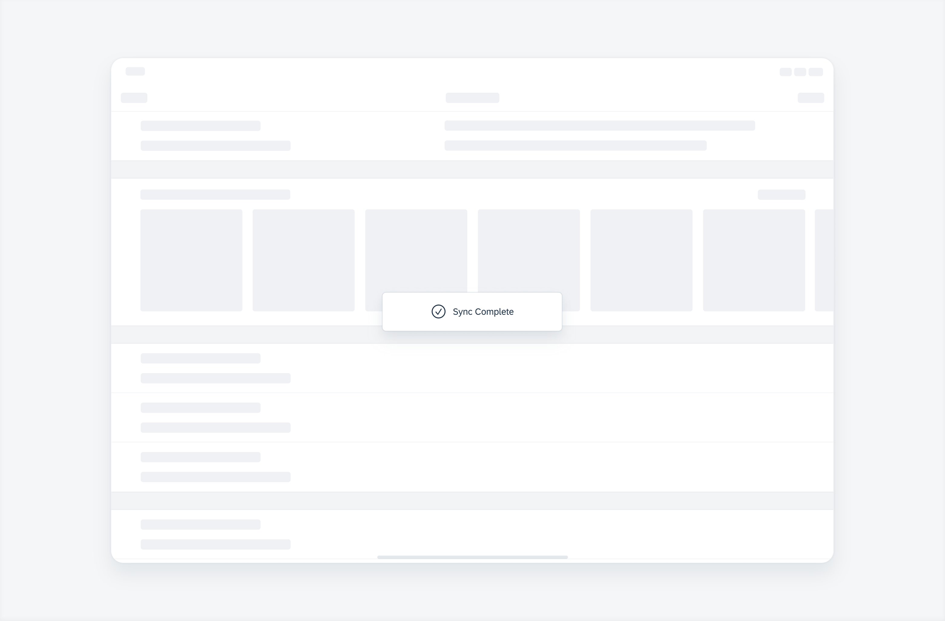
Feedback Indicators
Updated Pattern! The design of the progress and processing indicators has been updated with thicker indicator strokes, a light grey track, and the SAP Fiori icon inside.
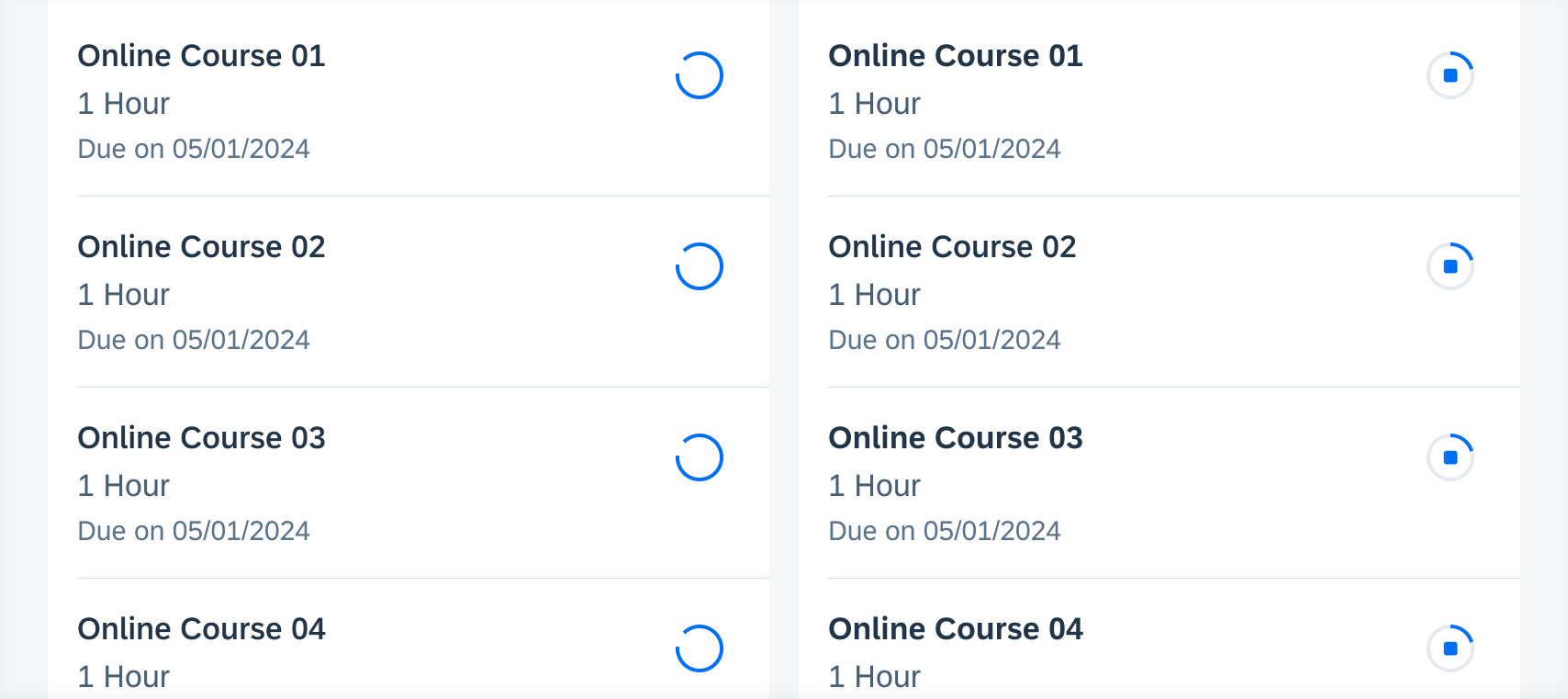
Processing indicator (left) and progress indicator (right)
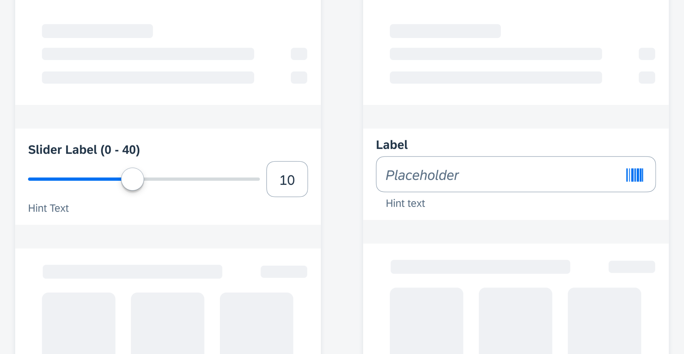
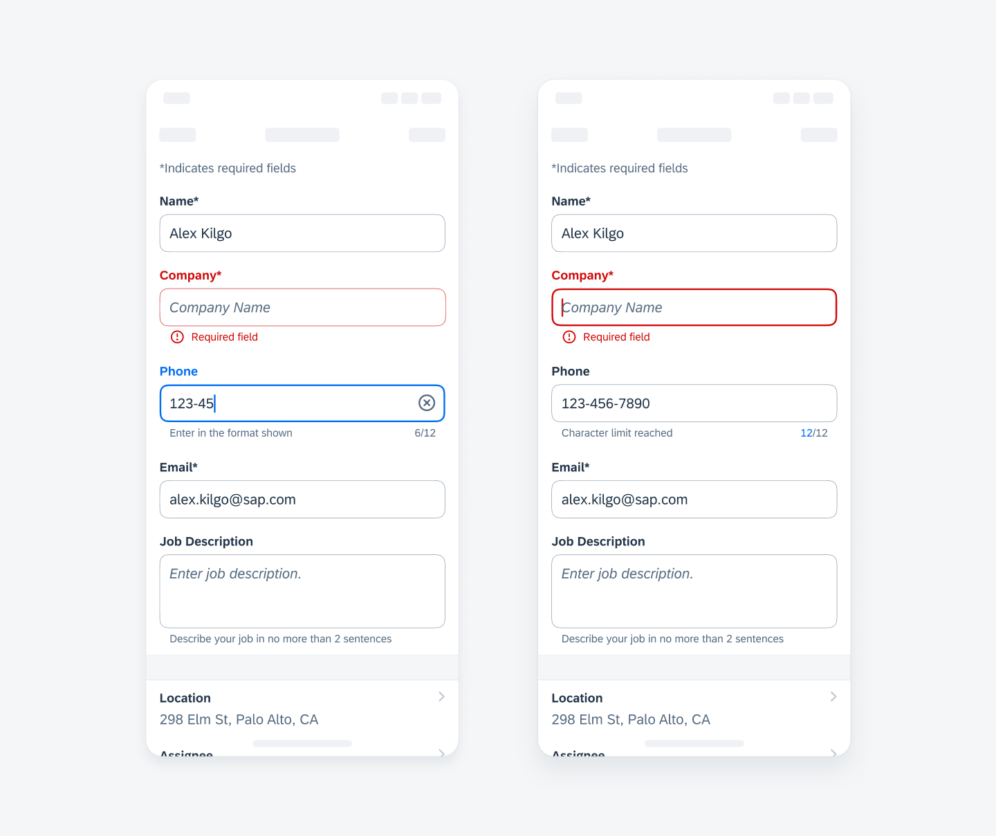
Form Cells
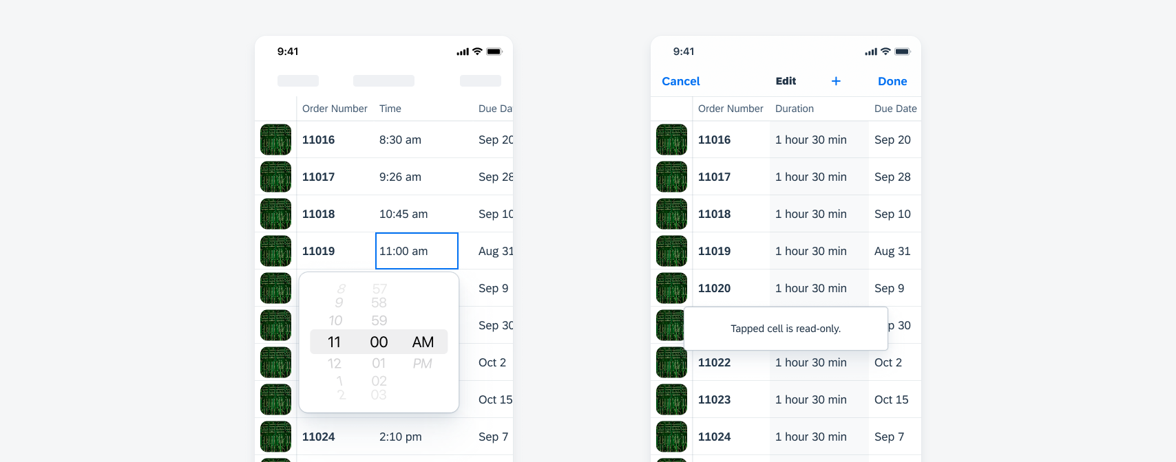
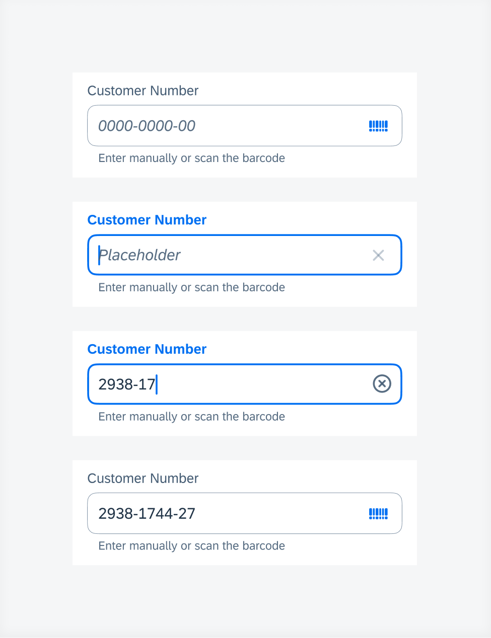
Updated Components! List picker form cell, in-line signature form cell, and pickers now have required field behavior available.
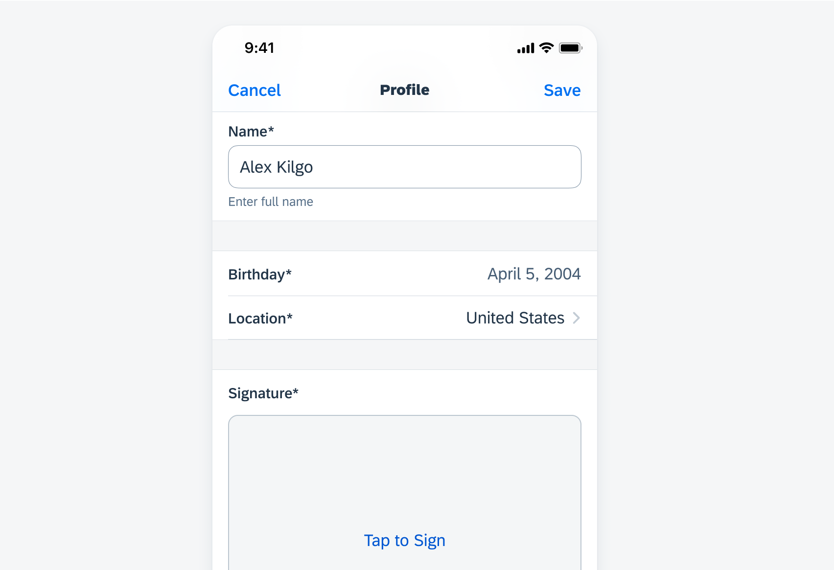
Examples of list picker, pickers, and in-line signature form cell with asterisks
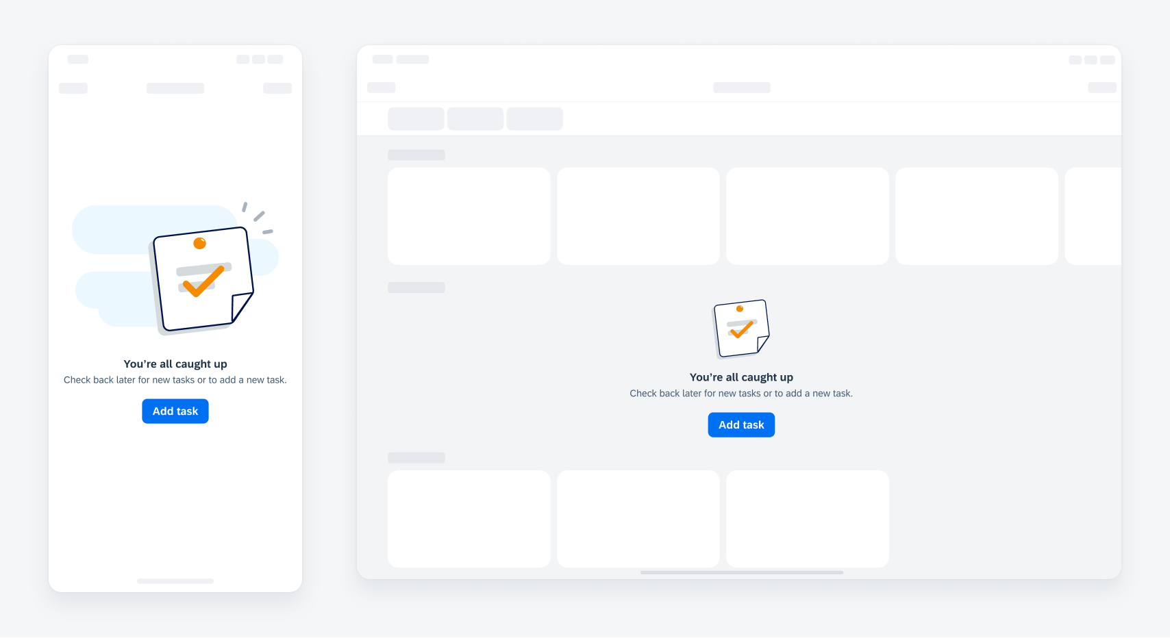
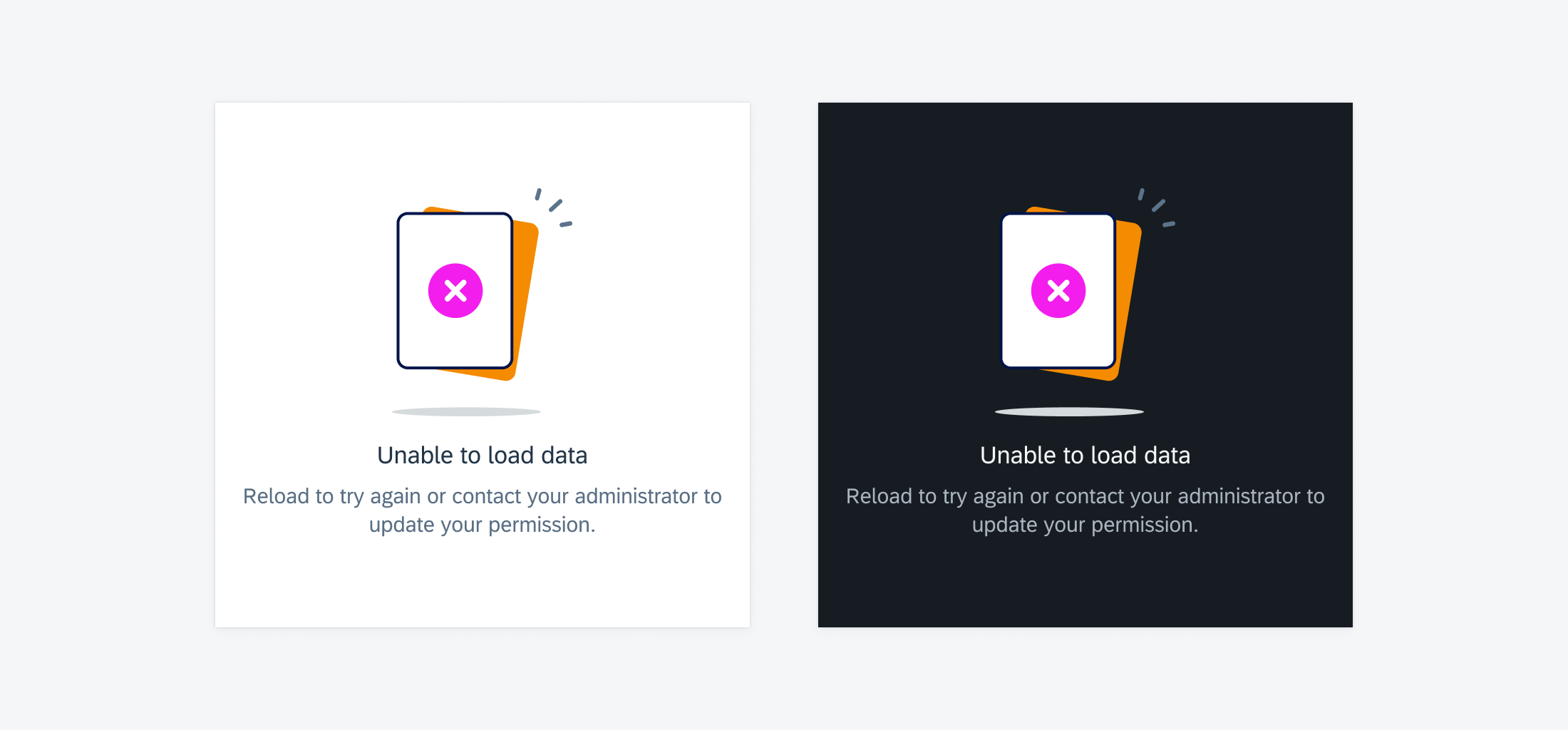
Illustrated Message
Updated Component! The illustrated message component now supports up to two action buttons. These buttons are flexible in layout and button type to better accommodate more use cases.
Updated illustrated message buttons
Segmented Control
Updated Component! Segmented control colors are updated to align with the native iOS control.
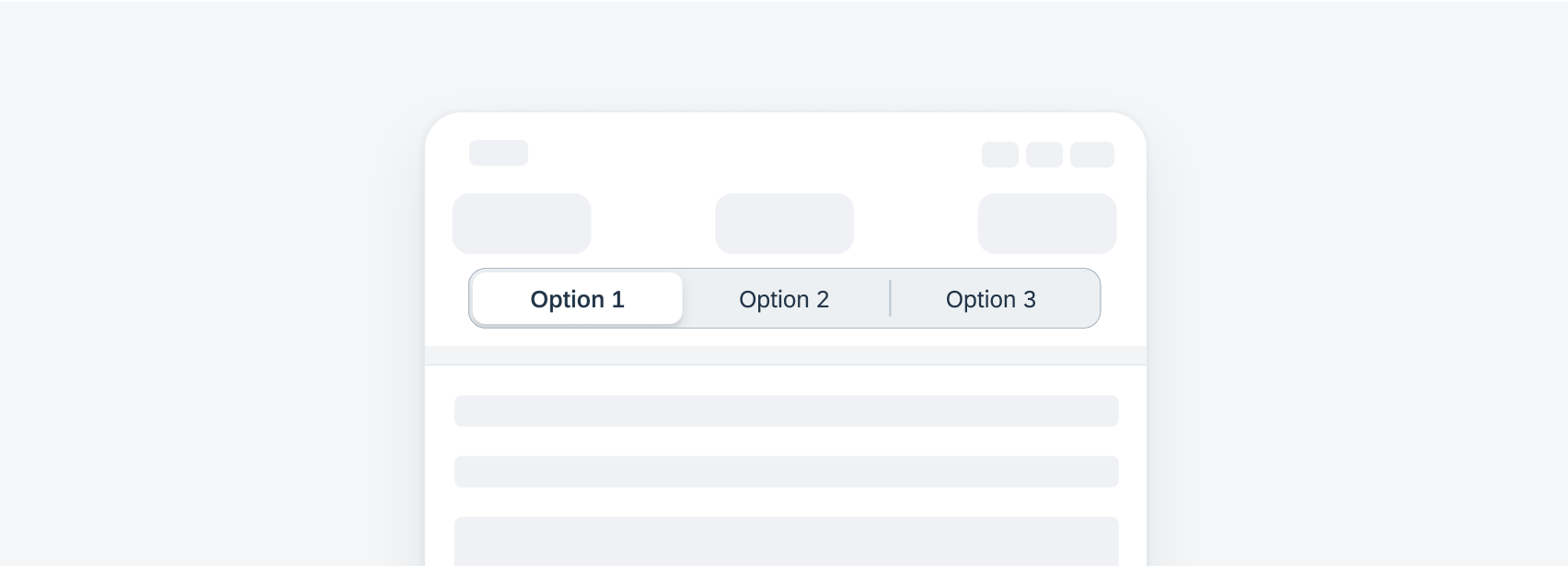
Updated segmented control colors
Sidebar Pattern
Updated Pattern! The visual design of the sidebar has been enhanced. Additionally, the sidebar has a new edit mode to rearrange and to hide or show items.
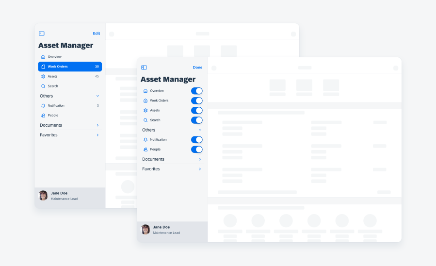
Sidebar in edit mode
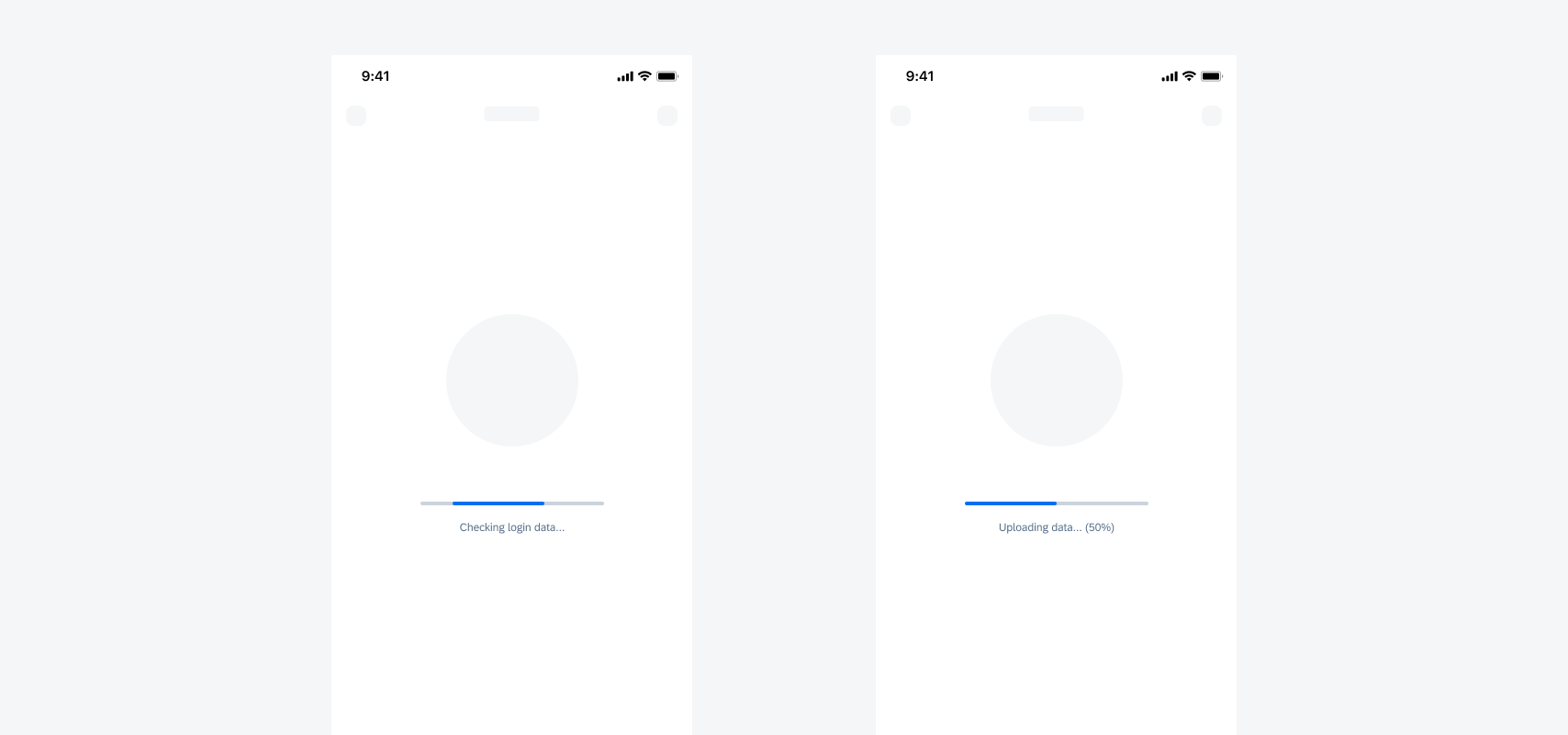
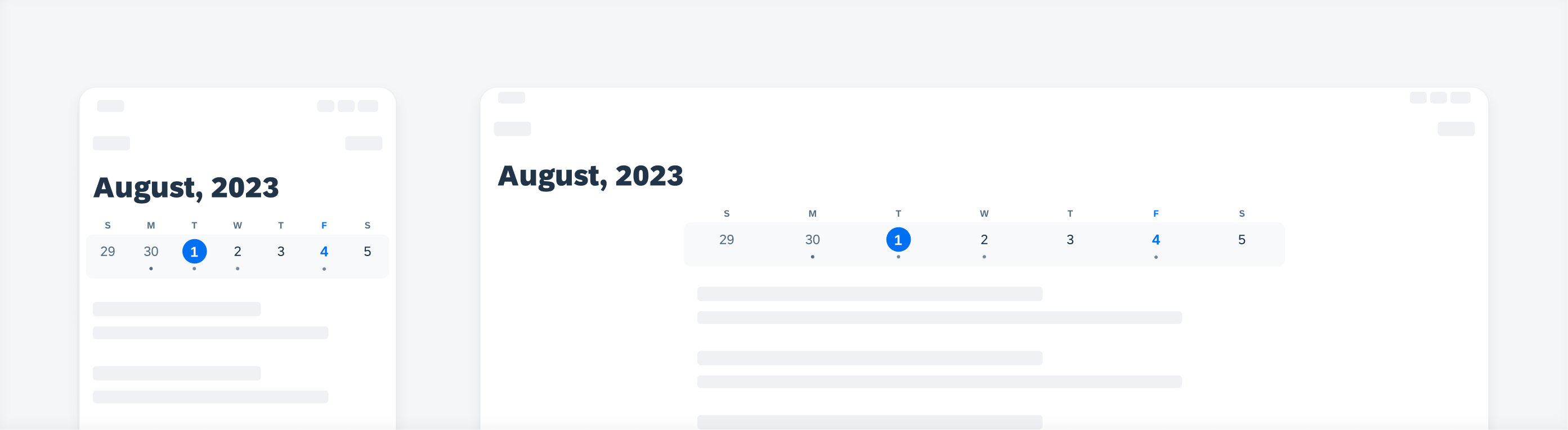
Skeleton Loading
Updated Pattern! Skeleton loading for object headers has been added to the design kit. It is used to replace the object header on a screen during skeleton loading.


 Your feedback has been sent to the SAP Fiori design team.